The latest from Benchmark Email
Tips, tricks, and best practices for the busy email marketer.

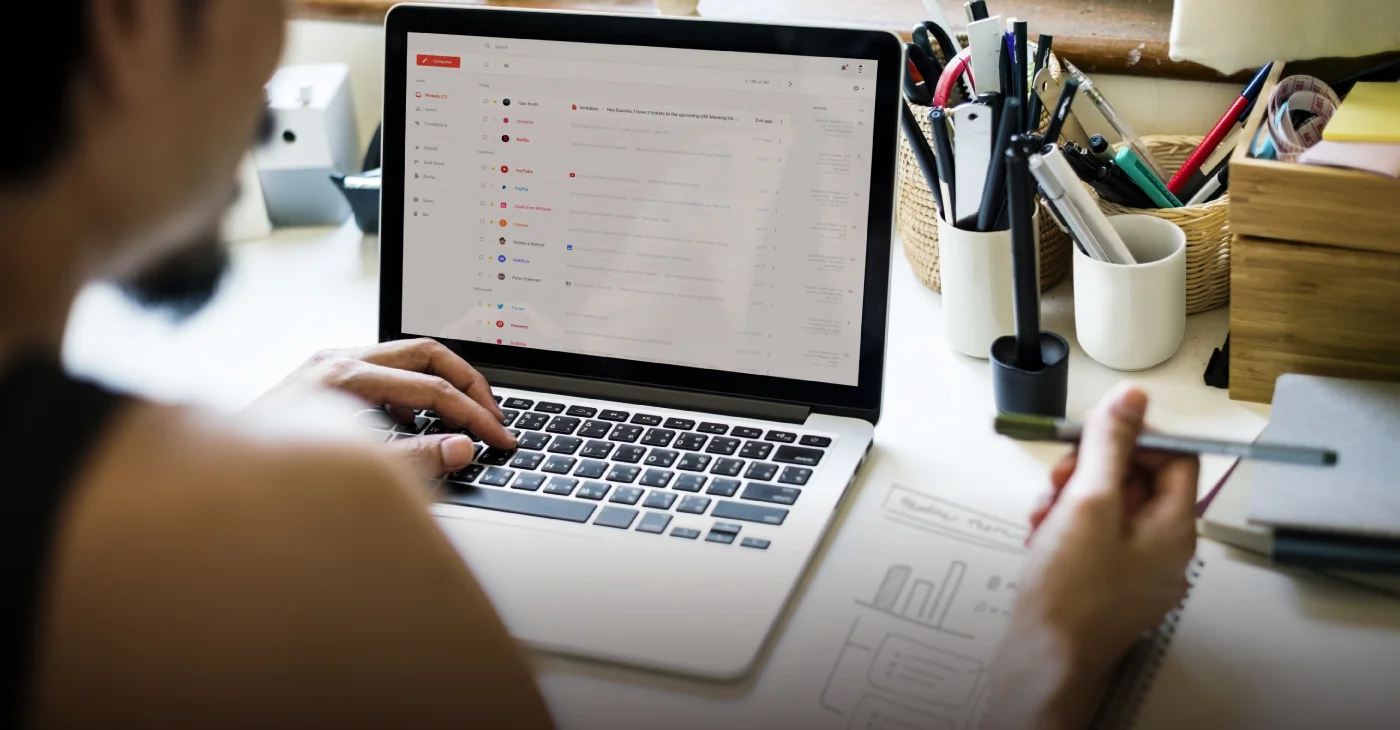
Mastering Email Marketing Without Overwhelming Yourself: A Guide for Busy Marketers
| April 18, 2024 4 min read
READ MORE
Latest Posts See all articles

Social Media
April 17, 2024 6 min read
How to Make Your Social Media Efforts Compliment and Amplify Your Email Marketing
April 17, 2024 6 min read

Email Marketing
April 16, 2024 5 min read
Email Design Trends: What Catches the Subscriber’s Eye in 2024?
April 16, 2024 5 min read

Email Marketing
April 11, 2024 6 min read
How to Fake it Till You Make it: The Email Marketer Edition
April 11, 2024 6 min read


Work Smarter, Not Harder
Create emails in a snap with our AI-powered email copy tool. Try it for free with a free Benchmark Email account.
SIGN UP FREE
Trending Posts See all articles
Email Marketing
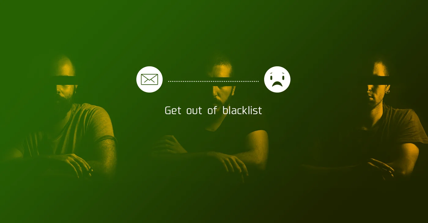
September 7, 2021 6 min read
Why Your Emails Are Going to Spam and Ways You Can Put a Stop to It
September 7, 2021 6 min read
Marketing Automation
March 23, 2018 8 min read
Top 5 Email Marketing Automation Triggers You Should Know
March 23, 2018 8 min read
Benchmark Recommends
See all articles
Social Media
How to Make Your Social Media Efforts Compliment and Amplify Your Email Marketing
| April 17, 2024 6 min read
Email Marketing
Email Design Trends: What Catches the Subscriber’s Eye in 2024?
| April 16, 2024 5 min read
Email Marketing
How to Fake it Till You Make it: The Email Marketer Edition
| April 11, 2024 6 min read