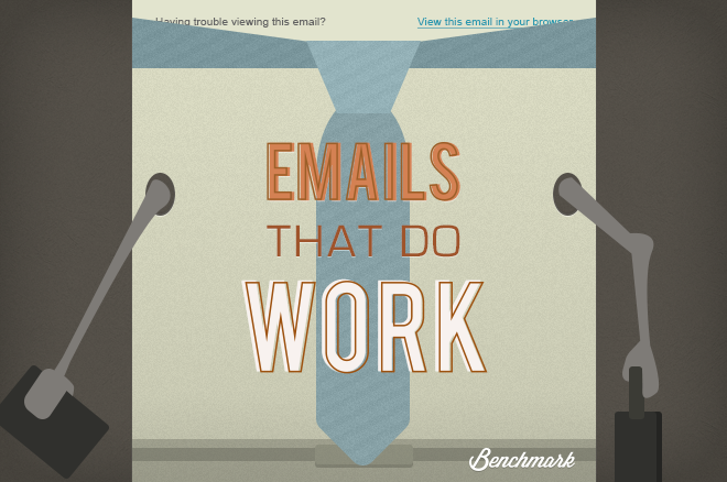
Here’s to another around of Emails That Do Work! Every month, I dive into the Benchmark Community to review and select a few emails that are putting good practices to great use. Keep these tips in mind when you’re preparing your next email campaign. Success starts when improvement shows!
More Than Sound
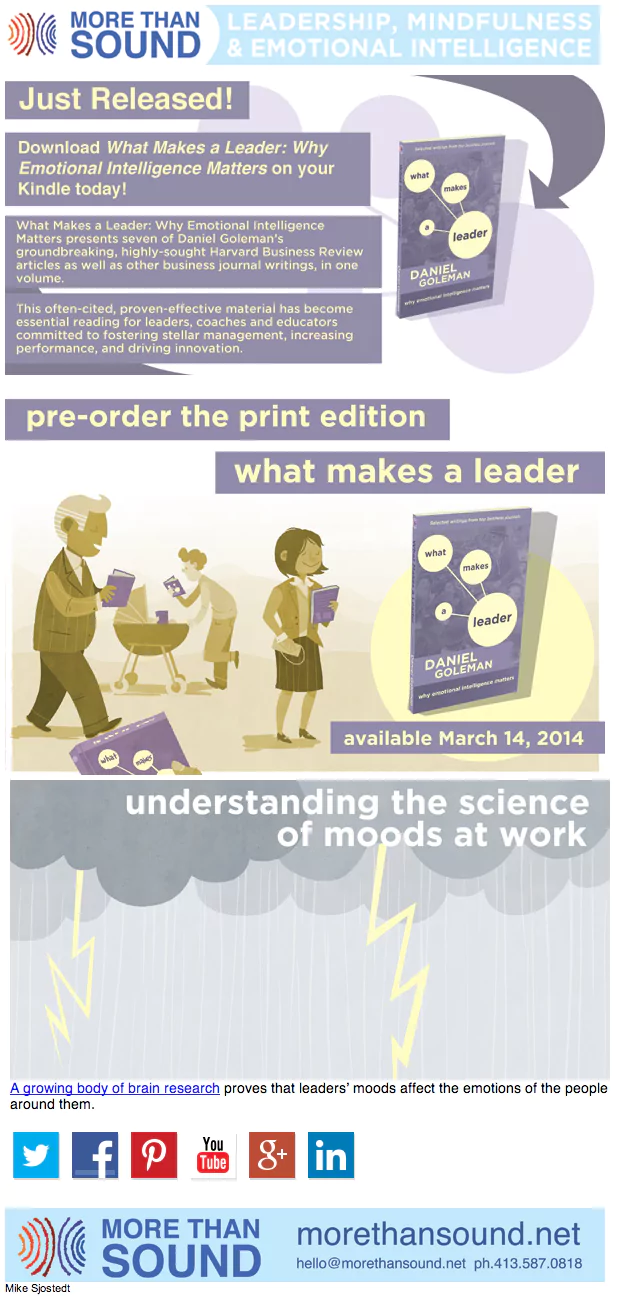
More Than Sound (MTS) creates and publishes high-quality tools to develop emotionally intelligent leadership and mindfulness. Their production expands from a line of podcasts, articles, blogs, publications, and video courses to offer tips and coaching on mastering the art of both subjects. Based on the nature of their business and their email campaigns (such as the one we’re reviewing today), we can safely say that MTS understands how to communicate effectively to their subscribers.
Why it works:
- Engaging Imagery: It’s very rare to see graphics that stray anywhere far from the usual stock photos. I was quite impressed by how MTS incorporated their promotional product into their imagery. Even at a glance, we can immediately segment the entire email into three portions – the purple intro and description, the yellow imagery, and an off-topic suggested read of “Understanding the Science of Moods at Work”. The friendly interaction between the people in the graphics and the product immediately communicates two messages: (1) that this book is for everyone, and (2) that someone at MTS took the time to create a visual to engage readers. Rather than to slap a few stock images that could maybe fit into the context of the email message, MTS took ownership in branding their imagery.
- Complementing Colors: Yes, complementing with an E, not an I…although these colors also do compliment each other as well. When selecting colors to use in creating your email template, take the time to make sure they look good next to each other. In this case, MTS opted for lighter colors that are easy on the eyes. As noted before, the colors also help segment the email into separate portions. Notice how the colors populate about 90% of the email without overwhelming the eyes. The opaqueness fills the page but doesn’t remove the spotlight from the content. You’re probably wondering what influenced the choice of colors within the email. Purple and yellow? Seems a strange pair to use, right? Take a look again. This email is a promotion for a newly released book. What colors are used on the book cover? Yes, there you have it. And that’s where we begin to make the connection of the subtle circular patterns behind the content. The colors and graphics are inspired by the featured product. Pretty neat, huh?
SARAR
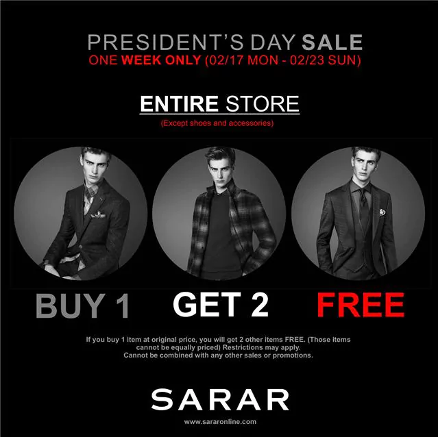
The SARAR Group is a menswear business with over 60 years of experience in the industry. Based in Eskisehir in Turkey, the headquarters now comprise of three modern menswear factories located right next to each other. About 40% of the factory’s output is exported to the U.S., Germany, Holland, Italy, Iceland and the United Arab Emirates.
Why it works:
- To The Point: This email conveys SARAR’s message in the blink of an eye. That’s a good thing, because many people tend to ramble in emails. This practice works well to engage your readers, and it’s worth the extra time that it might take to cut content out. What may seem less of a read could also mean a boost in readership. Squeezing anything and everything you’d want to say to a reader onto an email is wasted effort. Your subscribers will get lost trying to decipher what the main point of your message is, and will most likely forget about it altogether. That is, if they even get to reading the entire thing. One good habit to make your own, as SARAR has successfully done, is to cut down content. When in doubt, leave it out!
- Call Out Actions: If we take the email and read the red text, what do we get? “ONE WEEK ONLY (02/17 MON – 02/23 SUN)”, “(Except shoes and accessories)”, and “FREE”. Without even glancing at the rest of the content, we already know that there is a limited time event that excludes a few line of products, and that they are offering a deal in which the buyer gets something free. The red is eye-catching and encourages readers to take action, even if they don’t necessarily know what they need to take action on. If they’re interested, they’ll take the time fill in the blanks by reading the white text. Red is a very powerful color, especially when placed next to whites and blacks. It signals most readers to stop, or pause. SARAR puts into practice what most effective emails do – grab your reader’s attention first, and say what you have to say immediately after.
QNAP
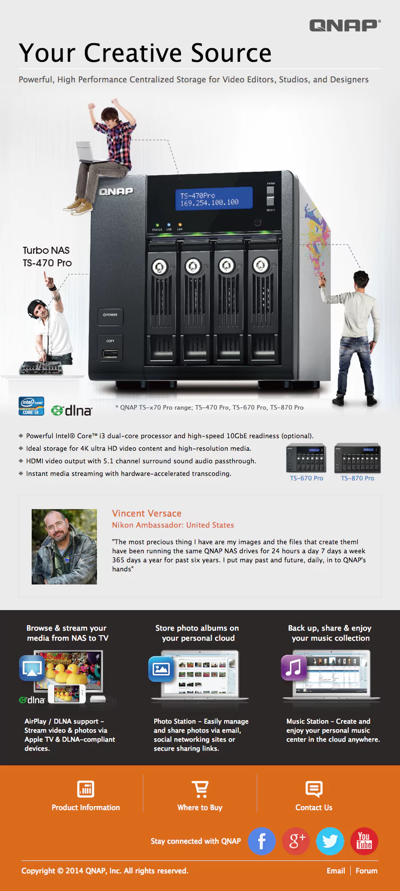
QNAP, Inc. is branded as the “Quality Network Appliance Provider” and aims to deliver comprehensive offerings of network attached storage and network video recorder solutions. The business integrates technologies and designs to effectively improve business efficiency on file sharing, virtualization applications, storage management and surveillance for other businesses.
Why it works:
- Content Structure and Layout: As someone who designs the landing pages for our acquisitions team here at Benchmark, I see QNAP’s email design ringing pretty close to home. Try to answer the 5 Ws when you’re developing your email campaign – Who, What, Where, When and Why. Of course, depending on your points, you may be able to eliminate a few Ws out of irrelevancy. In QNAP’s case, the When is left out because there isn’t a date or time of any significance to provide for the readers. The Who is answered by their logo in the top right. The What gets a bit more obvious (hint: it’s the large storage unit pictured in the dead center of the email). The Where is offered as link to redirect interested buyers to view locations that carry the featured product. The Why, though, should always be prevalent. Why do you want your readers to take action? Why do they want the What that you’re offering? This question can be disguised as product features, as QNAP has effectively done with bullet points below the storage unit (you know, that aforementioned storage unit with three small men interacting with it).
- Social Media Sharing (and Other Options): So you’ve sold your readers on why they should pursue your offer. What now? Put yourself in the customer’s chair. Is the product simple enough to decide on right then and there? Or does your product or service have more information to offer? If so, DON’T include it all on your email. An interested reader will pursue more details, so make it easier for them to find it. In the orange footer section at the bottom of QNAP’s email, there are options to view more information on the product, retailer locations, and an option to contact QNAP for anything else. Social media sharing buttons never hurt an email. If anything, they offer consumers to create a bridge of communication that will extend the lifespan of their relationship with the business. It also shows that QNAP has great web presence, making them more accessible and trustworthy than a business that fails to provide those channels.

Julie Van is an Acquisitions Designer for Benchmark. She learned all her life lessons from Ferris Bueller and leaves car freshener trees in her whip longer than she should. Nothing disappoints her more than finding too many lemon or orange-flavored Starbursts in a pack. That, and failure. Back when she had dial-up, Julie wrote fiction in her spare time because she wasn't allowed to go outside and play like the normal kids. She finished with her degree in marketing and advertising, later focusing her studies on art direction and ending this bio with a big bang. Bang!
Benchmark Recommends
See all articles

Mastering Email Marketing Without Overwhelming Yourself: A Guide for Busy Marketers

How to Make Your Social Media Efforts Compliment and Amplify Your Email Marketing