It’s that time again to take a gander through our Benchmark Community emails and rip them apart for all they’re worth. I’m kidding. It’s my first entry to help out for our Emails That Do Work series, and I’ve already gone and tarnished my reputation (as if I had one). Needless to say, I’ve scoured through over a hundred pages to pull some of our favorite user emails that, well, do work. We hope you find some of these tips useful so that you can optimize your own campaigns, too.
World Organic
World Organic (WO) sells certified, high quality organic products online. It’s based in New Zealand and about four years deep into development. The entire business is a visionary collection of the the founder’s life experiences and education. What pulls my attention to this particular piece is the main imagery that populates the top portion of the newsletter. Engagement secured! Well done, WO. The hard part’s over with.
Why it works:
- Branding: WO established a familiar presence by pulling colors directly from their main website. But wait – not just the colors. The typography. The layout. Even the basic “look and feel” of their site makes an appearance on this email. Everything has virtually influenced the design of their newsletter. Even at a glance, subscribers will immediately recognize the sender. And that’s called good branding.
- Relevancy: Readers find more validity in pieces that don’t look like they’ve been slapped together minutes before the campaign’s due to send. WO definitely took the time to design so that both imagery and content match well together. Take a look at the aforementioned image at the top of the email. Then, further down, there’s an iconic silhouette of raised hands in the “New Team Members” section. And so on and so forth, scrolling even further down. The media isn’t being inserted to fill in space. Every icon or image is intentional, and serves a purpose of being there.
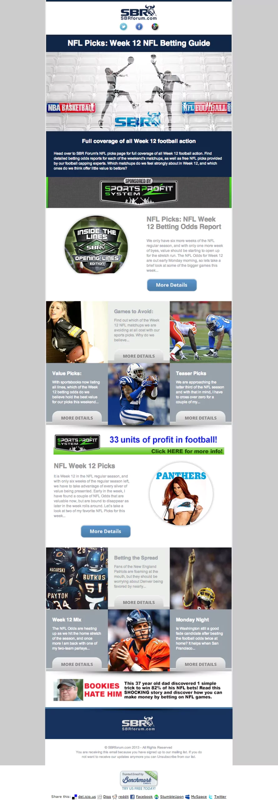
Sportsbook Reviews
Sportsbook Reviews (SBR) is a sports betting and handicapping forum where users can discuss picks, odds, and predictions for upcoming games and results on latest bets. Needless to say, the big S word sets the tone for what a subscriber would expect from SBR’s emails (pst, the S word being SPORTS).
Why it works:
- Sections, the other S word: Yes, this betting guide is lengthy and jam-packed with a lot of information. In the very case that the message is on the heavier side, go with the next best thing – sectioning. SBR pulls this tip off perfectly with its organizational skills. You can be a hoarder and no one would know it if you’ve got sweet Tetris skills. The same rules apply here as well. For businesses that have more content to deliver per email, the arrangement of both media and copy can make for an easier read. You’ve already gotten your subscribers’ attention if they’ve opened your email. SBR takes the extra effort to sort through what’s important and what’s less important so that their readers don’t have to.
- Text-to-picture ratio: Let’s all remember that 90% of information that comes to the brain is visual, and we are able to digest facts a lot faster when we are exposed to images rather than words. With that in mind, SBR made the smart move of incorporating imagery that relates to the text and appeals to their reader demographic at the same time. To put it bluntly, for every section of copy, SBR sneaks in either a victorious sports shot or visually-enticing hot girl in sportswear. Kudos to the decision makers at SBR. Knowing your target audience is one thing, but using it to your advantage is another.
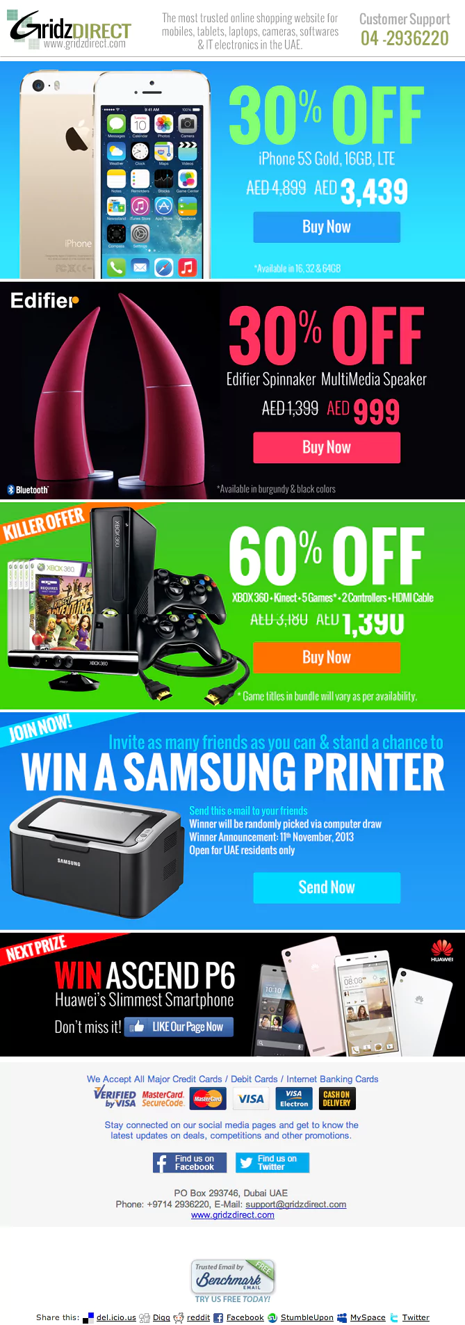
Gridz Direct
Gridz Direct is an online shopping website that sells electronic devices like mobiles, tablets, laptops, cameras, softwares, and a partridge in a pear tree. Okay, maybe not that last one. The business is a renowned IT and Telecom solutions company, specializing in Customized Development, Web Portals, IT Integration, and Logistical Fulfillment Solutions. Jargon aside, let’s get technical with this promo email.
Why it works:
- Structure: Some emails have the content, but fail to effectively communicate them because it doesn’t stand out or guide the eyes. Things that lack order or reason on media and copy placement tend to lose the reader at a moment’s glance. Gridz Direct creates a structure that is easy to read through, and allows the subscriber to predict the “pattern” as they continue downward. Sure, each box frames a different product with different colors. But the placement of imagery and text are uniform with one another. All discounts are on the right, and all call-to-action buttons are right below it. A shot of the product sits on the left. Lather, rinse and repeat.
- Visually loud: The colors are vivid and striking. Sure, each section different from one another, but it’s the consistency in structure that helps this shouting promo achieve its goals. The bright colors grabs the reader’s attention. The copy is short and sweet. The most appealing part is the discounted amount, which Gridz Direct enlarges to keep the subscriber interested. Whether you wanted the products advertised or not, you at least took the time to look.

Julie Van is an Acquisitions Designer for Benchmark. She learned all her life lessons from Ferris Bueller and leaves car freshener trees in her whip longer than she should. Nothing disappoints her more than finding too many lemon or orange-flavored Starbursts in a pack. That, and failure. Back when she had dial-up, Julie wrote fiction in her spare time because she wasn't allowed to go outside and play like the normal kids. She finished with her degree in marketing and advertising, later focusing her studies on art direction and ending this bio with a big bang. Bang!
Benchmark Recommends
See all articles

Email Design Trends: What Catches the Subscriber’s Eye in 2024?

How to Fake it Till You Make it: The Email Marketer Edition