It’s another segment of (cue the cheery, thematic music) Emails That Do Work. I’m your host, Juuuuuulie. Game show intro aside, our community is chock full of great, holiday-themed emails for us to take a look at. Here are a few that I have pulled to help you with both inspiration and tips to optimize your future emails and campaigns.
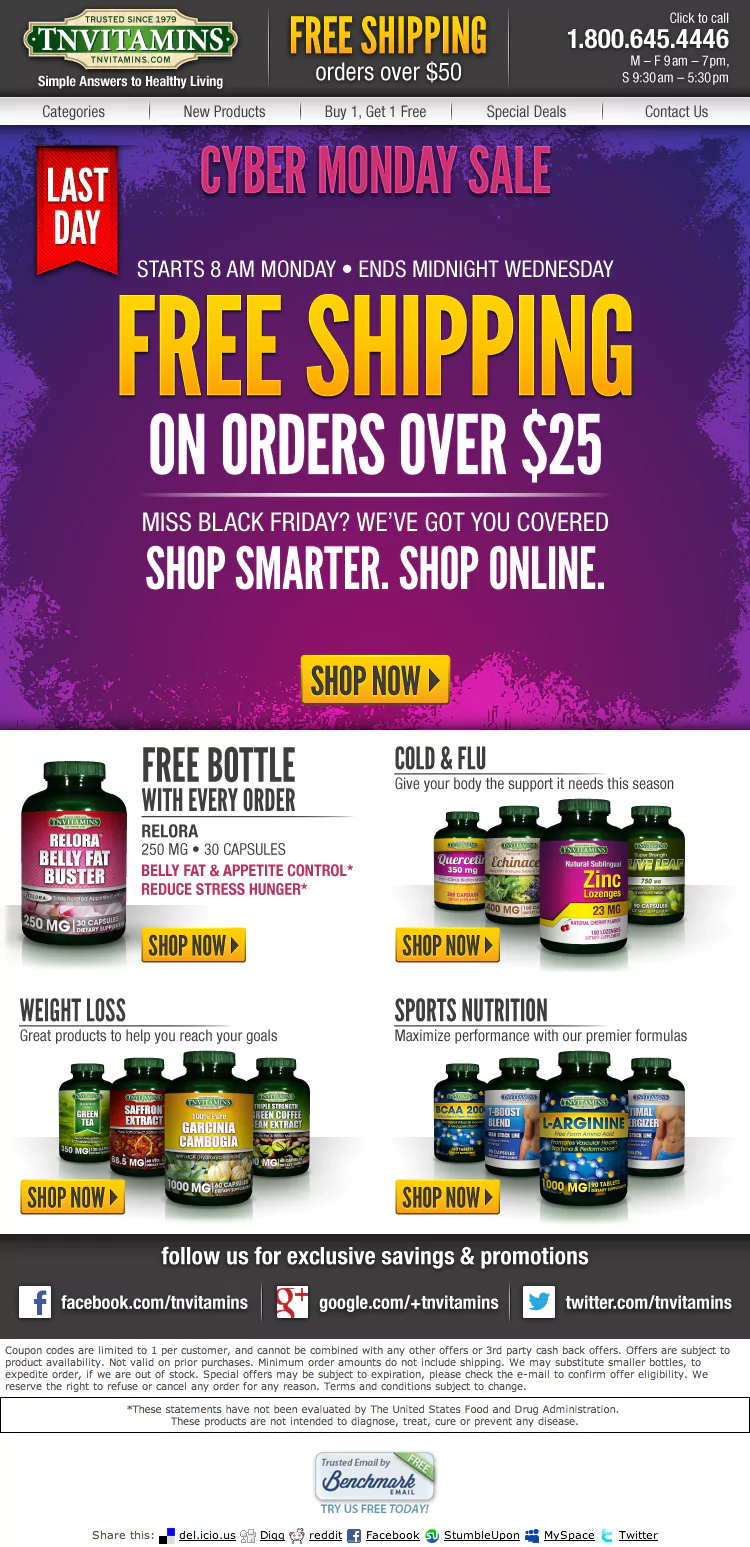
Total Nutrition
Total Nutrition (TN), or better known as TNVitamins, has been providing consumers with nutritional supplements at affordable prices for more than 30 years. They are one of the first companies to manufacture and distribute supplements directly to their customers. Over the years, the company has taken the initiative to formulate their own nutritional supplements, producing them and marketing them at affordable prices.
Why it works:
- Clarity of Message: Most emails come with an update or a point, and TN has definitely won this award in clarity. The bold, vibrant color of the first half of the page dominates and clears the way to announce their last Cyber Monday sale. Once a user opens an email, there’s a limited amount of time for the sender to relay their message. Emails that are too heavy in text could overwhelm the recipient, and discourage them from reading further on. TN did what most advertisers would do: make every word count. This is something to keep in mind for your future campaigns. Is your message too wordy? Can it be shortened and still communicate the same idea? Have a point to your emails, and make that point short, sweet, and CLEAR.
- Simplified Product Descriptions: TN has mastered the breakdown of communication to their loyal subscribers. In selling products that don’t necessarily have the easiest names for their customers to read through, they’ve bridged the gap by describing the product’s targeted results. I wouldn’t have known that zinc lozenges remedies the cold and flu. But by grouping together their products and categorizing them under what they are generally good for, TN makes their emails a lot easier and quicker to skim through. To give TN yet another pat on the back, the categorizes target common problems like colds, weight loss, and sports nutrition.
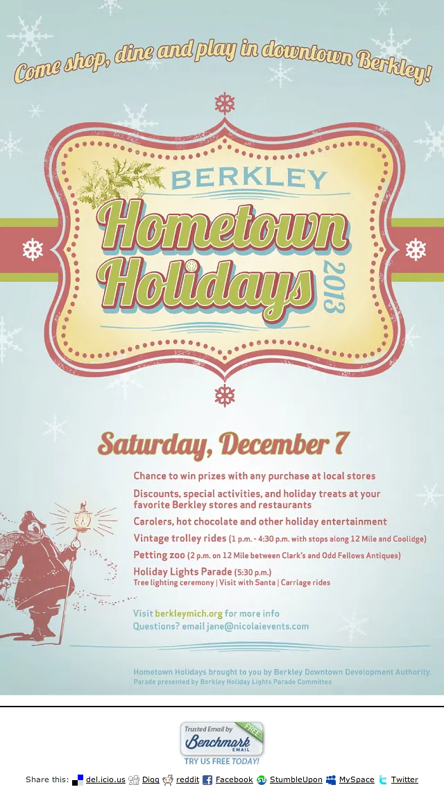
Elwin & Company
Elwin & Company (E&C) is a local Berkley Bakery that features prepared foods to go. Originally opening as a small European-style cafe serving breakfast and lunch, E&C has grown into a scone factory, now producing anywhere from 600 to 1,2000 dozen scones on an average day.
Why it works:
- Consistent Theme: Although many businesses often jump on the holiday bandwagon when it comes to seasonal color schemes, E&C gets a high-five for maintaining both a Christmas-y feel without sacrificing their branded look. The flyer uses colors that are easy on the eyes. The light, almost minty color used in the background hits close to home – their home site, that is. The seasonal, thematic colors of red and green also follow suit in its opaqueness. Case and point: mold seasonal looks and colors to appropriately match your brand. In E&C’s case, use of “lighter” reds and greens creates a holiday feel without taking their subscribers too far from their image. If your brand harbors darker, more striking colors, then feel free to darken your holiday’s reds and greens.
- Segmentation: With this email being an announcement for an individual event, providing information is unavoidable. When there is a bit of text to educate the readers with details, segmenting is the just-as-cool cousin of layout. E&C gave their readers a clear passageway of legibility by the way the message is organized. “Berkley Hometown Holidays 2013” holds the spotlight, but the date “Saturday, December 7” immediately follows below, guiding the reader’s eyes to even smaller text that will support the spotlighted headline. This gives E&C’s readers the option to determine whether or not this is something they are interested first, rather than bombarding them with the extra details first.
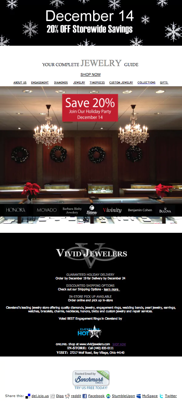
Vivid Jewelers
Vivid Jewelers has been family-owned and operated since 1978, located in upscale Cleveland, Ohio. In time, the business has evolved to incorporate high-end technology into the traditional art of jewelry design. Services include, but are not limited to appraisals, engraving, gold and platinum repair, watches, rings, settings, remounting and redesigning jewelry.
Why it works:
- Text-to-Photo Ratio: There’s a perfect balance between imagery and text, which results in an easy read. The picture of the store’s interior garnished with holiday decorations shows a sense of local presence. A physical storefront, or signs of one, often comfort potential customers with the notion that they can always address any inquiries or concerns the good ol’ fashioned way: face-to-face. But I digress! The point is, balance your content with some imagery. There’s no point in having something for your subscribers to read if they decide to pass right through it. Visuals are good attention-grabbers, and sliding in your text proportionately will help with this.
- Stacking: This method is probably the most mobile-friendly. If you did your research, you’ll know that most recipients are accessing their email via mobile devices. If you haven’t done your research, then you’ve learned something new today! Vivid Jewelers utilizes a stacked layout, confining the width of their email template and playing upon the fact that most users will be scrolling vertically for more information. So what do they do? Put the most important piece of information at the very top, of course. “December 14, 20% off storewide savings” reels the readers in before they even know what is 20% off.

Julie Van is an Acquisitions Designer for Benchmark. She learned all her life lessons from Ferris Bueller and leaves car freshener trees in her whip longer than she should. Nothing disappoints her more than finding too many lemon or orange-flavored Starbursts in a pack. That, and failure. Back when she had dial-up, Julie wrote fiction in her spare time because she wasn't allowed to go outside and play like the normal kids. She finished with her degree in marketing and advertising, later focusing her studies on art direction and ending this bio with a big bang. Bang!
Benchmark Recommends
See all articles


Efficient Email Marketing: Quick Tips for Marketers Juggling Multiple Tasks