Welcome to the September Edition of Emails That Do Work, the blog series where we dissect some of our favorite user emails, and talk tips on how to optimize our own.
Avanta Business Centre
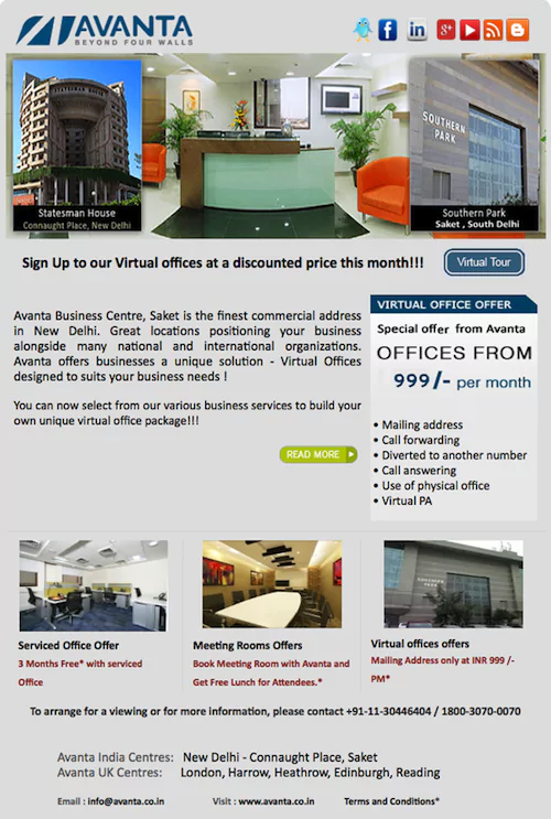
 The first email comes to us from Avanta Business Centre. Avanta provides professional, effective, cost efficient office solutions.
Why it works
- Pictures Galore. What is an email marketing campaign without pictures of your product? This piece epitomizes email marketing for those who use email to create sales. Avanta made use of their content by including pictures of the office space that they are selling. Some emails seem to focus too much on the basics of creating a snazzy layout, and forget the reason for the campaign, the sales! If you’re promoting a cupcake shop, I’d love to see pictures of your delicious treats when I open your email.
- Get Social Here and there, I will come across an email with social media buttons/links. As you can see, Avanta displayed their buttons in the header of their email and it couldn’t look any better. Even if you’re not able to update your social media daily, linking them to your email will have positive effects on both your email campaigns and your social presence. Only have a Facebook or Twitter? No problem, something is always better than nothing in such a social world. Don’t have social media at all? It’s about time to give in. Though some believe social media is a fad, the outlets may change, but it is here to stay.
Eye to Eye Interiors
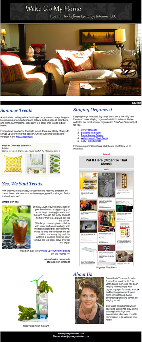
 Next, we have Eye to Eye Interiors, offering interior decorating, redesign and staging services in Chicago and the suburbs.
Why it works
- Organization. As an email that encourages readers to “stay organized”, this piece practices what it preaches. The columns, sections and headlines are placed perfectly, so that there isn’t too much or too little content anywhere within the email. It’s similar to the concept that we talked about in the first email regarding sales. Let readers know that whatever information you are trying to give them, you have mastered. As an interior design company, Eye to Eye proves just that.
- Color. Notice how the pictures and headlines pop. The top portion of the email has earthy colors, while the bulk is bright. Bright colors not only work great during the spring and summer seasons, but as long as they’re not overbearing, they usually make people happy. Also, notice the use of no color in the background. This not only helps the content pop off of the page, but gives the eye space to breathe at the same time.
Precision Ceramics Dental Labs
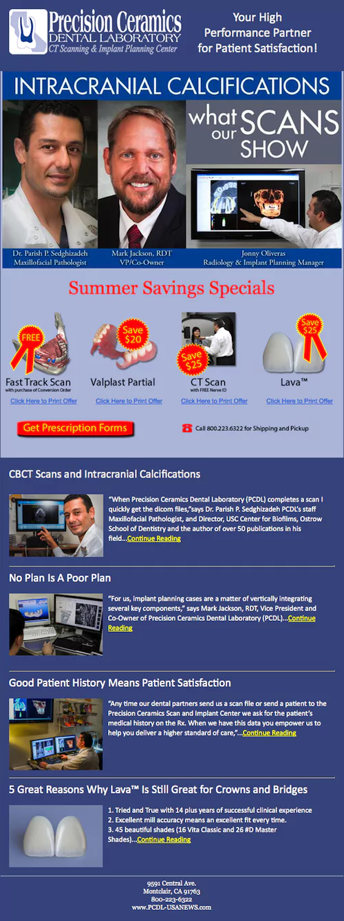
 Last, but never least, is Precision Ceramics Dental Labs.
Why it works
- Text-to-photo Ratio. For every block of text, have a photo. Not only does this keep readers engaged, but it may be what initially draws them into your email. Have your pictures directly correlating to the text and if you have no idea what type of pictures to include? Start with your staff and products!
- Layout Legibility. Precision Ceramics’ email does a great job encouraging the eye to continue reading the entire piece. Breaking up the layout of your email make it easier to follow, and keeps readers interested in what the next section is talking about. Try columns, rows, list and maybe even boxes. Just remember to switch it up every now and then.


