Have you ever considered why one landing page converts while another doesn’t?
Is it the color? Is it the headline? Could it be the offer?
The truth is, it’s probably a number of things.
But underneath all of the superficial changes you could make, there are a number of psychological principles that drive a much deeper reaction…
Specifically, there are 5 psychological elements that can make or break any landing page.
If you’re wondering what those are, we’ve broken down each of those into 5 distinct categories today.
Let’s get into it
1. Contrast
As humans, we’ve evolved to save mental energy by grouping together similar objects, people, and things. This helps us in our day to day lives, devoting minimal amounts of effort into decoding the world around us. The problem is when people with that same psychology view a landing page with similar colors, fonts, and call-to-actions.
In this scenario, unimportant and important information can start to blend together making it unclear what a user should pay attention to.
This is why contrast is so important.
Contrast takes a user’s attention and focuses it on what matter, while allowing less important elements to remain in the background. Take a look at a low contrast page in which the CTA, theme color, and main background image are all very similar:

Notice how easy it would be to overlook their main call-to-action on this page? Marketers ran a multivariate test comparing 12 different CTA’s against each other to determine which one would convert best. Not surprisingly, the CTA with the highest contrasting headline and subheading converted 60% higher than the other less contrasting variations.
So what does this tell us?
Use contrast on your landing pages whenever possible.
Specifically, use a contrasting call to action and encapsulate the form so it’s clear where people should focus and where they need to click in order to proceed.
Here’s an example of a landing page that utilizes good contrast between the page background, form, and call-to-action:
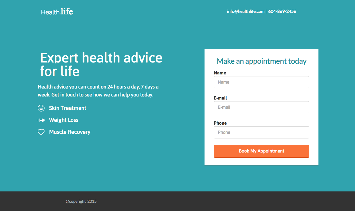
Notice how well the form and call-to-action jump off the page and command a user’s attention?
2. Visual Cues
There are a number of different factors that determine where our eyes focus at any given time.
It could be based on color, sound, movement, and a host of other factors in our immediate surroundings.
Marketers should be tactical about how they place elements on a page in order to draw a person’s focus to a particular spot.
Some of these tactics include adding cues. There are two that stand out as being the most commonly used:
- Eye Direction Cues
- Arrow / Linear Cues
Eye Direction Cues
Humans are naturally drawn to where other people are looking. It’s why pulling up to the scene of a car crash, you immediately look in the same direction as the other bystanders.
It’s also why, when you look at this picture, you can’t help but look at the headline and form:

Well, that’s how eye direction cues work, they focus a user’s attention on wherever a person’s eyes are looking. Eye direction cues are most commonly used in hero shots to focus attention on headlines, CTAs, and value propositions.
Arrow / Linear Cues
Another cue that’s commonly used is an arrow or linear cue. These types of cues are less subtle than an eye direction cue, but that doesn’t mean they’re any less effective. Arrow and linear cues are the simplest way of telling your users exactly where they should be focused on and where on the page they should looking.
Here’s an example of an arrow cue on a newsletter popup:

Notice how your eye is naturally guided towards the form, following the direction of the arrow?
3. Language
No one can deny that design and imagery can affect how well a page will convert. One aspect that can be easy to overlook however are the nuances of language and its impact on a person’s psychology. Past the obvious types of optimizations that marketers can make (things like their headline, sub-headline, and key descriptive sections), small changes can often have overwhelmingly powerful results.
This can include things like:
- Changing “Your” to “My” in a CTA since it represents a first person statement and can allow a user to take more personal ownership
- Adding “Guaranteed” since it communicates trust
- Adding “Now” to a CTA since it adds an element of immediacy
VWO published a study a couple of years back that compared a small CTA that read “request a quote” to “request pricing.”
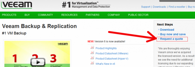
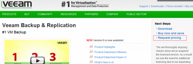
Their hypothesis was that by adding the word “pricing” it would be clearer as to what a user was requesting, and as a result, more users would click through on the CTA.
The result?
A 166% increase in click-throughs on that CTA simply by adding one word. Not too shabby!
4. Urgency
One of the most powerful psychological elements of all is urgency. Urgency is the reason why people line up overnight to get deals on Black Friday. The reason internet marketers see a surge in conversions in the last 24 hours of a product launch.
What creates this sense of urgency?
In a nutshell, there are two main factors: scarcity, and time.
Scarcity
Scarcity is the idea that there might not be enough supply to meet the total amount of demand. Because of this, the user might risk “missing out” if he or she hesitates to act immediately to take advantage of an offer.
Travel sites use scarcity to encourage users to book or lose out on an awesome deal.
Take a look at an example of scarcity in action on a hotel booking page:

Notice how they state they have one left at the discounted price, along with another notification that there are 25 other people currently viewing the page:
Time
The second factor that plays into the idea of urgency is time. Time is what puts that fire underneath a user by subtly telling them that if they don’t act right away, then what’s being offered will be gone forever.
The most effective form of time-based urgency is usually accomplished with a countdown clock. The reason being is that a countdown clock clearly shows a user that the longer they wait, the less time they’ll have to act.
Take a look at this example of time-based urgency being used via a countdown clock on an early access app landing page:

5. Social Proof
As humans, we are by nature social creatures.
Because of that, we’re constantly trying to adjust our behavior to align with what’s socially acceptable in any given situation.
This concept also comes into play when we’re quickly trying to determine the value of a product or service, and how much we can trust the company behind it.
This is the same reason that people so frequently visit review sites before trying a new restaurant, or why people will enlist the help of their friends before booking a trip.
Marketers can take advantage of this phenomenon by using social signals to their advantage by adding testimonials, reviews, and positive ratings that can help influence a user’s decision-making process.
If you want to A/B test a testimonial on one of your landing pages, here’s a couple of quick tips to get you started:
- Search through industry review sites for quick testimonials
- Try and use thumbnail photos of people being quoted whenever possible for added credibility
- Keep testimonials specific to the product being promoted
Summary
Understanding the psychology of conversion can help you become more scientific about what to test in the future, while at the same time giving you a better understanding of what’s working and why.
To recap, the 5 psychological elements we looked at that impact a page’s performance are:
- Contrast
- Eye Direction
- Language
- Urgency
- Social Proof
How are you utilizing psychology on your landing pages? Are there any tricks you’ve found that can encourage people to convert?
I’d love to hear your experiences in the comments below.
