Some say email marketing is a lot like getting free tickets to a movie. Your subject line convinces people to go inside, but your email and layout keep them from walking right back out. In other words, if you can’t immediately dazzle with your words and design, you’ll never sell your goods, promote your event, or show your subscribers why you’re sending to them in the first place.
Fortunately, creating an email campaign that bears a decent response and click-through rate can be done by following some easy to remember, similar rules for both layouts and verbiage. Use the tips below to cut the clutter and clean up your campaigns and you’ll send more subscribers back to your website, landing page or other preferred location.
Streamline Your Email Copy
- Be a heavy handed editor. Unnecessary words can bloat your emails into a blocky, cluttered mess. Write all your copy and go back – more than once, if necessary – to cut out the excess. By ditching phrases like “in order to,” “in regards to,” or “to enable you to” in your campaigns, you will improve your copy flow, engage your readers and make your emails easier to digest all around.
- Bust up your paragraphs. The days of droning on in five-sentence paragraphs are over. Thanks to everything from smartphones to social media, humans are more pressed for time than ever before. When you present a large-yet-well-written paragraph to your subscribers, prepare to be ignored. To combat reading fatigue, use no more than two streamlined sentences in a paragraph, and use links to send people to the director’s cut.
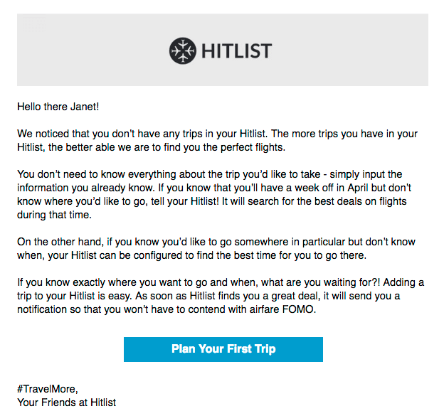
- Speak directly to your audience. Are you speaking directly to your subscribers or speaking about something and letting them listen in? Your readers want to know that you understand their needs, so write like you’re speaking directly to them. Instead of writing “it is easy to understand problems retailers face regarding inventory management,” write something like, “we understand your inventory management challenges.” Show readers that you’ve walked in their shoes and you’ll see more action on the response front.
Focus Your Email Layouts
- Use a liberal amount of white space. The best way to showcase graphics, text and video in your emails is to add plenty of breathing room. This can mean adding more free space between images, paragraphs and graphics, but not so much that your layout looks unfinished. If you’ve done your job right, your readers will quickly and easily absorb your images and copy when they open your emails, but not feel like they’re missing part of the meal.
- Be disciplined with images. The vast majority of email layouts need images to both present a product and break up text content. But while eye-popping images can captivate your subscribers, too many will turn them off. Instead of cramming your layout with eight or ten images, use five, four or three solid ones instead. Think quality – not quantity – when you choose your email images.
- Focus on the essentials. Are you dying to talk about the fifteen new products in your catalog, or the dozen or more services you’ve just started offering? Before you sit down and work on your layout, list the items that will take top billing in your email newsletter. Remember: too much choice is a bad thing. If you create a great email layout that gives three to five things their proper due rather than twelve that have to share that small space, you’ll see more click-throughs, sales and attention from your valued subscribers.
Finding a right balance between too much and too little is an ongoing challenge for even the most experienced email marketers, but the tiny screens of smartphones, tablets and netbooks make sleek layouts with tight, snappy text more important than ever. If you use the tips above to cut your campaigns down to size, you’ll easily see the fruits of hard work in your reports, response rates and sales.
The Email Marketing Plan Series:
- Creating an Email Marketing Plan – Who Is Your Audience?
- Creating an Email Marketing Plan – Reaching Your Customers
- Creating an Email Marketing Plan – Who Is the Competition?
- Creating an Email Marketing Plan – What is the Ultimate Goal?
- Creating an Email Marketing Plan – Go Viral with Social Networking

