Even though the new iPhone 6 and 6 Plus are packed with technological innovation it’s a shame that there is a single image embedded in the minds of every iPhone lover and hater: The very first purchaser of an iPhone 6 standing outside the New York City Apple Store, where he had been camped out since the Carter Administration, proudly opening the box in front of the world’s amassed journalists and promptly having it fall to smash on the sidewalk below. Although this “duh!” moment has become a part of iPhone 6 lore this new device has more lessons for email marketers and app developers than just “be careful when you open the box” as Apple has rewritten the resolution rules … again.
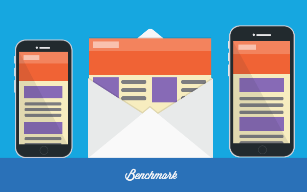
If you thought Retina wasn’t enough, here’s Retina HD
Just when you thought it was safe to rest on the laurels you have established as a master of the Apple Retina display resolutions and had all your emails displaying wonderfully on every imaginable iOS device, the fine folks at Cupertino have decided that you were far too comfortable so they’ve shaken things up. The iPhone 6 has a screen that measures 4.7 inches and bears 750 × 1334 physical pixels which provides it the same 326dpi as the iPhone 5s. No amazing news there but its big brother, the phabletty iPhone 6 Plus, sports a considerably larger 5.5 inch display with a 1080 × 1920 resolution at 401 dpi for the “Full High Def” experience now known as Retina HD.
Bizarre but effective new rasterization figures
It is obvious that Apple wants to punish anyone who dares to provide their offerings on Android as the viewport device-width in CSS pixels for the iPhone 6 is 375 while for similar display size on Android devices it’s 360. Similarly, on the iPhone 6 Plus, the device-width is 414 vs. Android’s 400. Just 14 or 15 pixel difference might not sound like much but it is an extra level of complexity when you’re trying to rationalize your display on iPhones with what you’re getting on Android. If that wasn’t confusing enough, the iPhone 6 has a rendered pixels figure identical to its physical pixels, but the iPhone 6 Plus throws a curveball at app developers and email marketers by bumping up its 1080 x 1920 to a default viewport size x dpr rasterization figure of 1242 x 2208 pixels as it downsamples by 1.15 so that every 23 pixels from the original render are remapped to 20 physical pixels. Have a migraine yet?
Icons are now 60 pixels larger
The icon size for the iPhone 6 Plus has been bumped up so that they don’t become readable only with an electron microscope, so the new icons are bumped up from the iPhone 4 and 5 standard of 120 x 120 px to a new 180 x 180 px.
Attributes to keep your iPhone 6 Plus customers happy
It bears note that there are a bunch of other useful attributes you may want to implement when it comes time to providing your iPhone 6 Plus customers with the best possible display experience:
- media type: screen
- monochrome: false
- color: true
- width in px: 414 px
- height in px: 628 px
- device-width in px: 414 px
- device-height in px: 736 px
- min-device-width in in: 4 in
- min-device-height in in: 7 in
- min-device-width in cm: 10 cm
- min-device-height in cm: 19 cm
- orientation: portrait
- aspect-ratio: no support / out of range
- device-aspect-ratio: 9 / 16
- resolution in dpi: no support
- resolution in dppx: no support
- color: 8
- -webkit-device-pixel-ratio: 3
It’s true that the only constant in mobile marketing is change, so wait until you see what iPhone 7 brings!

Hal Licino is a leading blogger on HubPages, one of the Alexa Top 120 websites in the USA. Hal has written 2,500 HubPage articles on a wide range of topics, some of which have attracted upwards of 135,000 page views a day. His blogs are influential to the point where Hal single-handedly forced Apple to retract a national network iPhone TV commercial and has even mythbusted one of the Mythbusters. He has also written for major sites as Tripology, WebTVWire, and TripScoop.
Benchmark Recommends
See all articles


Sync 2,000 Contacts with your Benchmark Account for Free

