Location! Location! Location!
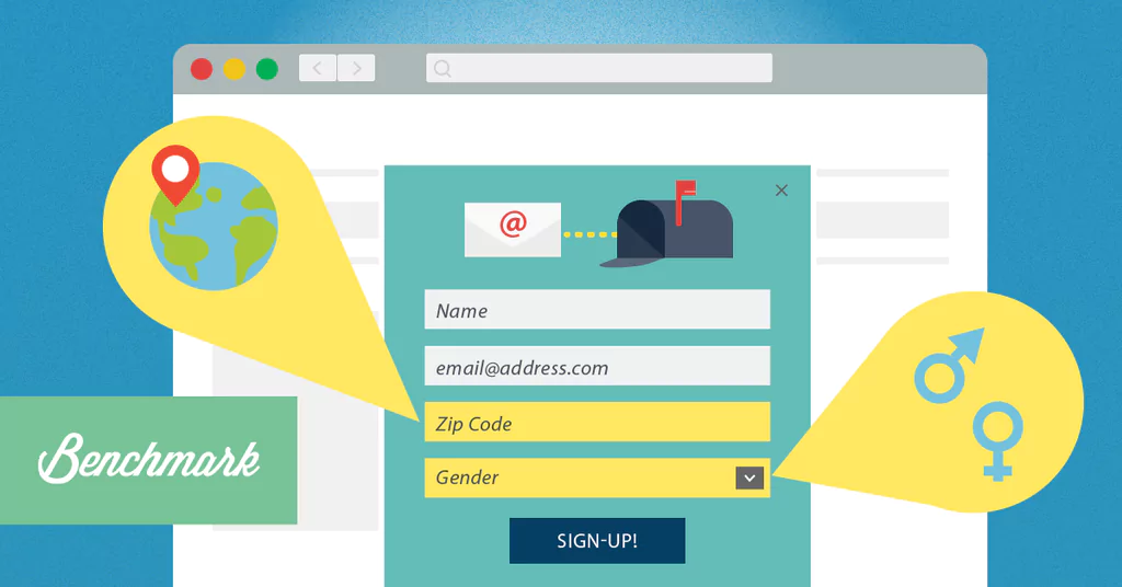
We talked about the importance of timing last episode, but one factor in that timing is where on the page a signup form is located. Do you want your form above-the-fold, in the sidebar or the footer? Listen to find out.
00:22 Andy Shore: Hey, everybody, welcome back to Clues for the Clueless Email Marketer. We’re gonna continue talking about how timing plays a role in growing your list, and we’re gonna get a little more into detail than the last episode and talk about, specifically, the location of where a sign-up form should be to make sure it’s timed properly.
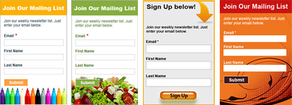
00:39 Daniel Miller: Exactly. Of course, the location of a sign-up form is gonna vary on the different type of page that you may be on. If you are on the blog page, the sign-up form may be on left or right side column, or maybe also at the very end of blogs. If you’re on a pricing page, that sign-up form may be in a totally different spot.
00:57 AS: Yeah. And we talked about the home page in one of our first episodes and the different ways that you can do that, and the reason it varies is because of how the timing plays into that overall user experience of visiting your home page for the first time. Someone goes all the way through your home page and you wanna make sure they’re consuming all that information. You could put a sign-up form in the footer because you know those are a captive audience. You’re not gonna get the highest volume of the traffic to that home page by putting it all the way down there, but that’s how you’re gonna get the people who are probably the most interested in your product, so the timing plays a role into who are you trying to get to sign up or versus, like you were saying, maybe a sidebar or above the fold, which is one of the first things they’ll see when they get to your home page, which isn’t quite the attention demander of a pop-up, but is gonna make sure, more often than not, people are gonna see it and give them that opportunity to subscribe. So it’s really just a matter of the timing for even the amount of subscribers you’re trying to get and the type of subscribers you’re trying to get.
02:00 DM: Exactly, and when you think of it when somebody goes to your blog, it makes a lot of sense for them to subscribe to you. Now, if somebody’s on your home page, what are they really subscribing to? I may not see something that is subscribable on your home page, specifically, but your blog, of course, ’cause you’re talking about a specific topic that I like. And any time you post new blogs, I wanna hear about that, so kind of think about that. Because of that, on the home page and other types of pages like that, I like to have it to where the sign-up form is always in the footer, so that way, people that know that they wanna subscribe, they can go to the very bottom and subscribe there. Now, as Andy said, not all of your website visits are gonna go to the footer, and that’s where maybe an exit pop-up plays a perfect role, which we’ll be getting into at a later episode, more into detail, how they work and what you can do with it.
02:51 AS: Definitely. We were talking a lot about the different pages on your website and how people might encounter, but I wanna take it offline a little, too, because timing and location play a factor there. If it’s in your store, do you put it by a register? Is it on displays throughout the store? Is it on the windows before you leave? Think about every time that customer experience and how they’re gonna maneuver through the space to where you want them to see it. If they’re in line by the register and you usually have lines there, they may be looking for something to read and you’re like, “Hey, get 10% off for subscribing.” That’s gonna be good timing and location because you’re getting a captive audience when you know they’re gonna be purchasing already, so a discount’s gonna be of value to them and it’s gonna help you grow that list. Or restaurants, we talked about the Chili’s example with the little table devices that help you go through all that. So don’t just think about it in terms of online because there’s a lot of the offline aspect as well.
03:49 DM: Andy, you just brought up a really good point in regards to restaurants or stores. Really think of yourself and what you wanna get out of this. If you do often have a long line at your cash register, it is of perfect sense to add a QR code or something that allows the buyer to subscribe from, right? Now, once they’re subscribing, they may be getting a 10% off, a 20% off, so really, put that in your business model. Do you want to offer that 10% off to somebody that’s already gonna buy, but also, knowing that now you’re gonna have their email, and you’ll have more chances to get them back into the store in the future. ‘Cause I have seen some businesses say, “Well, wait a second, I don’t wanna give away a discount if they’re already gonna buy,” but it’s not about that purchase; it’s about the long-term relationship that you can both benefit from.
04:40 DM: And then also, if you do have a restaurant that has a long line, you don’t wanna keep that line there; you wanna speed it up. So also think of it in that perspective as well. How much is this sign-up process really delaying your line? If somebody is trying to fill out their email at the point of sale and that’s having the line go longer, is that really beneficial versus maybe having little stands on your table, so when people are dining, they can subscribe there?
05:09 AS: Yeah, see, I was gonna go the opposite, but you made a really good point about not taking too much time in the line, but I was like, “Oh yeah, it’s another way to help people pass the time when they’re online,” so know how long your sign-up process takes because, after all, these episodes are talking about timing and that’s an important aspect, too. So we’ll catch you guys next time. Thanks for listening.
