When companies say they want to throw out a newsletter, there’s typically a lot more that goes into it than one imagines. It’s a lot like when someone says they want to start a blog but have never done a blog before. In both instances, people are focused on the message; they’re not focused on the messaging and the delivery. They’re not thinking about the mechanics of the platform and what’s really needed to not just say something, but also be heard. Once you’re heard the next step is to make sure more people hear you.
For those of us at the last step – how to make more people hear you – I’d like to introduce you to a novel concept that many of you haven’t thought of: the email subscription landing page.
Landing pages are used to get someone to the last final climactic step before a conversion. This is where the bells and whistles come in to really get someone to hop on board. And this is why a landing page for your email campaigns matters because this is where you’re making the sale.
Companies, especially enterprise level companies heavily reliant on the next level of growth, typically put out a link or a button for their audience to subscribe. But this isn’t making the same. In fact, this is stopping short. While it will certainly take some time to design a landing page for email sign ups, it’s necessary and in fact it’s a lean practice. Sometimes lean means doing more than doing less, especially when taking an extra step can guarantee you the results you need.
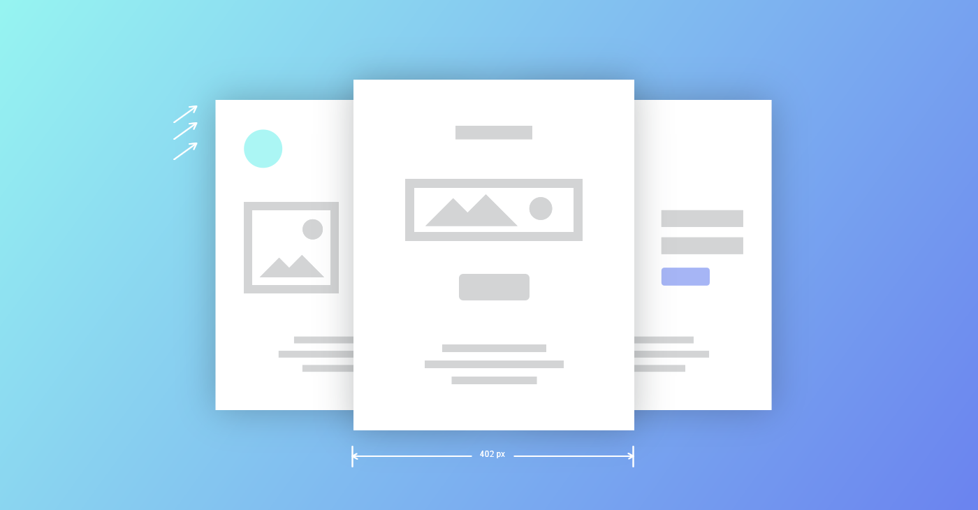
So the next question is how should you design your landing page. Your landing page can be visibly linked within your site or hidden, accessible only through link click so you can track which method of leads and clickbait is working best. Either way, it should be designed with consistency in mind with your larger brand. It should have the same style, colors, image quality, etc. However – and this is big, however, – don’t design your page to look like you’re asking for something. Landing pages sometimes look like calls to subscriptions or donation. They look sad and desperate. This is not what you want. You do not want to make people think they need to give you anything, time, money, consideration, whatever it is, you don’t want people thinking of you as a charity case.
Instead, design it to look like a magazine and create some major FOMO (Fear of Missing Out). This creates an attitude shift that says, “I NEED to be a part of this.”
Next up is the content. You want to cover the who, what’s and where’s but you want to keep the text light and simple, with a heavier focus on images. If there’s too much for people to read, you’ve lost them. You want the images being the real voice of the page and tweet-length text (140 characters roughly) guide people to the subscription point. You want a clear subscribe or “JOIN” button that draws attention.
Contrary to what a lot of people think, you want a higher emphasis on visuals than content, even though your campaigns might be more content driven. Think of your landing page as the person trying to get people through the door to an event or party. If they’re attracting attention, they’ve going to get people interested. If they’re giving lectures or requiring more focus than the five seconds it takes someone to pass by, then you’ve lost them. Digital media really isn’t that much different than the real life example.

Benchmark Recommends
See all articles
Sync 2,000 Contacts with your Benchmark Account for Free