Email marketing is amazing. In 2017, 54% of the entire planet had an email address. That means there are more people with an email address than there are people who have a Facebook account.
And while Facebook is a good way of reaching your audience and increasing your sales, savvy digital marketers use it as a means of capturing people’s email addresses. They know that email marketing is more effective than social media, with 44% of users checking their email for a deal from a company they know, whereas only 4% will go to Facebook.
If someone is on your email list, it’s because they chose to be there. This means all you have to do is keep them there, and to sell them your stuff.
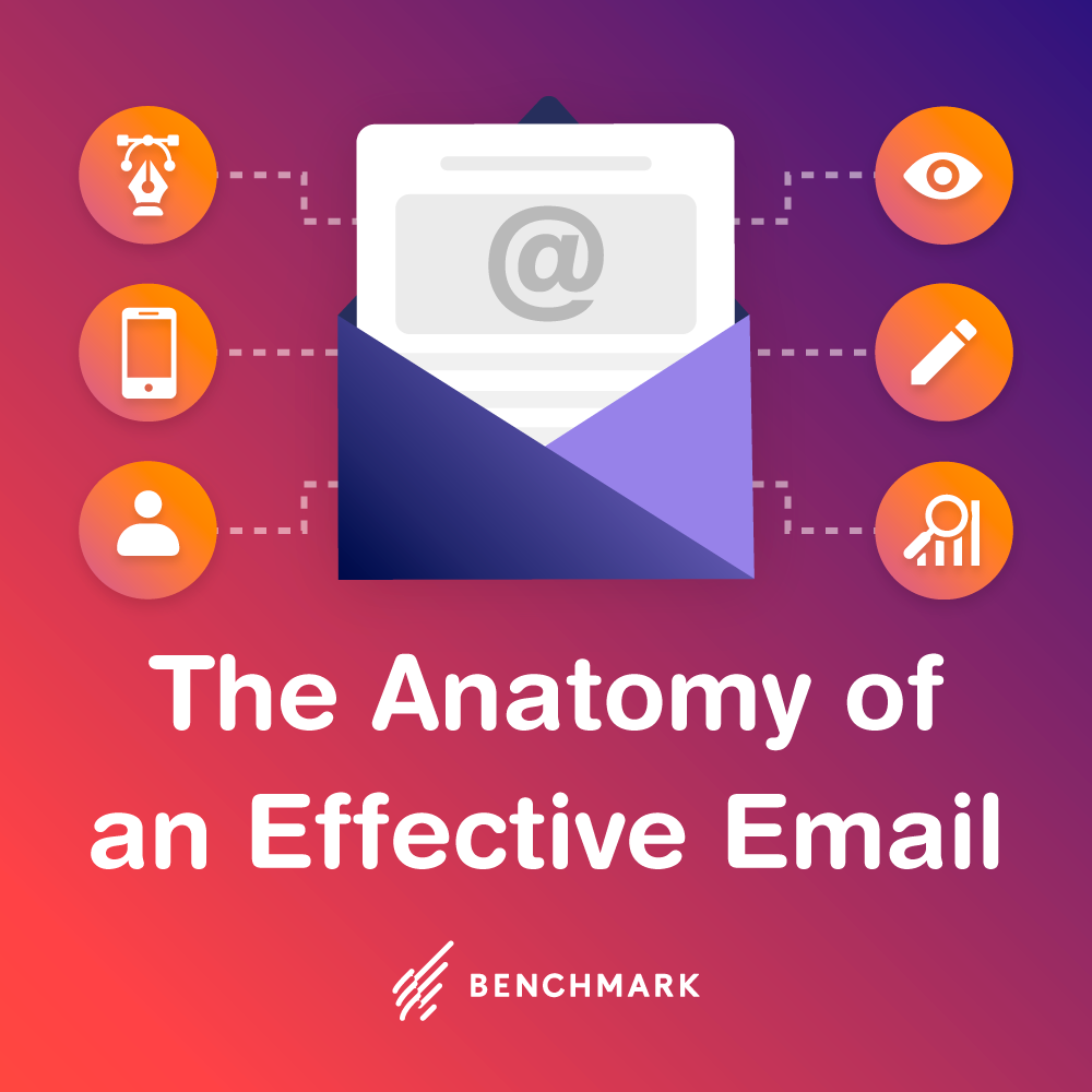
How are you going to do that? With a perfectly designed email marketing campaign that contains all the right components, from top-notch copy to engaging visuals.
First, you need to…
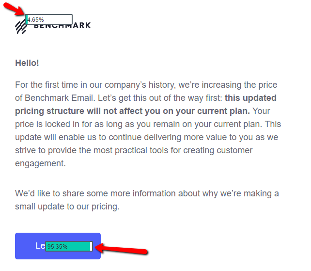
Nail The Subject Line
Almost 50% of your subscribers will open an email because the subject line appealed to them.
Buzzfeed knows how important the subject line is when it comes to making an email marketing campaign. Their subject lines are always brilliant, and their former newsletter editor, Dan Oshinksy gives great advice when he says that you need to “Make your subject line clear. Nobody should open an email and not know what they’re about to read.”
Email marketers struggle with the subject line because they get around 40-50 characters to make an impression on the reader. That isn’t much, and it means you need to do a few things in a limited space:
- Tell people what they’re going to get
- Be personal – include their name
- Tease – arouse curiosity
- Outline a benefit they’ll receive if they open this email
- Avoid spam words, such as “free” or “cash”
- Create a sense of urgency
Do you need to be a magician to make this work? Not at all. Here is an example of expertly crafted subject lines:
Send Out Awesome Copy
No one wants to read boring emails. They want to be informed or at least entertained.
Don’t focus on selling something in every email you send during your campaign. In fact, it’s hard to sell to strangers on the Internet unless you’ve first built a strong rapport with them so that they now trust you.
Build rapport by sending out emails that are rich in value and tips and tricks. Make a human connection with your readers by relating a personal story of yours. Get to know them with questions.
Segment Your Email List
Segmentation works. Segmented email lists return almost 60% more clicks and boost open rates by 14.64%. If you don’t segment your email list, you’re essentially sending out the same email to all your customers, who have different tastes, interests and priorities. Over time, some subscribers will feel as though they’re getting no value from your emails and will either stop opening them or unsubscribe.
Perhaps the easiest way to segment your list is with a survey or quiz. Keep in mind that your list will need incentivizing – after all, not all of your subscribers will take the time to fill out a survey or list out of the goodness of their own heart.
A survey gives you a massive insight into what your customers want, but it also lets you segment your list according to different wants and needs. Then, you can design your email marketing campaign so that you’re sending better-targeted emails out to the right cluster of customers.
WordPress has a Quiz and Survey Master plugin that you may find useful.
Another way to segment your list is according to past purchases. If a customer bought X product, make sure you retarget them with a similar product – as opposed to a random one that has zero interest to them. This tailors the shopping experience to each and makes it more personal – which is exactly what customers want.
Use Color
This is one trick that some email marketers miss, but it’s also not important that all marketers use color in their email. It all depends on what your niche is.
For example, an organic food newsletter would benefit from some green text that gives the email a vibrancy and freshness. This makes a better connection with the target audience.
Color can be a hugely important aspect of your email newsletter, and it can help you to stand out and make an emotional connection with your subscribers.
Think about Christmas for a moment. What colors would a festive email need to contain to make it stand out and catch your eye? Red and green would work.
Then there is, of course, the psychology behind color and most consumers have said that color influences their decision-making more than anything else.
What colors you use depends what your intentions are:
Red:
- Attracts attention
- Creates a sense of urgency (danger) that they might miss out
Yellow:
- Makes us feel good (sunshine, warmth, happiness)
- Use it to promote vacations and deals
Orange:
- Energetic (sun-kissed, oranges)
- Promote food produce
Green:
- Fruit and veg campaigns
Blue:
- Promotes a feeling of trust
- Water products and cleanliness
Black:
- Professional
- Slick
- Elegant
Create A Killer CTA
Emails with a single call-to-action increases clicks 371% and sales 1617%. They are an essential part of your email.
The CTA is the part where you tell your subscribers exactly what it is you want them to do. Want them to buy your product? Tell them with your CTA. Want them to take your quiz? Ask them with your CTA.
Make it a button so that it looks clickable, too. In text-heavy emails, visual elements stand out. Rather than placing a hyperlink in the body of text and hoping you receive clicks, create a CTA that is clickable and easy to find. You can use sites like Design Wizard to create a button without the need of a graphic designer.
Keep the CTA visually simple but also keep the text simple. Don’t give people too much to do. Give them just one choice:
Use a Premade Template
Visuals are well worth using. We’re living in an increasingly visual world and if you haven’t yet started to focus on the visual content of your emails, now might be the time to start.
In 2017, over 35% of visual marketers said visual marketing is now more important than any other content. A year earlier in 2016, over half of all B2B marketers were prioritizing visual content assets.
When you use a pre-made template, it’s a lot easier to implement visuals in your email marketing campaigns. Pre-made templates are especially popular with beginners who have never used visuals in their emails before. They provide a pretty good foundation, though I’d suggest that you tweak any template you use so that your voice comes through clearly.
There are tools available which provide you with ready-made email marketing templates that cost you no time at all. For you, there’s no designing involved. All you need to do is pick a template and tweak it so that – as mentioned – your voice and a brand image comes through.
Templates are made up of content blocks which you can easily delete or replicate or shift around.
Use Images
There’s no need to go overboard with images. Just one picture can tell a thousand words.
The great thing about images in emails is that you don’t need to waste time and money taking photos yourself. Instead, you can download a stock photograph from an online site. Pik Wizard, for example, offers lots of free images. In fact, there are a handful of sites that offer free stock photos.
It depends what your message and brand are, but you don’t always have to aim for high-quality images. A lot of email marketers use memes that are not top-notch photos, but which are humorous and engaging. And sometimes that’s all that matters.
Conclusion
These are some tips on how to design your email marketing campaign in 2018. Don’t expect instant results, of course. Fine tune your design efforts, be prepared to make changes until the conversions and sales start rolling in.
Let us know what you think in the comments below.

Claire O'Brien is the Marketing Manager at Design Wizard. Claire has more than 10 years experience in content creation including visual content, digital marketing, email marketing, social media and advertising. She has an avid interest in all things digital and software related.
Benchmark Recommends
See all articles

Sync 2,000 Contacts with your Benchmark Account for Free