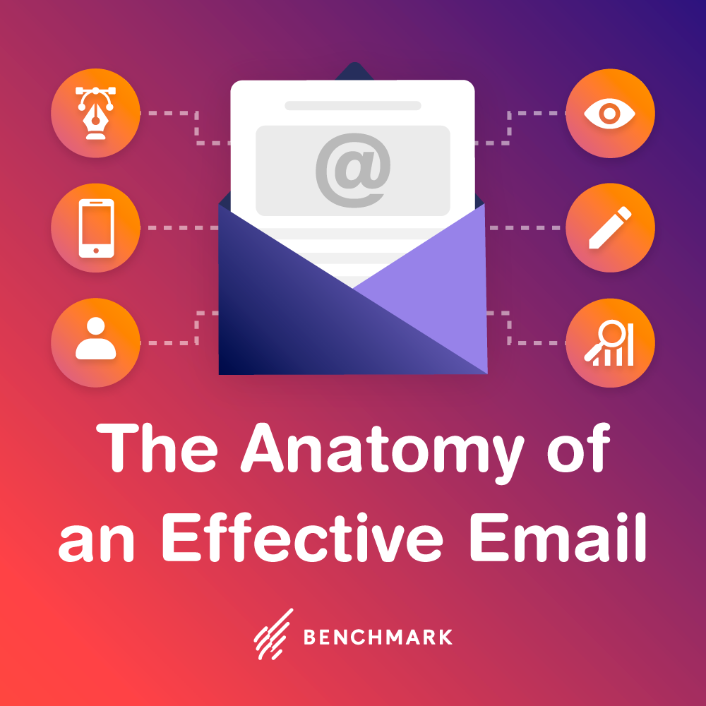
Your email or newsletter must be the perfect balance of text, white space, images and links. However, you might be surprised how many email marketers get this delicate equation all wrong.
Emails with too many images. We’ve seen it all at Benchmark.
However, this article is meant to help you get it right. What we’ve done in this space is list out the most common HTML formatting errors and mistakes – and how to correct them. So keep reading if you still have questions on whether or not you’re doing things right. Most likely, you probably do.
Mistake #1: Using too many images/graphics and not enough text
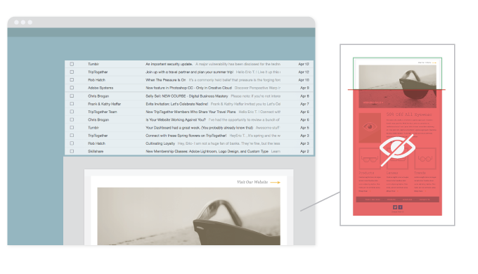
You’ve probably gotten plenty of emails – mainly from spammers – full of images (or even just one big image) but slim on the text side. While these emails may be pretty to look at, remember that just as email clients weed out spammy text emails, they also block image-heavy / light on text ones. 
So, what can you do about this? Keep reading:
- Shrink, shrink, shrink those images down so they don’t overwhelm the text. You need balance in your email or newsletters. Smaller images can help you achieve this.
- Use thumbnail images if you need to. When someone clicks on these thumbnails, link them back to the Web version of your html email or newsletter. This will help you tremendously as the people sent to the Web version of your email or newsletter will see your email in its entirety, images included.
- Use restraint. If you only have a paragraph of text and need to use one or two images, force yourself to pick the best one and stick with it. Remember: you can probably use the other images in a later campaign.
- Don’t send an email that is one big graphic or image file. You need text. Email clients look for text keywords in emails and newsletters to decide whether or not to let these campaigns through to the inbox. A 100% graphics file won’t make it through.
Mistake #2: Forgetting the preview pane
 In the old days of email, it wasn’t a big deal to send out a long-ish newsletter because chances were, the recipient could see the whole version of it in their inbox. Not anymore. With preview panes dominating so many email clients (Outlook and Windows Mail being just two), it’s entirely likely that most of your customers will see a small sliver of just a few inches.
Thanks to this, you only have a few inches to woo your recipient into opening up your email campaign and viewing it in its entirety. Here are some tips on using the preview pane to your advantage:
- Put your most important stuff on top. If you put your call to action or your most important sales pitch on top of your email, that’s what your preview pane-using clients will see. Intrigue them.
- Place your logo accordingly. If you put it on the left side, for instance, not only will it be seen, it won’t interfere with your sales pitch / message.
- Thinking of going wide? Don’t. Most preview panes have restrictions on how much of your email will be shown, width-wise. Keep it simple by going no wider than 575 or 600 pixels.
- Consider a text link above all else. Use a text link at the very top of your email – even above your graphics. If the text of this link is compelling enough, your customers will click on it and visit the Web-based version of your email.
Mistake #3: Using dead links, images that don’t work and more
The old saying about the word “assume” is entirely appropriate here, as legions of email marketers assume that their images and links work before they send out emails. It’s not enough to send a test email to check your layout. You have to make absolutely certain each link works and each image shows up correctly.
Here are some tips:
- Don’t use text URLs in your email campaigns A text URL is one that shows an entire Web address. For instance: benchmarkemail.com . To cut back on your chances of getting blocked by email clients, use a hyperlink and regular text rather than a full text URL.Here’s the right way: Visit Benchmark Email
Here’s the wrong way: Visit https://www.benchmarkemail.com/ - Use text that stands on its own If you’ve done all you can to make certain your images work, you should still create text that stands on its own without those images. Servers, PDAs, cell phones and email clients sometimes have technical problems and fail to show images. Thanks to this, your email copy should stand on its own if no images are shown.
Mistake #4: Using elaborate code and/or attachments
Thanks to so many emails competing for attention, many email marketers – maybe yourself included – have used types of code outside the norm to make emails more dazzling. Although we applaud that enthusiasm, we know those emails will probably not make it to the inbox:
- Ditch the outside-the-norm coding. Even we can admit that you can do a heck of a lot more with an email by using Active X than you can with basic, boring HTML. The same goes for Javascript. However, there are a few huge drawbacks to using these sexier types of code: viruses. Spammers are notorious for sending all sorts of nasty things (viruses, trojans) via Active X. Thanks to this, the vast majority of email clients block Active X out of the gate. If you use this code, your email will never even make it to the inbox, or even the trash. So stick to HTML as design code.
- Don’t send attachments. Attachments are like a red flag for spam filters. Send a commercial email with an attachment and you’re just begging for your email campaigns to get blocked. For this reason, we recommend ditching any and all attachments. If you need to expand on your topic and are desperate for more space, just link back to a landing page on your site where you feature more info.
Mistake #5: Not testing your email out with a variety of popular email services
It’s easy to forget that email clients use different coding to display your emails. This means that an email in AOL may look differently than an email in yahoo or Gmail. Here are a few ways to tackle this issue:
- Be obsessive about sending test emails. We can’t express enough how important it is to send test emails before your campaign goes out. Send out five or six test emails to the top free email services (yahoo, Gmail, AOL, Hotmail, etc.) and click on every link and image in those emails when they arrive. Since most services will disable images, send a test email and turn on images with each client and see how many show up correctly.
- Tackle the big problems. Let’s face it – you’ll never get your email to display perfectly across all email clients. Thanks to coding issues, your email or newsletter will probably look slightly different in AOL than it will in yahoo or Gmail. However, while certain things can be overlooked, you must concentrate on the things that cannot. These may include images that show up in some email clients but not others, whether or not your email gets dumped in the spam bin by some clients but not others, and other big issues. Tackle the big things before your email comes out. Testing will help you flush these big issues out into the open.
Sidestepping the HTML formatting issues listed above is one the most important things you can do, as an email marketer, to improve deliverability. While some of these tips might seem foreign – especially if you’re a beginner – check this list often and before you know it, these tips will be like second nature.

Benchmark Recommends
See all articles


Sync 2,000 Contacts with your Benchmark Account for Free