
Our company has found itself in a new season of change, and our different product teams have been growing and finding their strides. We’ve made mistakes and have faced a bunch of challenges, but we’re learning to make continuous steps of improvement. So, thanks for joining our team’s journey. Here’s a little peek into what went into our release of the restyle and organizational update to the Drag & Drop Editor.
Why did we take this on?
Our Editor Product Team is comprised of two designers, a front-end developer, a back-end developer and our key stakeholder CEO. We focus on the three email editors: Drag & Drop, Plain Text and Code Editor. When we were in talks of what to take on next, we identified a reoccurring problematic issue that needed solving: inconsistent UI across our newest tools.
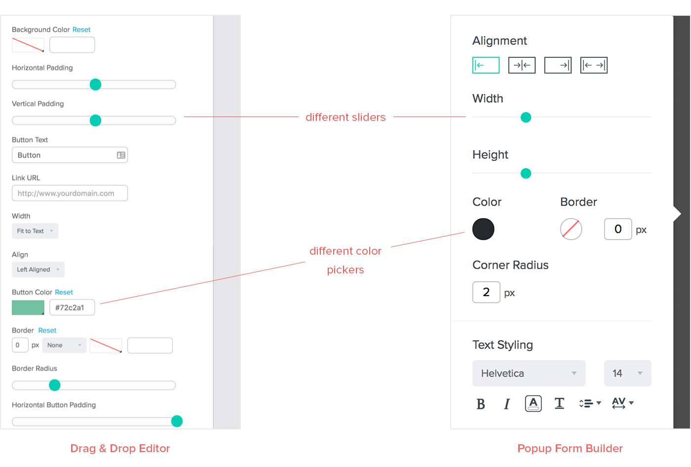
Over the past few years, Benchmark has released some new builder tools: three email editors, two signup form builders, email engagement automation and most recently Automation Pro (Beta). One weakness was that each tool had different style variations that resulted from a number of possibilities such as multiple designers, multiple developers, lack of style guide, poor handoffs, problematic legacy code and so on. Some variations were visually obvious and some were code specific.
With so many inconsistencies, it was creating a nightmare for our product teams to do any feature updates. Not to mention, it hurts our users’ experience and creates confusion as to what are expected behaviors and visual cues. How does a user learn to trust your app if the action outcome is a guessing game? We needed to organize ourselves and move toward product consistency so that our users could spend less time thinking about how to use our tool and more time focusing on their task at hand. Because of this, our team identified two goals:
- Clean up our design styles and code
- Create a more seamless user experience across our updated tools
There were multiple opportunity areas, but for this release, we decided to limit it to style and organizational UI updates in the top navigation, active block panels and text editing toolbar. Each area presented its own challenges, so here are some of those thoughts.
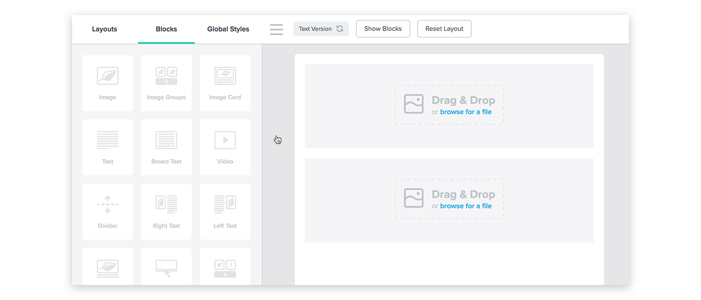
Simplify navigation within the editor
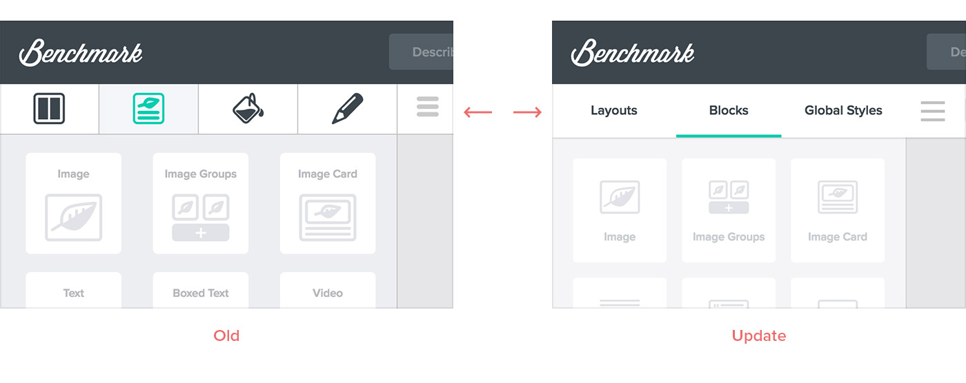
The first opportunity sat with the main navigation in our editor. This was represented by four icons that divided each edit area. The fourth icon (a pencil) indicated when a block was selected but didn’t actually contain options in its panel when a block was not being edited. It ate up valuable space and was more confusing than helpful to our users, so we removed it. We also replaced the icons with text to improve clarity across all languages. Icons took less room, but we thought it important to use clear labeling here.
Dedicating ourselves to nine languages isn’t easy. It means that all our decisions come with additional challenges and we design with worst case scenarios in mind. One challenge is character count. Most of the time our English text uses fewer characters than some languages such as German and Portuguese. In such a limited area, what happens when it gets too long? Does it push to two lines? Truncate? Expand the area?
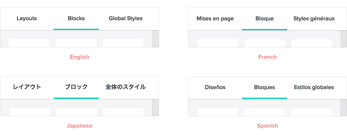
In this case, we chose to solve the issue through text size and insert fallback behaviors. This is a smaller scenario, but at other times it becomes a larger challenge when there are more factors at play.
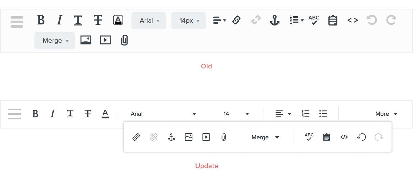
Text editing toolbar
Since this is one of the components that people use the most, we realized that updating and sectioning our icons could go a long way to enhance the user experience.
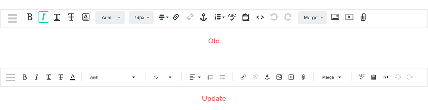
We also changed the behavior of the bar to be more adaptable on multiple screen sizes and devices. The full bar is shown until a user changes their browser size. At this time, each option collapses into a menu that can be accessed by clicking “More.” The old design invaded our user’s workspace by pushing their work down, whereas the updated design didn’t.
Active block panels
This is the area we focused our efforts on. When we applied UI elements from our newest signup form builders and created any missing ones, it helped with style consistency and gave the panels more breathing room. Beneath the surface, the code was combed through, cleaned up and structured to be more modular and run faster (thanks to our front-end developer!).
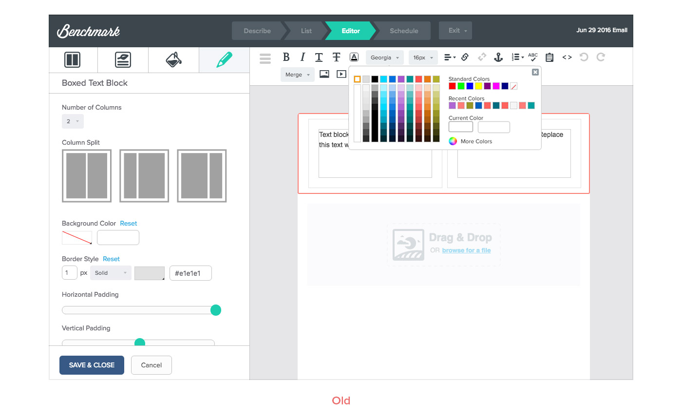
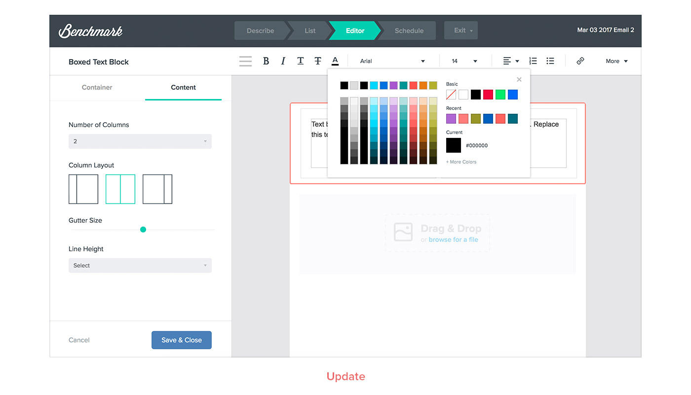
The second problem was organization and consistency amongst the blocks themselves. If you placed all the block options side by side, the organization was different. Our users were readjusting to each individual block, so we standardized organization across all of them.
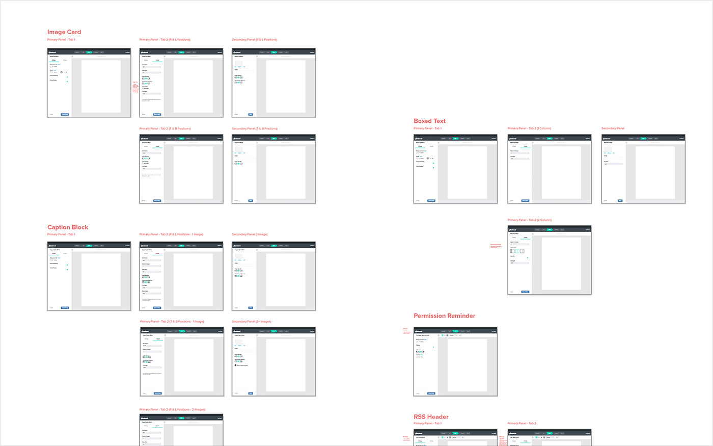
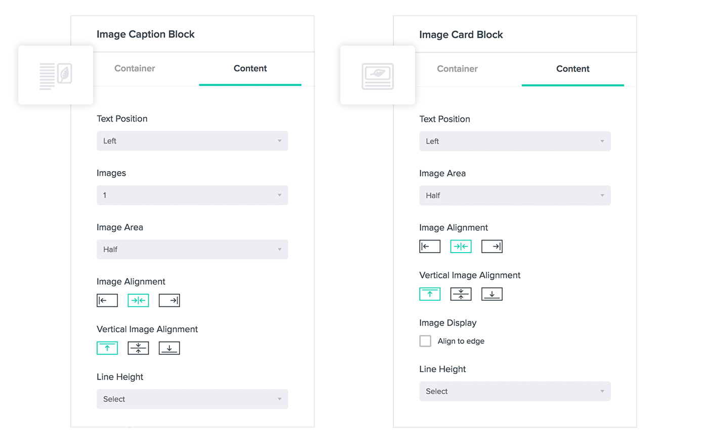
Our biggest change addressed issues with the amount of options shown at a given time and had impacts on user workflow. Some blocks were getting really bloated and weren’t scalable for the future. So for those blocks, we separated their options into two tabs based on function and then usage level within the tab. The first tab contained options relating to the overall block and the second tab dealt with options relating to the elements within that block.
So, what’s next?
A lot actually! Our team has been taking baby steps to gain deeper user insights by moving toward the “Jobs-to-be-done” methodology. If you haven’t yet, I highly recommend checking out Intercom’s ebook ? They nicely describe it like this:
People buy products and services to get a ‘job’ done. The key to success is understanding the real job customers are using your product for.
This year is shaping up to be full of new and exciting releases. Hopefully, we’ll be chatting about them along the way! Until we meet again …

Kristen Pon is a Senior Product Designer at Benchmark. She started with a background in traditional graphic design, but transitioned into product design after a few years on Benchmark’s first in-house design team. She values positive work environments and you can probably hear her laughing down the hall. She’s told quite often that she has a loud laugh. Small things like coffee, sunflowers and WERQ© class can make her day.
Benchmark Recommends
See all articles

Sync 2,000 Contacts with your Benchmark Account for Free

