Behind the Scenes: An Insider Look at The Challenge of a Rebrand
May 12, 2017 9 min read
Let’s rewind a bit:
Benchmark started back in 2004 as an email marketing service that was easy to use and accessible to anyone hoping to grow their business.
Since then, the company has experienced significant changes resulting in the need to reidentify who we are over the years. This has been reflected in cycling through a few different logos and rebrands in an effort to match our shifting identity.
Our Challenge
The product and design growth that we have experienced often happened out of necessity and somewhat unexpectedly. As a small company, time and resources are minimal and we have had to do our best within the reality of those limitations. We were able to maintain a fairly consistent identity. However, we lacked the opportunity to create a brand that fully embodied who Benchmark is and the direction that we are going. As the design team, this often left us in an awkward and unclear space, making it difficult to have excitement and ownership of our identity as the company continued.
It was time for a change. It was the time that as a company we had something that could scale and something that could perform.
One of the most fundamental parts of a brand identity has to do with the logo. This presented the first, and greatest, challenge. Our old logo had some major weaknesses. It consisted simply of our name written in a script typeface without a correlating mark. When using our logo in small spaces, we did not have a mark or small version of the logo that functioned well. We often ended up using the ‘B’ of ‘Benchmark’ for those situations, which was less than ideal.
Another challenge was our primary brand color. As a dark navy blue, our brand looked far too similar to numerous other corporate enterprise software companies. Along with a generalized name like Benchmark, correlating to the mainstream tech market, there was a need to create a new brand identity that would stand out and demand attention.
How Do You Rebrand a Company Anyway?
When we began the process of creating a brand identity, we had no idea what we were doing. Identifying the challenges above was only one small step in the task before us, and we realized we had more questions than answers.
How do you rebrand a company with offices in nine different countries and nine different languages? Where do you even start? Our small in-house design team sure as hell didn’t know. We searched for every rebrand we could find on the internet, trying to dissect blog posts looking for any hints of how the process could work. Many companies that shared about their rebrands often mentioned only bits and pieces of the process. It was rare to find anyone that detailed each of the steps, but for those that did, we were extremely grateful. We also found a couple of books including Designing Brand Identity and Design Matters that guided our journey.
For companies that willingly shared about their rebrand, it seemed that each one we found had a very different process. Some of the companies with greater resources utilized outside agencies to take on the rebranding task, not surprisingly creating stellar results. It became evident that there are many ways to rebrand, and we had to choose a way that was best for our company. Since our design team knew the uniqueness of Benchmark, understanding its quirks and functions, we felt the creative freedom to choose a path for rebranding that reflected our individualism.
Finding Our Company Identity
The initial Benchmark identity was conceptualized organically, without much thought or intentionality behind it. As the company shifted and grew, it became clear that having an identity with a purpose was a necessity in order to continue succeeding in a competitive and quickly changing market.
2016 was the year that marked large scale changes for our company and its identity development. As a whole, Benchmark dug deep to figure out exactly who we are, who we want to be and where we fit with the rest of the enterprise software world. This could not have been better timing for our design team as we began to take on the rebrand.
Determining how to encompass the complexity of holding to our roots, while also having a better definition, required an assessment of the Benchmark of old and the Benchmark that was to be. This happened in a few different ways and contributed to the creation of our brand brief that we worked on with Curt and Denise Keller, the owners of Benchmark.
Our CEO, Curt, chose the word ‘Benchmark’ and a navy blue back in 2004, from a desire to be a company that appeared corporate and professional. Curt has always had big dreams for Benchmark and envisioned it being a standard in the industry. The hope was that the company would be the rock, or benchmark, by which our clients would evaluate email marketing. The dream of Benchmark was still foundational, whereas the colors could use adjustment.
Curt and Denise are very down to earth and practical. They have created an incredible company culture that is comfortable, casual and feels like a family. We love extending those same feelings and values to our customers through our products, and knew that this was vital to include in the rebrand.
To evaluate our trajectory, including customer base and products, diverse teams were formed within the company. Using books like Traction, Scaling Up, Inside Advantage and 2-Second Lean, people on the teams helped to give input and perspective in defining the new company identity, and guiding the rebranding process.
Step 1 – Define the Attributes
Based on our conversations with the owners and the strong themes that emerged, we set out to define our brand attributes. The most obvious themes were that Benchmark is powerful and professional while simultaneously being friendly, approachable, and practical. That balance is our sweet spot.
To coincide with these themes, we created a list of attributes, which would be a crucial part of the rebranding process. This list of attributes became the foundation for our visual ideas and was the system with which we ranked ideas and made decisions. No matter how great a concept was, if it failed to communicate the attributes of the company to our design team then inevitably it would fail to communicate our brand.
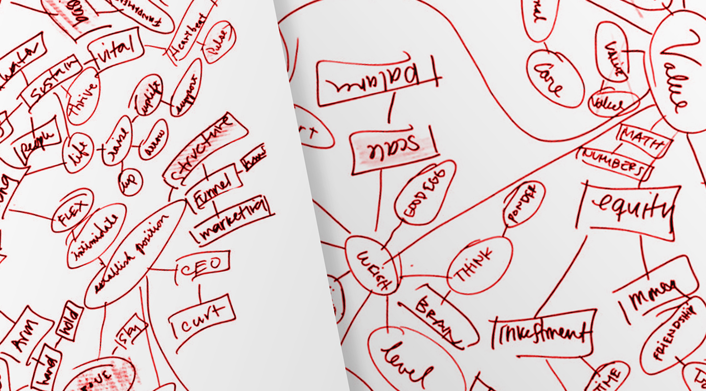
To formulate our list of attributes, our design team did a word association exercise. We placed words from the brand brief in the center of giant posters, filling each one with any words that correlated with the one in the middle. We ended up with hundreds of words. We then highlighted all of the words that stuck out as strong attributes and had potential to give us visual ideas for the brand. From all of the highlighted words, we were able to narrow down to a final short list of attributes.
Step 2 – Draft Out All Ideas
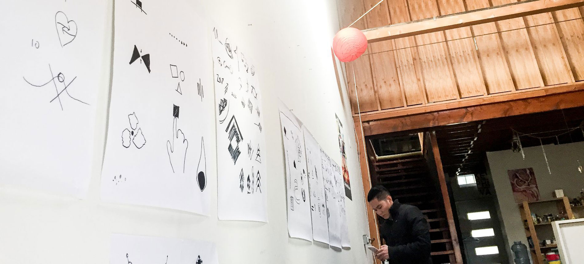
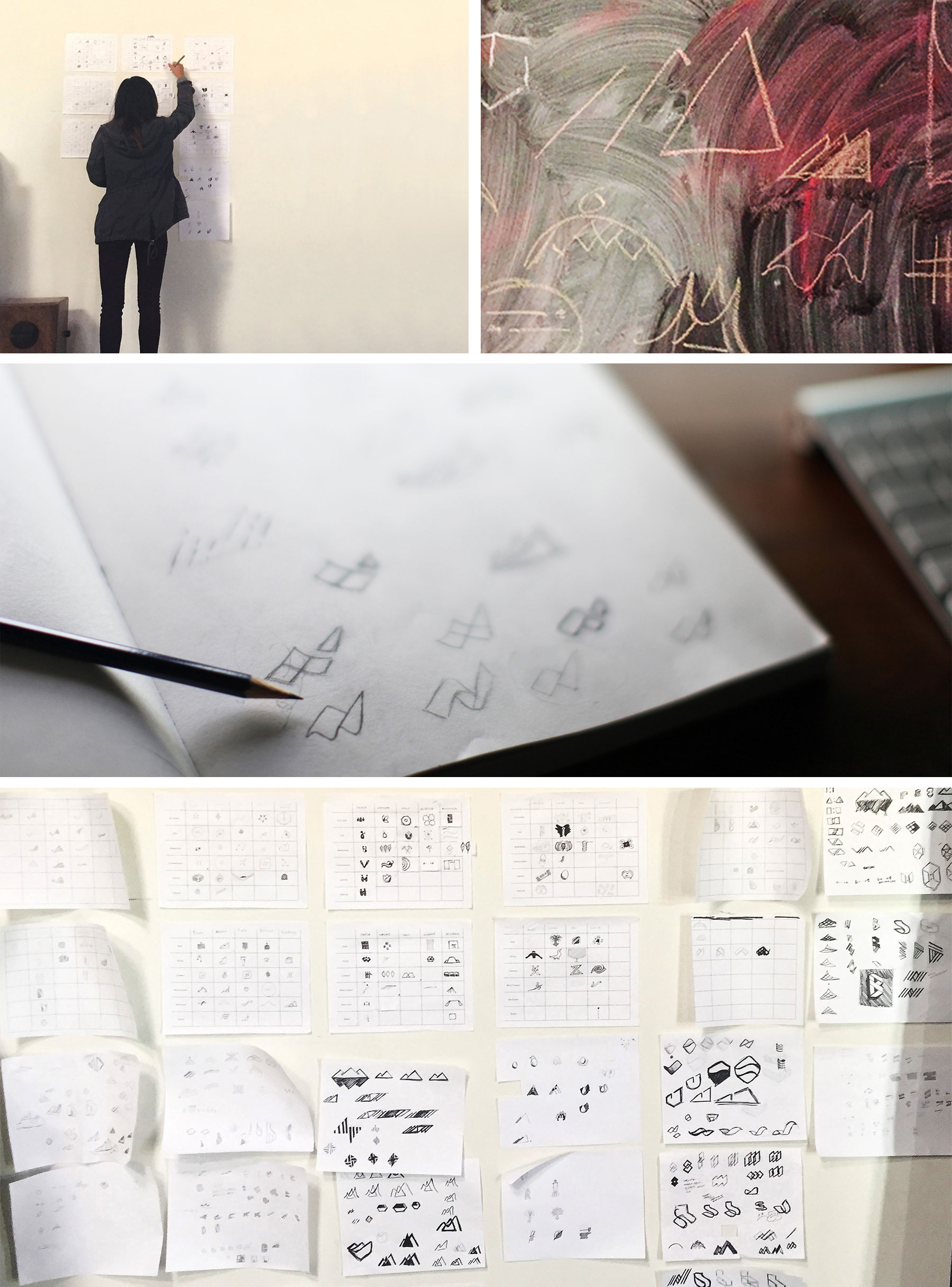
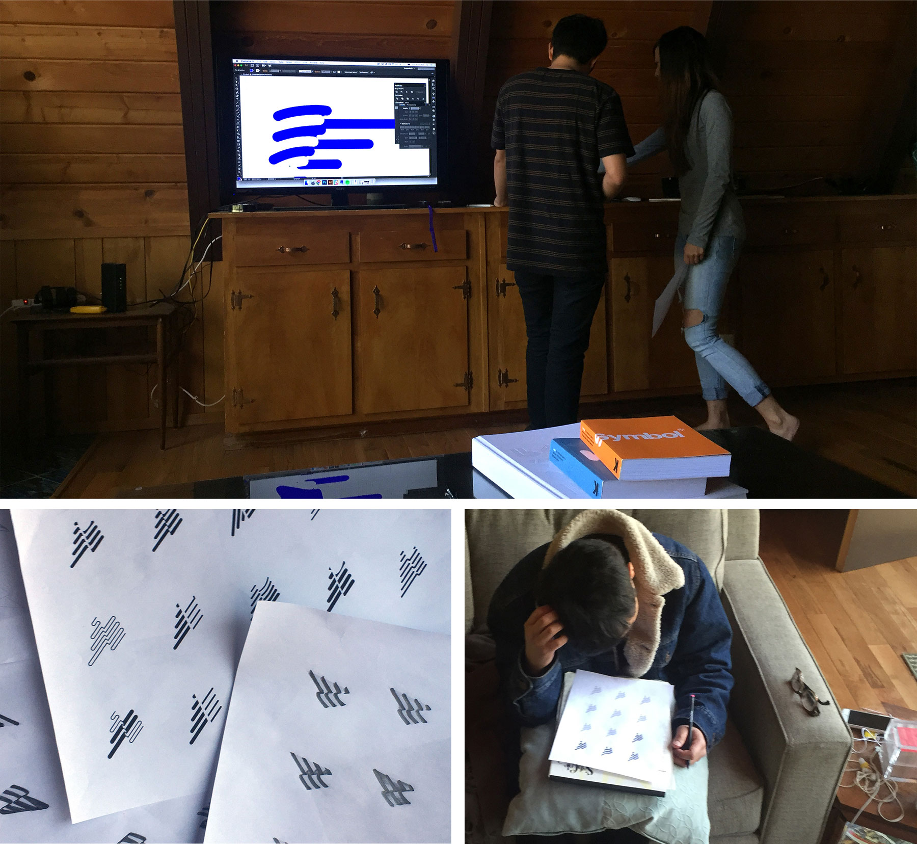
From the list of visual attributes, we did quick sketch sessions of our raw ideas. This was by no means a visually stunning exercise, but it was extremely helpful to start the development of the logo mark. As we did this, we started to see strong visual themes emerge, some of which would end up being in the mix until the very end of the process.
After flushing out some broad concepts, we honed in for some smaller sketches on the logo mark. To do this, we did an exercise where we created visual metaphor matrices, which helped us generate ideas by combing words on a matrix. We listed our attributes individually on one axis and then had simple words on the other axis. In trying to compare the combination of two of the words, it pushed us to come up with more ideas.
Step 3 – Exercise and Iterate
As the process continued, we went through hundreds of concepts. One thing we definitely learned is that we must iterate and be open to new exercises to keep moving and creating. Time after time, we found ourselves feeling as if we had no ideas left, but also recognizing that what we had generated so far was not yet right. Whenever we were stuck, we would try more exercises to keep pushing things further.
Step 4 – Deciding on a Direction
When we felt confident that all of the ideas had been explored, it was time to make the tough decision on the final direction of the logo mark. This was one of the most difficult moments in the process. We had a handful of logos that felt exciting to take to take to the next level. We also knew that we didn’t want to settle and desired to select something that would leave a lasting impression as a representation of the company.
Ultimately, it came down to which one encompassed the most attributes. As a team, we selected our top picks, then did a silent vote and discussed the results. It was a relief to get past that stage and onto the next.
Step 5 – Iterate Until It’s Right
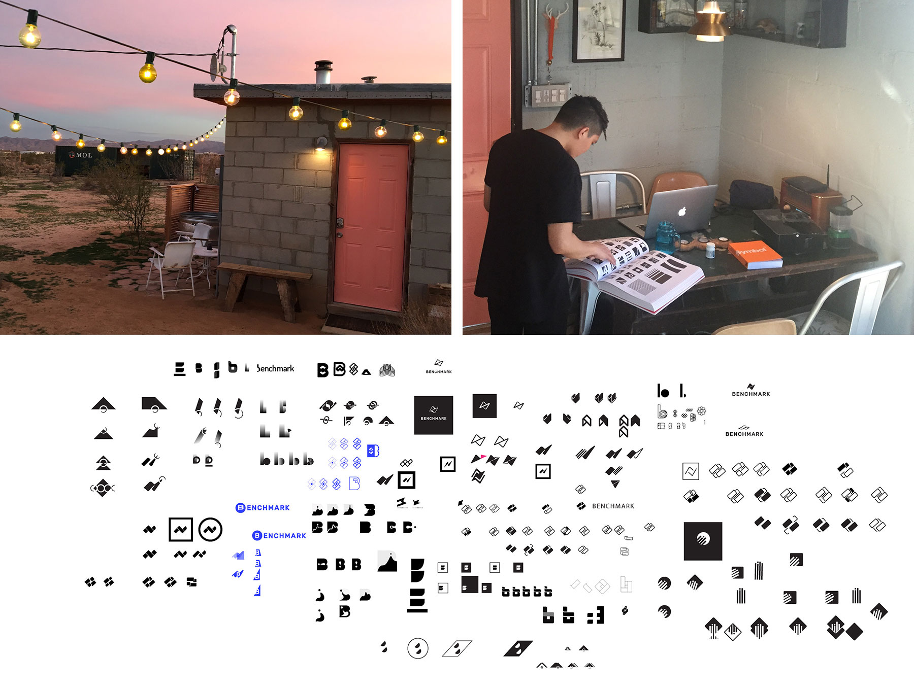
There was still much more work to do even after selecting the final direction. We continued to draft versions of the logo mark by doing exercises on both paper and in Adobe Illustrator.
There reached a point after numerous iterations where we knew that we were close, but for some reason were having trouble finalizing the concept. Our team kept making attempts, creating and doing exercises, but nothing felt quite right. Finally, Kristen, one of our designers, started to see something happening in an old treatment of the logo from a previous exercise. As she had us gather around the mark that we had been adjusting for awhile, she began to explain what she was seeing, and as we listened, everything clicked into place.
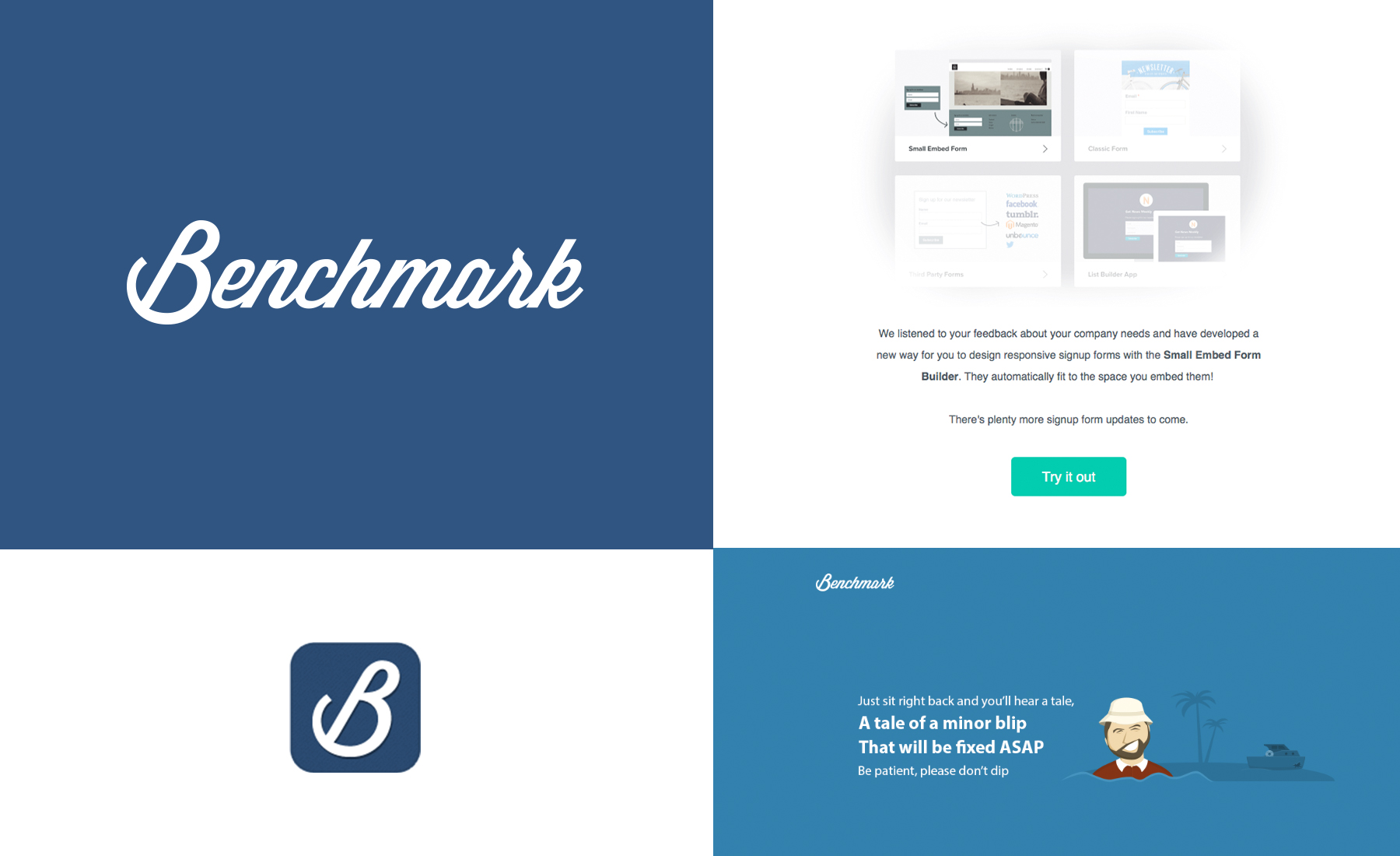
The center of the mark was where the magic was happening. It was about growth and transformation, about never being the same again and continuous improvement. Lines were moving forward from the left to the right, intersecting and communicating with the negative space. Once the lines pass through the center, they change position and continue to grow. This reflected not only our company story but the story we wished for our customers. Our new logo contained all of our attributes and then even a little bit more.
Step 6 – Logotype and Typography
For the logotype and typography, we decided to use a sans serif. Whenever we saw ‘Benchmark’ written in serif, it felt too serious and didn’t fit our attributes as well.
After trying hundreds of sans serifs, we landed on a beautiful typeface from Luzi Type called Buenos Aires that paired beautifully with our finalized mark. Thinner weight sans serifs felt too weak to hold our company name, and heavier weights were too overpowering. We also wanted a typeface that was solid but still felt approachable and friendly.
Interestingly enough, Luzi Type had another sans serif that we loved called Messina, which ended up being our main typeface apart from the logo.
![]()
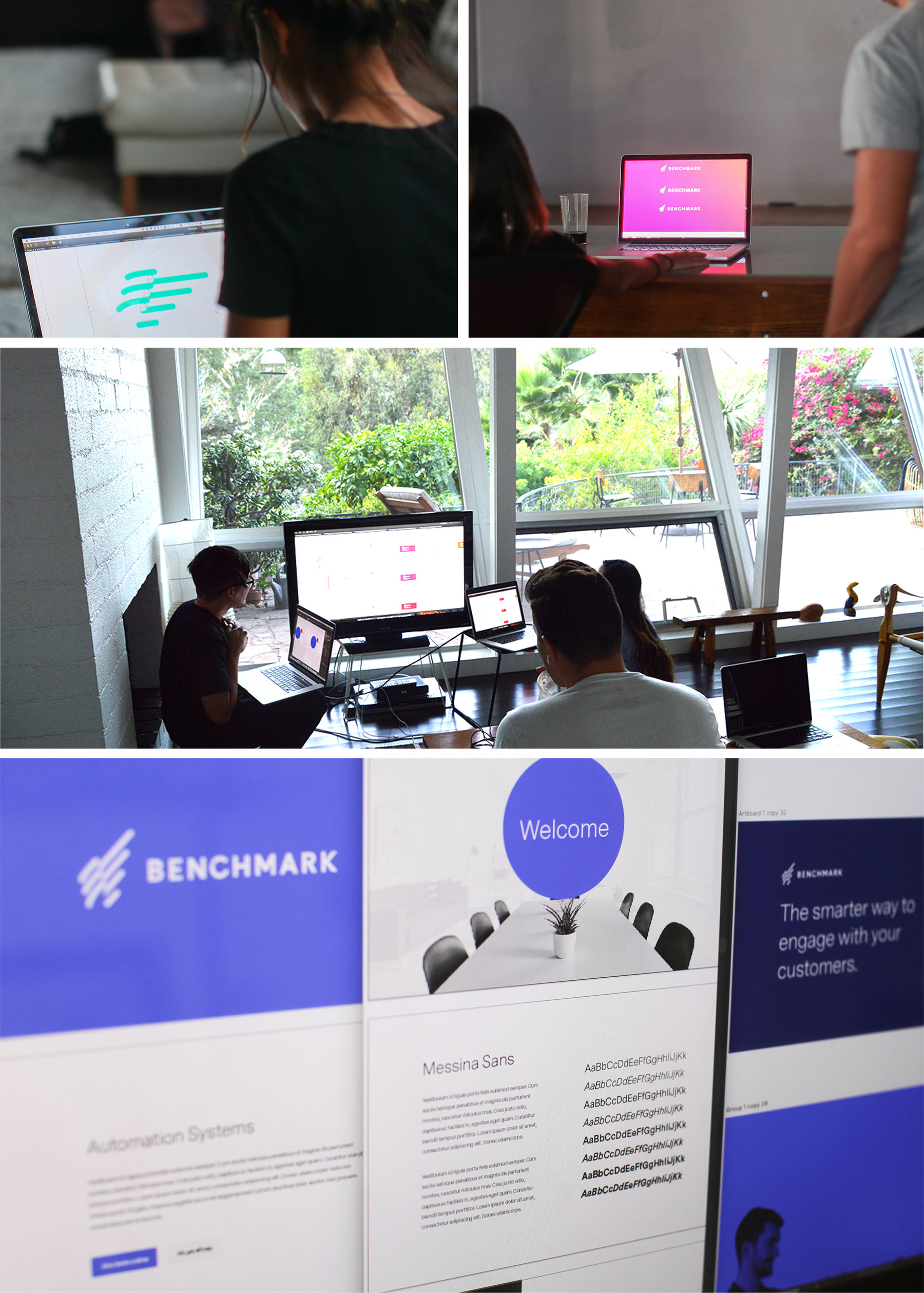
Step 7 – Identity System and Continuous Improvement
Our design team is still in the beginning stages of creating our identity system and has started exploring ways to incorporate this motif into developing products. The hope is that the new motif translates growth, transformation and communication as it is implemented into the redesign of our application and our new CRM product that Benchmark is currently pre-releasing to a select group of users.
You can continue to join us in our rebranding journey by subscribing to these posts and read stories on how we are learning to improve.
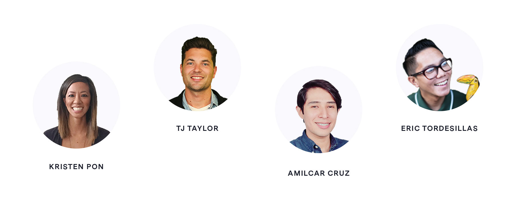
Our Team
A sincere thank you from all of us on the Benchmark brand team for taking the time to read about our labor of love.

How About You?
This was a really intense, but incredible process for our design team. There were many things that we learned from it, and looking back, we wish that we would have had more resources and guidance to help us not feel so alone on the journey. Our hope in sharing our process through this blog post is that it provides encouragement and offers direction to other designers embarking on a company rebrand.
If you have questions, would like more resources, or have stories of your own rebrand, we would love to hear from you in the comments below or on social media!
– Are you currently working on a brand or rebrand project? What is it?
– Share your process! However simple or complex, it really helps others.

As the Director of Design, I love the intersection of strategic and creative thinking that comes with my role. Being able to overcome challenges, learn new things and work with talented teams brings me great joy. It is incredibly motivating knowing that I get to work with people to accomplish goals which benefit others. When I'm not working, you can find me at the ocean with my partner, Lindsey, or making a tiki drink for friends.
Benchmark Recommends
See all articles

Sync 2,000 Contacts with your Benchmark Account for Free