 Scenario A: A political group was relaunching their website and one of their primary aims was to have that site help the group generate money. After months of back and forth discussion between group members, one ace politician known for generating money strongly recommended they optimize their landing page.
“What’s a landing page?” they asked.
Scenario B: A giant Los Angeles based PR company needed to increase their client’s mailing list. They kept scratching their heads about it, wondering what would work best. The fact remains that while their team was highly intelligent, neither they nor the client was web savvy. They also didn’t know what a landing page was, why it mattered or how it could transform their campaign.
For a political organization that survives on donations, it’s critical for them to use every tool possible to allow the widest monetary stream. A PR company needs to know marketing inside and out. The success of their client’s mailing list signup depends on how easy it is for site visitors to navigate to a signup form.
So What Exactly Is a “Landing Page”?
A landing page is essentially what page a person “docks” at when visiting your site. It’s the final page that requires a call to action. It’s often only associated with e-commerce sites, but every single company that has a web presence and hopes to attract customers needs to understand the blueprint of a landing page.
When you’re in a physical establishment, there are signs and guides everywhere to help direct you where you need to go. In a digital world, it’s a lot more confusing, and well-drafted landing pages used strategically through email marketing, social media or home pages act as “guides” to get your customers where YOU want them to go.
Once there, a landing page needs to be simple to understand with a clear call to action. It has to still “sell,” so you can’t get lazy when designing one. You have to utilize strategic marketing ideas, market research…in essence you have to understand your audience, what they want and what drives them, in order to get what you want from them.
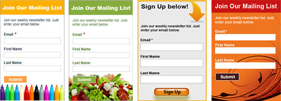
Whether it’s the sale or a mailing list sign up, you have to make it simple and worth their time to give you want you want.
How Should I Design My Landing Page?
Follow these tips to ensure you boost your landing page for maximum performance.
- Focus on one thing at a time – You may have a great product or service, but tooting all your offers at once only distracts and confuses your customers. The more time they have to weigh the options, the less likely they’ll pick one. Try focusing on just one thing at a time.
- Stay on point – Just like you shouldn’t be offering too many things at once, you also shouldn’t be filling your landing page visitor with too many details about you or your company. Again, be very specific.
- Don’t create a series of directions by linking them to other areas of interest. It’s a crumb trail they’re likely to follow, leaving the landing page offer completely forgotten about. Refer to point 1 here and focus on one campaign at a time.
- Remind them of the benefit – What is your customer going to get out of the transaction? What does signing up get them? Perhaps you can offer a free PDF, a discount or some other benefit or access that offers value in exchange for the sell or sign up.
- Make it easy for them to act – Respect that your end user is busy and doesn’t have time to sign up or hunt for the transaction point. Make it easy for them by being very clear where they have to sign up or how they can make a purchase. The more they have to look, the more steps they have to go through, the higher the chances that your campaign will suffer and likely fail.
- Keep graphics simple and in step with the tone of your site and service/product. Too many graphics are distracting. The wrong kinds of graphics or “boring” graphics don’t entice customers to bite, and too few graphics doesn’t inspire confidence or a sense of vision for where you’re going or what you want them to feel from the transaction.
