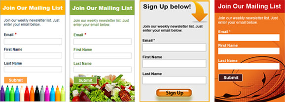
Some email marketers treat the color scheme of their email newsletter as an afterthought. If it works it works, who cares about the psychology behind it? Colors may not seem like a big deal, but they are actually a crucial element of your design and branding. Plain and simple – they elicit emotion and when used correctly can be instrumental in driving business.
The Attention Grabbers
You want to grab your subscriber’s attention. There are certain colors that are better at this than others, with red being at the top. Red demands attention and provokes a range of emotions. Just think of the sign and traffic light slot that has us trained to stop whenever we see it. Or the prestigious Hollywood carpet that reminds us of fame and power. When someone opens an email with a predominately red color scheme they are very likely to at least scan it on mere instinct. Red, orange and other attention grabbing colors can put more emphasis on navigational elements, company logos and calls to action.
Warm and Inviting
Some colors are good for getting people to take notice, others are good for getting them to feel a certain way. For example, blue is generally known as a color that exudes comfort and confidence, one that helps people feel at ease. Yellow, on the other hand, is often seen as a symbol of hope while green can be calming and also viewed as a reflection of success. These consumer-friendly colors could be useful in a welcome email that brings new subscribers onboard or any campaign where getting the reader to trust what you’re saying is essential.
Visual Engagement of the Sexes
When it comes to engaging a predominantly male or female audience, some colors may be more effective than others. We all know that pink is seen as the color of femininity, so it could compliment an offer on products for females or a message targeted at women readers specifically. Black is often associated with power, and could help persuade a segment of affluent male subscribers to click through and learn more about expensive products.
For the email marketer who has a targeting plan for both men and women, the color scheme can be the difference between success and failure. While the aforementioned colors have traditionally emphasized female or male, stereotypical presentations can rile your more individual recipients. Maintaining a healthy contact list and engaging your segments will benefit not only your open rates but also keep you in touch with your subscribers’ attitudes and preferences.
It’s All About Your Brand
Everything discussed here in this post is based on general guidelines. We can talk all day about what people generally respond to and how it makes them feel but in the end it’s all about what works best for your business. Whatever color schemes you use in your email campaigns should be consistent with your brand and appealing to your target audience. Bottom line: there is nothing wrong with switching things up from time to time, but if you want readers to notice you on first glance and recognize you when you return to their inbox, choose a color scheme that not only delights but intrigues.


