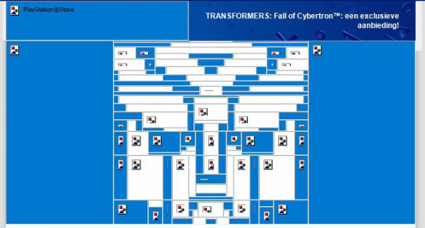
A friend of mine sent me an email earlier, saying that it was the best marketing email he had ever seen. That’s a pretty strong statement. I’ve seen some pretty great emails here at Benchmark. Some have made me laugh so hard it hurts, and others have opened my eyes to entire worlds that I never knew existed. It’s pretty rare that I see an email campaign that is so unbelievably clever that I have to share it with the world.
 |
At first glance, the email is pretty generic. That’s not to say it’s unattractive, but nothing really stands out … and then you see it with the images disabled.
 |
Do you see it? If not, take a few steps back or squint your eyes. Done right, you should be able to see the transformers logo built out of tables and background colors where images would normally be placed. I have some serious respect for those who created this little gem. Even if it did go unnoticed by some, there are some brilliantly clever minds in Sony’s Marketing Department. They sure made my day with this one. I call this a win.


