有效的電子報
Hi, and welcome to my first blog series! Today, and once a month, we are going to get together and take a look at some Emails That Do Work. That is, some of the best designed or attention-grabbing emails from the Benchmark Community. We’ll highlight aspects that contribute to their success, showcase our favorite user designs and talk tips on how to optimize your own emails. Let’s get started!
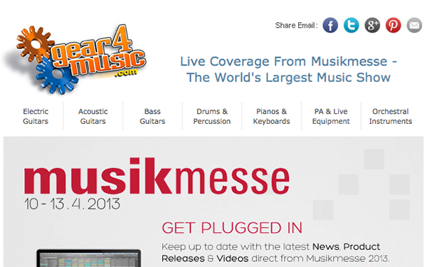 |
Our first email comes from Gear4Music.com, one of the largest retailers of musical instruments and equipment in the UK. Notice, the majority of the email consists of various pictures, but arranged to where you can’t help but want to read the entire page. The top portion includes not only their logo, but social media links and a navigation bar linking to different pages of their website. As your eyes continue to wander down the email, you come across pictures of products arranged like an e-commerce website. The page ends with links to their social media yet again and a footer including their contact details and a map. Gears4music.com does a great job using pictures and social media buttons to ensure that even if their customers don’t take the time to read their email in detail, they have a visual of the products and are aware the company is social. Impression made.
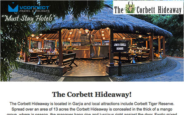 |
Our second in our series of Emails That Do Work comes from VConnect Travel and Holidays, a complete travel solution provider. At first glance, this email is very text heavy. The beautiful thing, though, is that the text is aligned in such a perfect, legible way. First, we are drawn into an email-wide picture of the luxurious hideaway, followed by an introductory paragraph constructed to make us want to jump on the first flight we can book. The email then breaks into three columns, glorifying the main attractions. While most hate to open a text heavy email, this layout deceives you into reading the entire page, as if the more you continue to read the better it gets. Ending with a map, directions to the hotel from multiple angles, their logo, contact info and social media buttons, VConnect proves that a lot of text can be a great asset to an email … if you do it correctly.
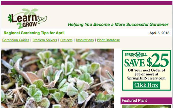 |
The third example is brought to us from Learn2Grow, an online guide to helping you become a more successful gardener. To start, this page has the ideal picture-to-text ratio. Whether it’s the standard product pictures or coupons that customers can click or print, this layout is definitely a winner. Notice the coupons are not actually for Learn2Grow, as they are solely an informative site, but for gardening related companies. Working with industry related companies is a great way to expand your customer base and spread your brand message. As for layout, they used two columns. The left as the main, to not only draw the readers into the email as a whole, but to keep the page short and sweet as well. No one really ever wants to read a super long email, regardless of the content. The most effective aspect of this email, is that it completely matches the website. Check out http://www.learn2grow.com/. Looks familiar, eh? Learn2Grow did a phenomenal job connecting the overall feel of their website to their customer emails. As a reader, there is a sense of trust when you receive an email branded to reflect the company. Always keep your branding in mind, it represents who you are to your consumers.
 |
Fourth is a great example of an e-commerce inspired email. Boss Safety Products distributes quality safety supplies and first aid products. Boss started with their headline banner and a title picture, which changes depending on the email topic. Though layout variety can keep a subscriber engaged to keep reading multiple emails, consistency is key. Try to mix up your layout design while keeping an asset consistent, like your logo placement. Again, trust is a huge factor to a reader when taking action on your email. The email then becomes an e-commerce email, displaying certain products they carry. The regular price, the sale price and what percentage you saved. The best part being when clicked, these products link you directly to the product page on their website. The flow of steps resulting in the call to action is very simple, as it should be. Enticing readers to open your email is one thing, but encouraging them to follow that email to your main website and take action is another.
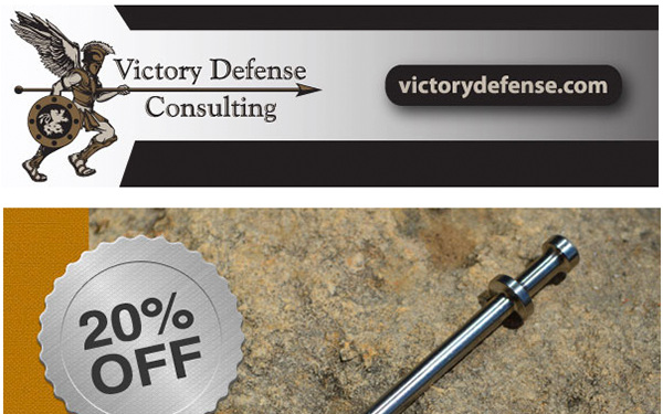 |
Last, but definitely not least, Victory Defense Consulting (VDC) is a Veteran Owned Small Business with an expertise in delivering high quality security & consulting services. Needless to say, this email is full of lines and lines of text but the “do work” aspect is made very clear. VDC does a great job of patterning their text with their imaging. As you scroll through the email, it seems that just as your ADHD kicks in and you want to move on to something else, there is an image. This continues throughout the entire email, like a game you never wanted to play but can’t stop looking at. Not only can this aspect be used to section off parts of an email, but to keep the reader engaged if it contains a lot of information. Don’t be afraid to include all of your content, but ensure it visually communicates to the reader.
我們的公司
比較
解決方案
比較
帳戶
© Polaris Software,LLC Benchmark Email® 為
Polaris Software, LLC 的註冊商標
© Polaris Software,有限責任公司
Benchmark Email® 為 Polaris Software, LLC 的註冊商標