How Do I Make Sure My Emails Are Mobile Friendly?

How many of you start the day by waking up and then instantly start reaching for your phone (by reaching I mean if it’s not already under your pillow)? I know I do. Certainly the fact that our smartphones are such a huge part of our lives explains the data that shows that 56% of the email opens come from mobile devices according to Litmus.
So yes, mobile opens are at an impressive 56% overall, with webmail taking 2nd place (22%) and desktop placing 3rd (17%). If you’re already thinking of ways to make your email be spotlight ready and most importantly results ready for mobile, here’s some advice you should follow.
Before we start, I’d like to add a note here, as with everything: Data should be your ultimate decision-making aid before you go all out with these awesome improvements. You should check your email reports to study your subscribers and learn which device they are using the most to open your emails.
Now let’s get started!
Look Great Everywhere, Always
Responsive design is such a trending topic and rightfully so. In short, what a responsive design does is display your content properly no matter how someone views it or the device that’s used to access it. Benchmark Email offers an Email Designer that automatically makes your emails responsive for you, so you don’t have to worry about more complex approaches like fluid or scalable design (apologies if that comes off as sales-y but I had to mention we’ve already done all the legwork for you).

An example of a single email design being displayed correctly on multiple devices.
Short Subject Lines
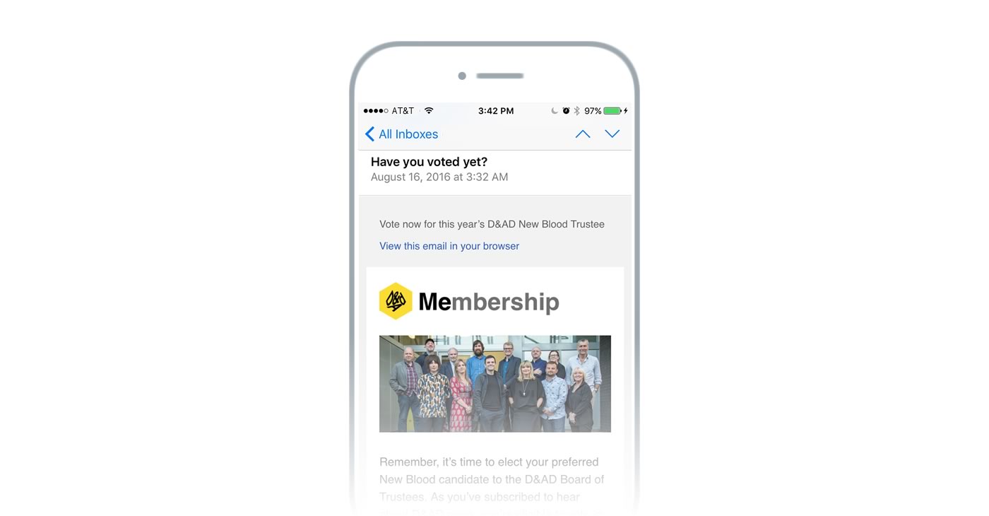
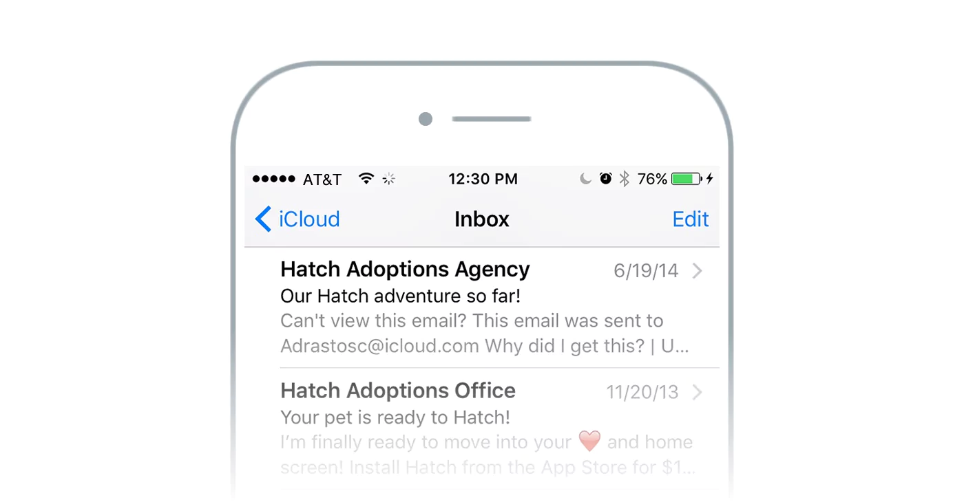
The length of your subject line should be optimized for mobile no doubt, however, you should know that there’s a slight variation between email clients (iOS mail, Gmail, Yahoo Mail, etc.) and how much of your subject line they display. A common desktop inbox displays about 60 characters of a subject line while mobile applications show around 25 to 30 characters, So 40 characters or less would be a good rule of thumb for your subject lines. Make sure that the most important sentence in your subject like is placed first.

Visible Call To Action (CTA)
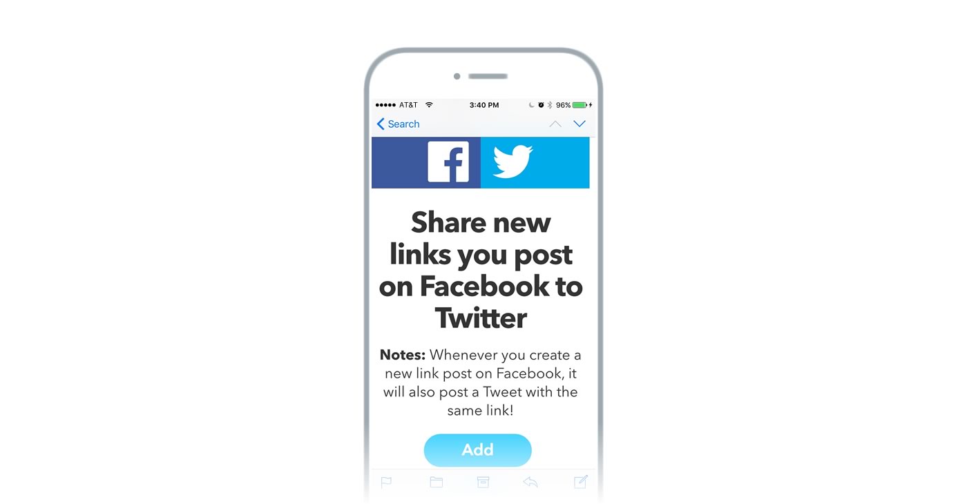
Your CTAs should be visible enough for your subscribers to find and to act on them. Buttons are a bulletproof industry tactic that lets your subscribers engage with your campaigns easily. To make them mobile friendly place them near the top. Make sure that you convey why any subscriber should follow that link and use verbs that describe what they will do when they click it.

A simple and easy-to-click CTA.
No Tiny Fonts
Reading a piece of text with a font under 12 pixels is already hard on a desktop for some people. A good rule of thumb would be to keep all your paragraphs and CTAs above that mark, making your content more readable on the smaller screens.
Images
Images and email are a vast subject and one you should review in order to obtain the best results. For mobile, you should be making sure that your images stay small in size (anything above 100kb will start adding uploading time). However, there are other factors to consider to start painting a picture: some email clients only display images from verified sending addresses and others just don’t display images automatically until permission to display them has been granted.
Here’s a simple checklist to have images optimized for mobile devices:
- To work around the aforementioned image display situation include alt text (alternative text) for all images. You can do so through Benchmark’s Email Designer in the image option panel. This text should be a short description of what the image is about.
- Even with alt text in place, don’t include CTAs or important messages in images. Instead, make your images a visual support for your text and the overall message of your campaign.
- Make sure your images don’t go over 600px wide. That width will make your email display correctly on mobile even if it isn’t responsive.

Using images while keeping mobile in mind.
That’s All, For Now
These 5 points should help you get started pretty easily on your newfound mobile strategy. However, if you have more questions or tips you think are important to share please add them below in the comments section.
A powerfully simple email marketing platform
Sign up for free to see how effortless email marketing can be.
Our Company
Compare
Solutions
Compare
Account
© Polaris Software, LLC Benchmark Email® is a registered trademark of Polaris Software, LLC
© Polaris Software, LLC
Benchmark Email® is a registered trademark of Polaris Software, LLC