

Mistakes You’re Making With Your Mobile-Friendly Email Campaign

Key Takeaways
- Prioritize responsive design: Ensure layouts adapt automatically to any screen size to prevent user frustration.
- Optimize media: Use compressed images (under 1MB) and data visualizations to keep emails fast-loading and readable.
- Focus on accessibility: Use large, tap-friendly buttons (at least 44×44px) and legible font sizes (minimum 14px).
- Be concise and honest: Keep subject lines short to avoid being cut off, and steer clear of clickbait to maintain subscriber trust.
- Design for dark mode: Preview campaigns in both light and dark settings to avoid broken logos and unreadable text.
- Test everything: Always preview campaigns across multiple devices and email clients (Gmail, Outlook, Apple Mail, etc.) before sending.
Your subscribers are reading emails on their phones, on the couch, in line at the coffee shop, mid-commute. That’s not a trend; that’s just how it is now. And it’s actually great news for marketers who want to reach people where they already are.
You can send emails that people read or engage with on their mobile devices, and that matters because:
- Many people receive push notifications from their email apps and are alerted to new messages immediately.
- People often carry their phones everywhere and may be more likely to read content during downtime, like while waiting for an appointment.
- Mobile devices continue to account for the majority of email opens.
- Handheld devices let people engage with content wherever they are, like on road trips, at concerts, at sporting events, you name it.
- Email apps now do a lot of the work for subscribers before they even open a message, from AI-generated summaries to dark mode rendering, which means how your email displays matters as much as what it says.
The takeaway is clear: if you’re not optimizing for mobile, you’re leaving engagement and revenue on the table. Even carefully planned mobile-friendly email campaigns can backfire. Here are the mistakes mobile-centric marketers should avoid.
1. Neglecting responsive design
One of the most common mistakes marketers make with mobile-friendly email campaigns is failing to use a responsive design. Responsive design ensures that your email automatically adjusts its layout based on the device it’s viewed on, whether that’s a desktop, tablet, or smartphone. Without this adaptability, your email may appear jumbled or difficult to read on smaller screens, which can frustrate recipients and reduce engagement.
How to Avoid It: Use an email service provider (ESP) that supports responsive templates, or work with a developer to ensure your email’s HTML adapts to different screen sizes. Test your emails across devices to confirm they display correctly on mobile, tablet, and desktop.
2. Ignoring event context
One of the best email marketing practices is to connect content to well-known events. You could even do this more broadly by talking about summer getaways as the weather warms up.
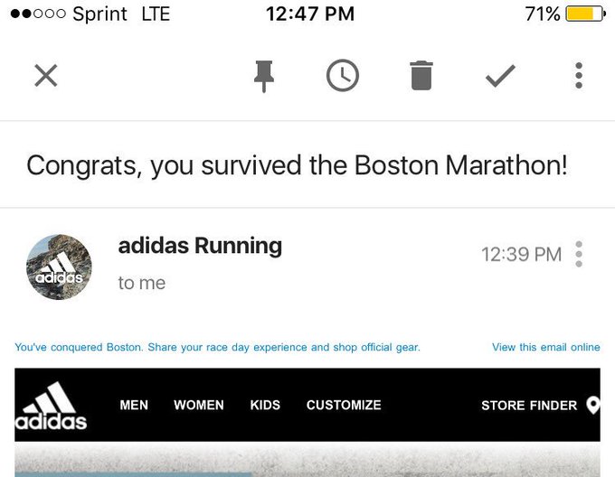
But connecting with people by referencing relatable events can also go wrong. Adidas learned that the hard way in 2017 when it sent an email with the subject line “Congrats, you survived the Boston Marathon!” overlooking that the phrase “survived” carried a very different meaning for some recipients after the 2013 Boston Marathon bombing.
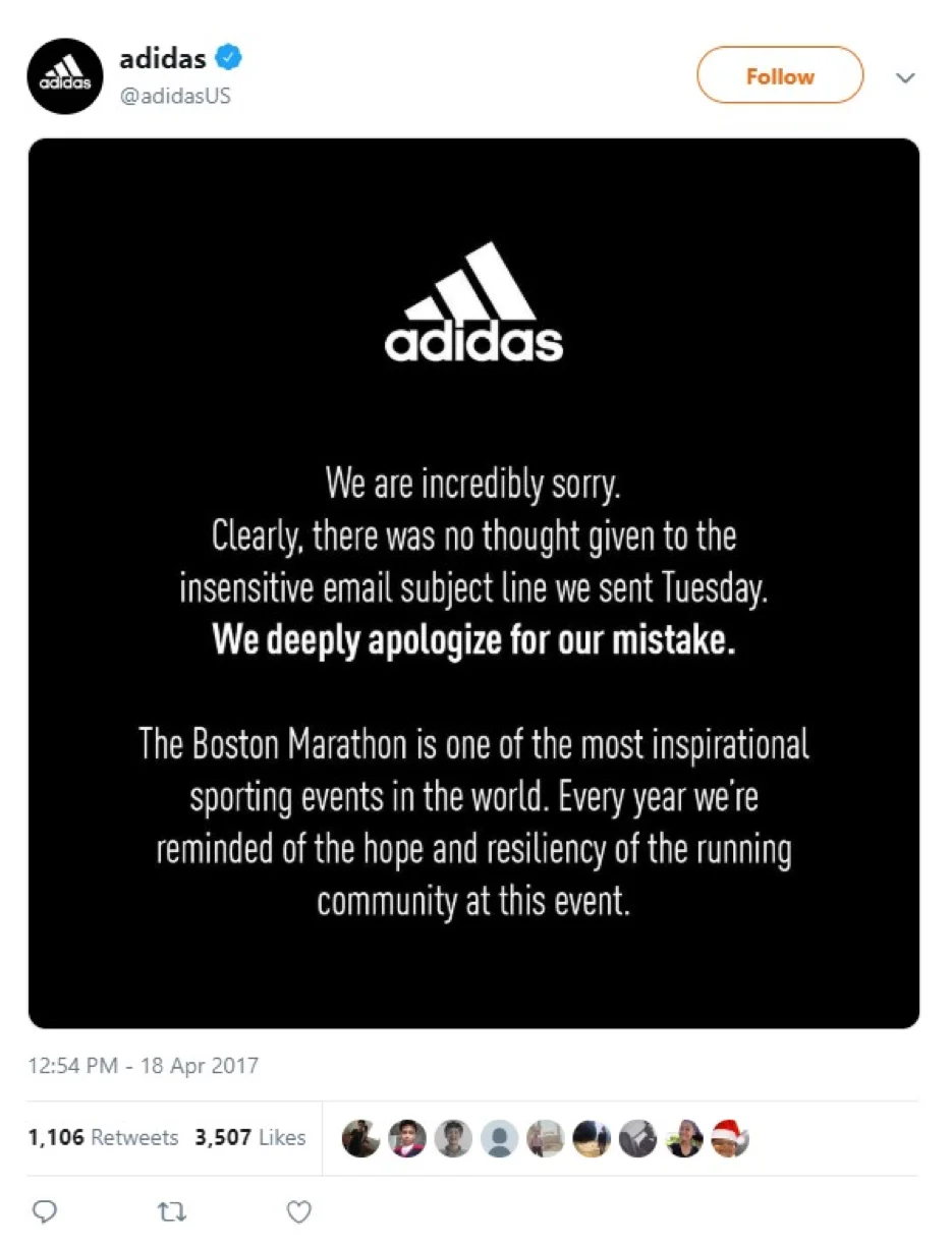
The brand received significant backlash on social media and quickly issued an apology.
When tying your email to a real-world event, take a moment to consider how your words might land with different audiences and in different contexts. Even well-intentioned copy can miss the mark if it’s connected, however loosely, to something that carries a different emotional weight for your readers. A quick gut check before you hit send can save you a lot of awkward follow-ups.
3. Using oversized image files
Emails packed with large image files may look beautiful on a desktop, but they can cause major issues on mobile devices. Large images slow down load times, increase data usage, and may not display properly on some phones. If your email takes too long to load, many users will simply close it and move on.
How to Avoid It: Compress images without sacrificing quality, use formats like JPEG, PNG, or WebP, and aim to keep image file sizes below 1MB. Also, include alt text for images so that if an image fails to load, your audience can still understand your message.
4. Writing subject lines that are too long or too specific
People may receive dozens or even hundreds of emails each day. If someone opens an email and immediately thinks “that doesn’t apply to me,” they’ll get frustrated with the sender for cluttering their inbox. Long or overly broad subject lines can also get flagged as spam.
Consider an email sent to someone who signed up for secret shopper assignments at local businesses. The subject line required participants to be within a specific age range and traveling to Arizona soon, which is overly specific for a subject line. On a mobile device, the subject line also got cut off after “Help us.” Readers never learned what the opportunity actually was. This email went to the spam folder even though the recipient had also signed up for the contact list, likely because back-to-back exclamation points made the message look like junk.
How to improve your subject lines:
- Keep it brief: Put the most important words first so they aren’t cut off on mobile screens.
- Use segmentation: Collect demographic data (like age or location) at sign-up to send targeted, relevant content.
- Avoid “spammy” punctuation: Limit consecutive exclamation points to stay out of the junk folder.
5. Packing in data without visualizations
Adding statistics to your emails is a great way to build credibility and give your readers something worth pausing for. But readability is one of the hallmarks of a great mobile email. People reading on a phone or tablet have much less screen real estate than desktop users, and large blocks of text tend to get a quick exit.
Data visualizations make statistics easier to absorb. Visuals help people quickly absorb and act on information, no spreadsheet degree required. If you’re sending a data-heavy email, consider:
- Inserting an infographic that pulls the main findings from a larger study
- Creating a pie chart showing the top benefits of a product based on a poll
- Including a line graph that illustrates how a trend has shifted over time
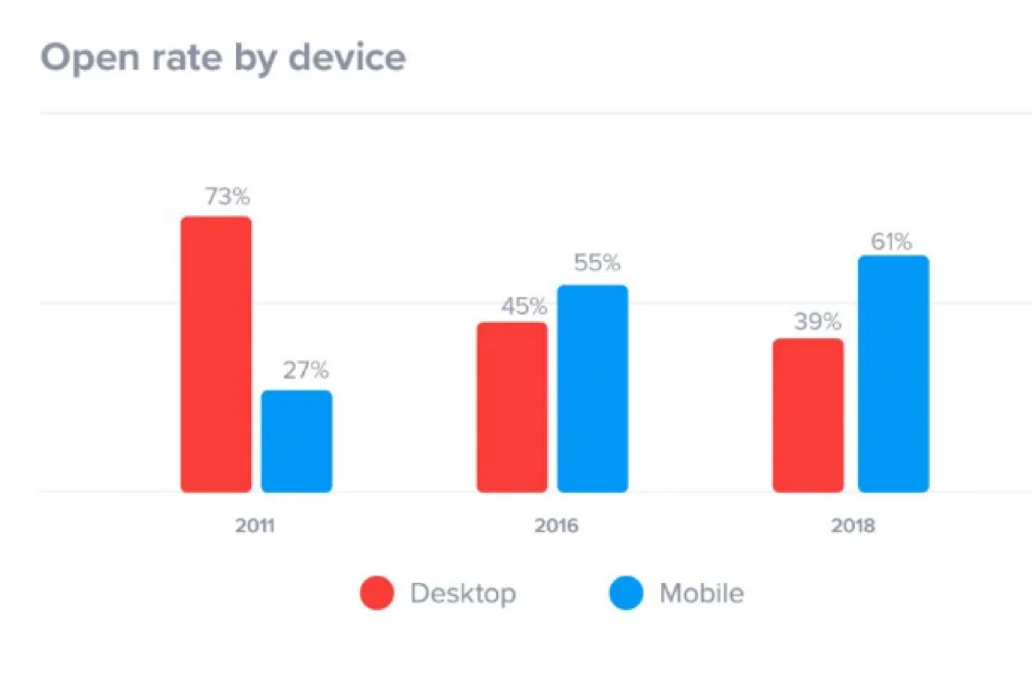
A bar graph with contrasting colors can also work well. For example, a chart comparing mobile versus desktop open rates makes the point at a glance in a way paragraphs of text never could. Consider using a visualization as a teaser, followed by a link to the full data.
6. Using small, hard-to-tap buttons and links
Small call-to-action buttons or links that are easy to click on a desktop can be frustrating to use on a smartphone. If a recipient has to pinch, zoom, or repeatedly tap to follow your link, they’re less likely to complete the action.
How to Avoid It: Make your CTA buttons large and easy to tap, with enough surrounding space that users can tap without difficulty. A good rule of thumb is at least 44×44 pixels, per Apple’s design guidelines. Use high-contrast colors and place buttons prominently.
7. Relying on clickbait headlines
Clickbait headlines are designed to grab attention through shock or mystery. Think “You’ll never believe what happened next” or “The secret the industry doesn’t want you to know.” These phrases are familiar to virtually every inbox, and research shows they can backfire.
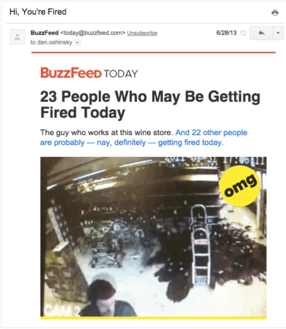
Readers are savvier than ever. They can spot a bait-and-switch from the subject line alone. BuzzFeed once sent an email with the subject line “Hi, You’re Fired,” which became one of its most-opened emails ever, but also generated a wave of anxiety and frustration among recipients who felt misled. BuzzFeed later shifted its strategy to focus on delighting readers first.
It’s best to steer clear of clickbait in mobile campaigns. And the research backs it up. Clickbait subject lines actually make people less likely to open. Urgency is fine when it’s genuine, like a limited-time offer, just don’t manufacture anxiety to drive a click.
8. Skipping tests on different devices and email clients
What looks great on one device might appear broken on another. Each email client (Gmail, Yahoo Mail, Outlook, Apple Mail) can render HTML differently, which means your design could look perfect in one inbox and entirely off in another.
How to Avoid It: Most ESPs, including Benchmark Email, have built-in testing tools that let you preview your emails across devices and screen sizes before you send. Take advantage of them. Test on both iOS and Android, check across different screen sizes, and ensure your images, buttons, and formatting render as intended. A quick preview pass before sending can save you from a lot of inbox embarrassment.
9. Sending image-heavy emails
Many people who read email on mobile want to limit their data usage, and image-heavy emails can quietly eat into that allowance. That doesn’t mean avoiding images altogether, but it’s worth asking whether your message comes through without them.
One strong example: a branded header as the primary graphic element, sent shortly before a forecasted local weather event, paired with short, scannable paragraphs and a bulleted list breaking down a service’s benefits, followed by a clear “Schedule Service” call-to-action button. This example succeeds by using:
- Timeliness: Sent right before a forecasted local weather event.
- Scannability: Short paragraphs and bulleted lists for quick reading.
- Clear CTA: A prominent button that follows directly from the call-to-action.
An approach like this is ideal for mobile users. It tells them what they need to know without requiring them to download a series of images first.
10. Ignoring readability and font sizes
Fonts that look clean on a desktop can appear tiny and illegible on a smartphone. If your audience has to zoom in or squint, they’ll likely delete your email rather than engage with it.
How to Avoid It: Use a minimum font size of 14px for body text and 22px for headings. Stick to simple, legible fonts like Arial, Verdana, or Helvetica, and avoid cramming in multiple typefaces or overly complex typography.
11. Ignoring dark mode rendering
This mistake didn’t make the original list because dark mode wasn’t yet the default experience it is today. Most major mobile email clients now support, or default to, dark mode, and emails that aren’t built with this in mind can look broken: transparent logos that disappear against a dark background, text colors that become unreadable, or background images that clash badly with inverted color schemes.
How to Avoid It: Use PNG logos with transparent backgrounds designed to work on both light and dark backgrounds (or provide both versions), avoid relying on pure white or pure black backgrounds baked into images, and preview your campaigns in dark mode specifically, not just across devices, but across light/dark settings on those devices.
12. Overlooking interactive email elements
Interactive email (image carousels, accordions, embedded forms, and even simple polls) has moved from novelty to genuine accessibility, especially for mobile users, who benefit from being able to act within the email itself rather than clicking through to a separate page. Emails that ignore this entirely aren’t “wrong,” but they’re missing an opportunity, especially for mobile readers who often abandon multi-step processes that require leaving the inbox.
How to Avoid It: Where it fits naturally, consider adding lightweight interactive elements, like a product carousel, an embedded survey question, or an expandable FAQ section, and always include a static fallback for email clients that don’t support interactivity, so the email still works for everyone.
Create a mobile-friendly email campaign that resonates
These mistakes are more common than you’d think, but now you know exactly what to watch for. With Benchmark Email’s responsive templates, built-in testing tools, and intuitive email builder, avoiding them is easier than ever. Try it free today and start sending mobile-friendly campaigns that actually connect.

Sign up for a free Benchmark Email account today!
SIGN UP FREEFrequently Asked Questions
How do I make my emails mobile-friendly?
Use a responsive template, keep copy short, set body text to at least 14px, compress images under 1MB, make buttons 44×44px or larger, and test on several phones and email apps, including dark mode, before you hit send.
What font size works best on a phone screen?
Use 14px or larger for body copy and at least 22px for headings so readers can scan without zooming.
How long should a mobile email subject line be?
Stick to roughly 25–30 characters, or about six words, so the full line appears on most phone screens.
What size should call-to-action buttons be for easy tapping?
Use buttons that are at least 44×44 pixels, add generous white space around them, and choose high-contrast colors so they’re easy to spot and tap.
Do I need to design separately for dark mode?
Not entirely separately, but you do need to test for it. Use logos and images that work on both light and dark backgrounds, avoid relying on background colors baked into images, and preview your campaign with dark mode enabled before sending.
About the Author:

Content Marketing Manager | Content marketing, inbound funnel, social media, email nurture | Natalie Slyman is an experienced Content Marketing Manager at Benchmark Email with a strong B2B background and a knack for crafting pillar content that boosts SEO and brand authority. She regularly shares actionable insights—from remote-work strategies to AI-powered content workflows—via blog posts and webinars tailored for busy marketers.
A powerfully simple email marketing platform
Sign up for free to see how effortless email marketing can be.
Our Company
Compare
Solutions
Compare
Account
© Polaris Software, LLC Benchmark Email® is a registered trademark of Polaris Software, LLC
© Polaris Software, LLC
Benchmark Email® is a registered trademark of Polaris Software, LLC