

Email Design Inspired by Physical Mail: What Marketers Can Learn from Direct Mail Aesthetics

Inboxes are more cluttered than ever before. Marketing emails, transactional emails, and personal messages all pile up in our inboxes daily, creating an overwhelming amount of content that often goes unnoticed. In this crowded space, how can your email stand out and capture your audience’s attention?
One powerful way is by borrowing from an unexpected source of inspiration: direct mail. Yes, the same physical mail that has been around for centuries. In an era dominated by pixels and screens, incorporating tactile aesthetics and design principles from traditional mail can breathe new life into your email marketing efforts.
By drawing on visual cues and strategies from physical mail, marketers can craft emails that feel more personal, distinctive, and memorable. Let’s explore how you can integrate the aesthetics of direct mail into your email design to cut through the noise and captivate your audience.
1. The Power of Texture: Adding Visual Depth
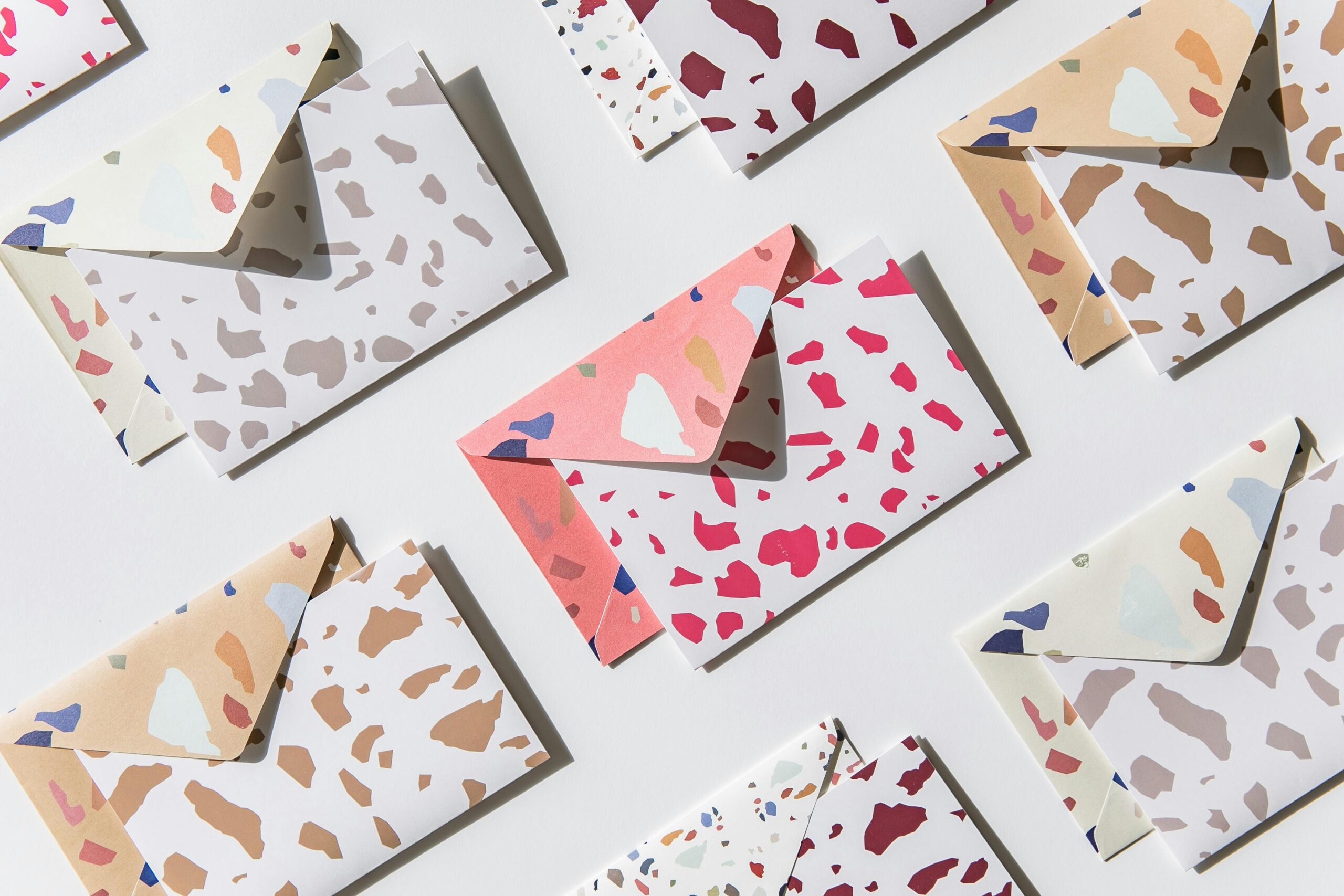
One of the key characteristics of physical mail is its texture. When you receive a letter, postcard, or catalog, you can physically feel it, and the texture immediately adds to the perception of quality. Whether it’s the smoothness of glossy paper, the ruggedness of kraft paper, or the weight of a luxury envelope, texture plays a crucial role in the way we interact with direct mail.
In the world of email, while we can’t replicate the feeling of physical texture, we can mimic its visual cues to create a sense of depth and richness in our design. Here’s how:
- Shadows and layering: Adding subtle shadows behind images, buttons, or text blocks can create a sense of depth and make the email feel less flat. Layering elements visually, such as overlaying a semi-transparent color on an image or using a card-style design, can emulate the multidimensionality of physical mail.
- Bold borders and frames: Much like how physical postcards have borders or envelopes with defined edges, adding frames around sections of your email can create a structured, tactile feel. A well-placed border can make your email content feel more organized and polished.
- Texture-based backgrounds: While you can’t literally feel an email, you can incorporate backgrounds with texture. For example, a paper-like background or a design that mimics fabric, wood, or even subtle linen can make the email feel more grounded and less digital. This strategy helps bring in the warmth and familiarity of physical mail.

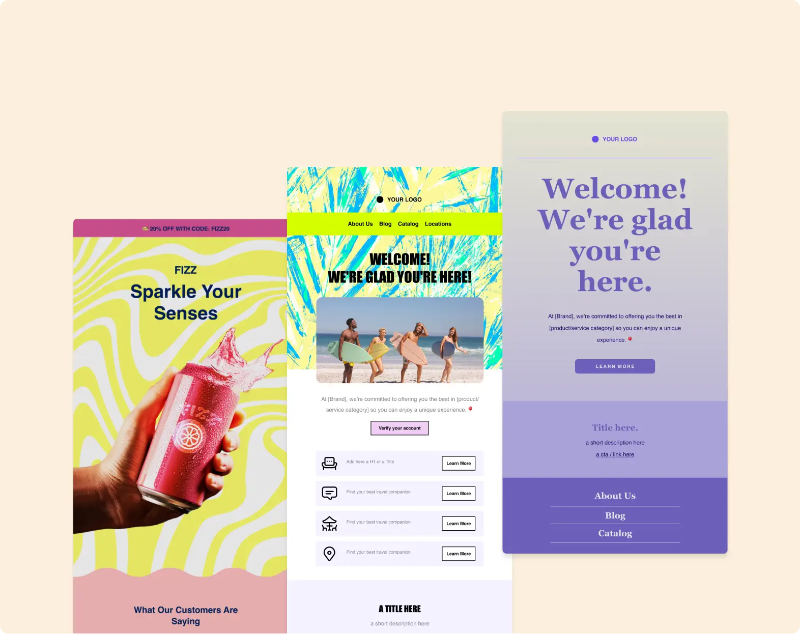
2. Visual Hierarchy: How Physical Mail Does It
Direct mail is effective in part because it’s designed to grab attention immediately. The hierarchy of information—what’s featured in the headline, what’s smaller text, what’s the call to action (CTA)—is intuitive and easy to follow. Emails can borrow this visual structure to create a more digestible and compelling reading experience.
Here are some key strategies for designing an email with a clear visual hierarchy inspired by physical mail:
- Bold headlines: Just as direct mail often uses bold, standout headers to grab attention, your email’s subject line and header should be visually prominent. Use larger fonts, bold text, or a contrasting color to make sure your most important message stands out. The goal is for your audience to know exactly what the email is about at a glance.
- Clear segmentation: In physical mail, items like coupons or offers are often clearly separated or highlighted. In your email, use clear sections with distinct headings and background colors to guide readers through your message. A good practice is to place the most crucial information or CTA above the fold, where it’s immediately visible without scrolling.
- Contrasting CTAs: Direct mail often emphasizes a call to action with large, visually compelling buttons or tabs, and email marketing can do the same. Ensure your CTA buttons have enough contrast to stand out—use bold colors, ensure there is enough whitespace around the button, and make it large enough to catch the reader’s eye.
3. Personalization and Handwritten Aesthetics
One of the charms of physical mail is the sense of personal touch it offers. Handwritten notes, personalized envelopes, and tailored offers make the recipient feel special. In a world where digital communication often feels impersonal, adding a human touch to your email can make it stand out.
Here are some design strategies to channel this sense of personalization:
- Handwritten fonts: While overusing them can be tacky, a well-chosen handwritten font can give your email a personal, bespoke feel like a handwritten note. Use this sparingly for a header, signature, or special offer to give the impression that the email was crafted just for the recipient.
- Personalized greetings: Just like receiving a letter addressed specifically to you, personalized email greetings can make your email feel more direct and thoughtful. Ensure that personalization is woven naturally into the design, such as in the subject line or opening sentence.
- Addressing the recipient’s interests: Physical mail often relies on targeted messaging to ensure the recipient feels that the content is relevant to their needs. This can be replicated in email marketing by segmenting your email list and tailoring messages based on user behavior or preferences.
4. Envelope Design: The First Impression
In direct mail, the envelope is the first thing the recipient sees, and it plays a massive role in whether they open the letter inside. Similarly, the pre-header text and email subject line serve as the “envelope” for your email and can significantly affect whether the recipient opens it.
Here’s how you can take a page from physical mail’s playbook:
- Subject lines as “envelopes”: Just as an envelope’s design can hint at the value of its contents, your subject line should entice the reader to open the email. Using curiosity-driven language, clear value propositions, or even the recipient’s name can make the email feel like a must-open piece of correspondence.
- Pre-header text: Often overlooked, it serves as the secondary “envelope” copy. It should complement the subject line and provide additional context for the email’s content. This is especially important on mobile devices, where the pre-header might be the deciding factor on whether someone opens your email.
5. Creating Physical-Like Experiential Moments
Finally, direct mail often creates a sense of anticipation or surprise through unique formats or unexpected textures. While email is fundamentally different, you can still replicate some of this sense of excitement by incorporating interactive elements and surprise features.
For example, include animated GIFs that mimic the sensation of unboxing a product or opening a letter. Another idea is to add interactive buttons that let recipients “open” something new within the email, such as revealing a discount code or exclusive offer when they click a specific section of the email.
The Best of Both Worlds
Email marketing doesn’t have to feel purely digital. By borrowing visual and design cues from traditional direct mail, you can make your emails feel more personal, unique, and engaging. Whether it’s through texture-inspired backgrounds, personalized aesthetics, or the strategic visual hierarchy often seen in physical mail, these strategies can help your emails stand out in a crowded inbox.
As marketers, the key to success lies in creating an experience for your subscribers—one that feels tactile, engaging, and personal. Direct mail has mastered this for years, and now it’s time for email marketing to do the same.
About the Author:

Content Marketing Manager | Content marketing, inbound funnel, social media, email nurture | Natalie Slyman is an experienced Content Marketing Manager at Benchmark Email with a strong B2B background and a knack for crafting pillar content that boosts SEO and brand authority. She regularly shares actionable insights—from remote-work strategies to AI-powered content workflows—via blog posts and webinars tailored for busy marketers.
A powerfully simple email marketing platform
Sign up for free to see how effortless email marketing can be.
Our Company
Compare
Solutions
Compare
Account
© Polaris Software, LLC Benchmark Email® is a registered trademark of Polaris Software, LLC
© Polaris Software, LLC
Benchmark Email® is a registered trademark of Polaris Software, LLC