


12 Best Practices for Designing Professional Email Campaigns in 2026
Key Takeaways
- Mobile-first design is non-negotiable. More than 60% of emails are opened on phones, and a desktop-only layout will lose you most of your audience.
- Subject lines and preview text drive open rates more than anything else in your design. Spend disproportionate time here.
- One clear call to action per email beats three competing ones—every time.
- Accessibility matters for both inclusion and deliverability. Alt text, color contrast, and semantic structure protect your campaigns.
- Templates save time, but only if you customize them. Sending the unedited template that ships with a tool is the fastest way to look unprofessional.
A professional-looking email isn’t about fancy design. It’s about a message that loads cleanly on any device, says one thing well, and makes the next step obvious. That’s it. The brands you admire aren’t sending elaborate emails. They’re consistently sending simple, well-structured ones.
The good news is that “professional” in 2026 means clearer and simpler than it did five years ago. This refreshed guide walks through the 12 best practices that actually matter for designing email campaigns(opens in new tab) that get opened, read, and acted on.
What is a professional email campaign?
A professional email campaign looks intentional, reads clearly on any device, and drives a measurable business outcome. It doesn’t have to be beautiful. It does have to work.
A few traits that consistently mark a campaign as professional:
- A subject line(opens in new tab) that earns the open without overpromising.
- A clean header with your brand identity, but no clutter.
- One main message, one main image (or none), one main call to action.
- A footer that includes your physical address and an easy unsubscribe link. Mobile-friendly formatting that doesn’t fall apart on smaller screens.
That’s the baseline. Everything below adds to it.
The 12 best practices for designing email campaigns
1. Design mobile-first, always
Most subscribers will open your email on a phone. Design for the phone first, then check that it still works on a desktop. Single-column layouts, large tap targets (at least 44 by 44 pixels), and font sizes of at least 14px in body copy and 22px in headings will address most common mobile problems(opens in new tab).

2. Write subject lines that earn the open
The subject line is the most important line of copy in any email. Keep it under 50 characters so it doesn’t truncate on mobile. Lead with the value, not the brand. Avoid all-caps, excessive punctuation, and spam triggers(opens in new tab) like “FREE!!!” Test specific subject lines with your audience rather than relying on a generic formula.

3. Use preview text intentionally
Preview text is the line of copy after the subject line in the inbox. Most templates pull the first line of the email, which is often something like “View this email in your browser.” Set the preview text manually to a short, punchy continuation of the subject line. This single change can noticeably lift open rates.
4. Stick to one clear call to action
Every email should have one job. If you ask the reader to do five things, they’ll do nothing. Pick the most important action, click through to a product page, register for a webinar, reply with a question, and make it the only thing the email is really asking for. Secondary links can exist, but they should be subordinate.
5. Keep the design clean and scannable
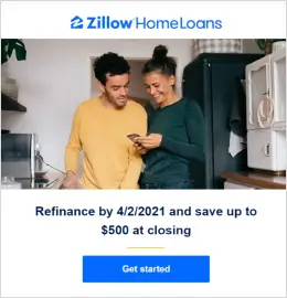
Subscribers scan emails before they read them. Use short paragraphs (two to three sentences), clear headers, ample white space, and a logical visual hierarchy. The reader should be able to understand the gist of the email in five seconds without reading every word.
6. Use images thoughtfully
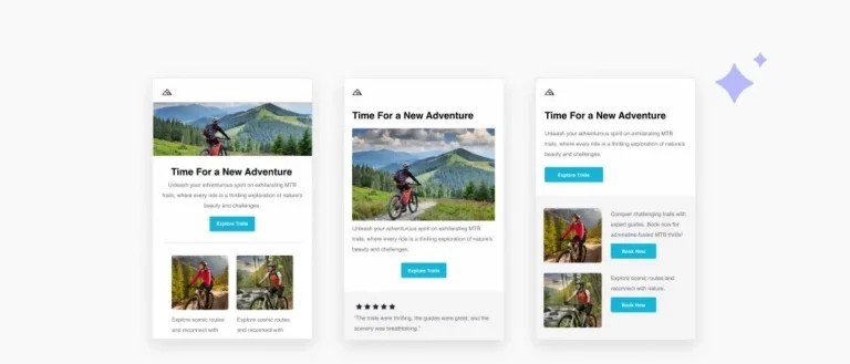
A single strong image is better than a wall of stock photography. Always add alt text so the image is described when it doesn’t load (which is more often than you’d think. Many email clients block images by default). Compress images to keep load times fast. Don’t put critical information in images, because if the image doesn’t load, your message disappears.
7. Match your brand voice and design system
Your email should look and sound like the rest of your brand(opens in new tab). You should carry your brand into your emails(opens in new tab) by using consistent fonts (or fallbacks when custom fonts don’t render), consistent colors, and a tone that matches your website and social channels. Inconsistency makes your brand feel uncertain.
8. Make the unsubscribe link easy to find
Hiding the unsubscribe link is a deliverability killer. Subscribers who can’t find it will mark you as spam, which damages your sender reputation. Put it in the footer, in a normal-sized font, easy to spot. The people who want to leave were going to leave anyway. Letting them go cleanly protects everyone else’s inbox placement.
9. Build for accessibility
Accessibility is both ethical and practical(opens in new tab). Use a font size of at least 14px in body text. Maintain a contrast ratio of at least 4.5:1 between text and background. Add alt text to every image. Use semantic HTML headings (H1, H2, H3) instead of just bold text. Subscribers using screen readers, low-vision users, and many older subscribers will all read your campaigns more comfortably.
10. Optimize for dark mode
A growing share of subscribers read email in dark mode. Test how your campaign renders with a dark background(opens in new tab). Logos with white backgrounds, dark-on-dark text, and color combinations that look fine in light mode can become unreadable in dark mode. Most modern email tools (including Benchmark Email) preview both modes.

11. Set the right send time and cadence
Design isn’t just visual. Timing is part of the campaign. Test send times for your specific audience. B2B audiences often respond better midweek mornings; B2C audiences often respond better evenings and weekends. And cadence matters: a beautifully designed email sent at the wrong frequency still underperforms.
12. Use templates as a starting point, not a finished product
Templates save hours of work. They also make every email look the same when teams send them unchanged. Customize the colors, swap the placeholder images, rewrite the copy, and adjust the call-to-action button to match your specific message. It takes five minutes to separate a template from a brand asset.
Comparing the elements that matter most
| Element | Impact on performance | Effort to optimize |
| Subject line | Very high (drives opens) | Low |
| Preview text | High (drives opens) | Very low |
| One clear CTA | Very high (drives clicks) | Low |
| Mobile-first design | Very high (drives every metric) | Medium |
| Accessibility | Medium (drives reach + deliverability) | Medium |
| Send time and cadence | High (drives opens + unsubscribes) | Medium |
| Image-heavy design | Variable (often hurts more than helps) | Medium |
If you’re working with limited time, focus on the subject line, preview text, a single CTA, and mobile-first design. These four cover most of the available lift.
Common email design mistakes to avoid
A few patterns that consistently underperform:
- Designing on a desktop and forgetting to check the mobile. Most subscribers will see the broken version, not the polished one.
- Using images for headlines or critical text. When images don’t load, the message vanishes.
- Adding too many calls to action. Pick one. Make it impossible to miss.
- Sending a template that looks like a template. Five minutes of customization separates amateur from professional.
- Forgetting the footer. Your physical address and unsubscribe link aren’t optional in most jurisdictions.
Putting it all together
Professional email design in 2026 is less about graphics and more about clarity, accessibility, and intent. Get the subject line, the preview text, the mobile rendering, and the call to action right, and you’re 80% of the way there. Add accessibility and brand consistency, and you’re producing campaigns that compete with brands that have entire creative teams.
Benchmark Email’s drag-and-drop builder(opens in new tab) includes built-in mobile previews, accessibility checks, and dark mode testing built in so you don’t have to handle most of this manually. Sign up for free(opens in new tab) and try it out.

Sign up for a free Benchmark Email account today!
SIGN UP FREEFrequently Asked Questions
What makes an email campaign look professional?
A clean, single-column mobile-first design, a clear subject line, one focused call to action, consistent branding, and accessible formatting (alt text, font sizes, color contrast). Professional doesn’t mean elaborate. It means intentional and easy to read.
How long should a marketing email be?
Most marketing emails perform best with 50-200 words of body copy. Long enough to make the case, short enough to respect the reader’s time. Newsletters and educational emails can run longer, but the principle is the same: every paragraph earns its place.
What’s the best time to send an email campaign?
It depends on your audience, but B2B campaigns often perform best Tuesday through Thursday between 9 and 11 AM in the recipient’s local time. B2C campaigns often see higher engagement in the evenings and on weekends. Test for your specific list rather than relying on industry averages.
How many calls to action should I include in one email?
One. A single clear call to action consistently outperforms multiple competing ones. Secondary links can exist (e.g., footer links or related content), but the primary CTA should be unmistakable.
How do I make sure my emails work on mobile?
Use a single-column layout, font sizes of at least 14px for body and 22px for headers, tap targets of at least 44 by 44 pixels, and test every campaign on a phone before sending. Most modern email tools (including Benchmark Email) automatically preview mobile rendering.
About the Author:

High level marketing, technical email topics, email trends | Jessica Lunk is the VP of Growth Marketing at Benchmark Email, where she combines strategic flair with hands-on expertise to help busy marketers elevate their email game. Delivering timely insights on list hygiene, ROI, and email deliverability, she’s a go-to voice for practical marketing wisdom.