

6 Top Email Marketing Design Tips to Keep Your Readers Engaged

Email marketing is a practice that 82% of B2B and B2C companies are now incorporating into their marketing strategies.
However, just because you are sending an email that reaches your consumers’ personal inbox, this does not simply guarantee the monetary results you’d expect.
You’re going to have to provide your readers with quality content that will actually capture their attention, and you’re going to have to do this in a very quick and concise way.
This is where a visually pleasing email marketing design can come to your advantage.
What are the benefits of a stunning email marketing design?
An email marketing visual design will be one of the key components that you will need to nail. If done right, this can encourage audience engagement and result in the conversions you were aiming for.
The harsh reality is that people still care a lot about aesthetics. Many of consumers’ decisions are based on visible elements. With that being said, a wise selection of visuals in your email content will play an important role in helping you stand out, keeping readers interested in your message, and ultimately, growing as a business.
Wonder how you can make the most out of email marketing and deliver optimal results for your business? Here are the email marketing design tips and tricks on how you can keep your reader’s engaged.

The Ultimate Guide to Email Marketing Design For Higher Engagement
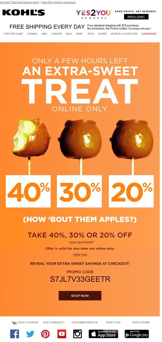
1) Choosing the Right Color(s)
Color can make a huge impact on how your readers’ perceive your product and brand, and this will similarly apply to your email content.
Whether or not your newsletter or promotional campaign will speak to your readers will depend on your selection of color for your email marketing design.
Make sure that your color palette highly corresponds to the subject of your email. On most occasions, you should consider using your main brand color as this will be most representative of your brand, which can help your audience in terms of brand recognition.
However, if you are promoting a festive campaign, it is possible to use colors outside of your brand for greater emphasis on the email subject. For example, you may use red, green, and white for a Christmas campaign, or red, pink, and white for Valentine’s.
Whichever color you choose to use in your email marketing design, remember to be consistent with it. Avoid using too many colors as this will only set you back and give your audience a visual headache.
In fact, color psychology reveals that different colors are associated with different types of human emotions. Hence, it is recommended to tactically select a color that best corresponds to the type of attention to want to attract from your audiences.
The following list shows the common colors used in marketing campaigns and their emotional effect on audiences:
Red
Evokes passion and excitement. Red has high visibility and helps bring a sense of urgency to your email content. Interestingly, it can also promote hunger!
Recommended for: Food, travel, and sports-related email marketing content
Yellow
Associated with intellect, joy, and sunshine, hence the reason why it can make people feel good and happy.
Similar to red, yellow also promotes hunger and can be used along with it.
Recommended for: Vacation deals and food email marketing content
Blue
Represents stability, reliability, and calmness.
Darker blue shades represent expertise and is used by many corporates. Remember to never use it for food or cooking-related newsletters or campaign as it suppresses appetite.
Recommended for: Water, cleaning, and high-tech products
Green
Green is the color of nature that symbolizes growth and harmony.
However, green can be a bit of a tricky color as different shades can have different effects on people. To be safe, try to aim for a brighter green.
Recommended for: Fruit and vegetable produce, and sustainability marketing campaigns
Orange
An energetic color with high visibility. It stimulates appetite and is often associated with healthy food.
Recommended for: Seasonal campaigns during Fall, food email marketing campaigns and non-corporate brands
Purple
Symbolizes royalty, luxury, power, and nobility. Purple also helps express wealth and extravagance.
Recommended for: Feminine or children’s products
Black
Highly associated with professionalism, luxury, elegance, and mystery. Black help depict professionalism of your email marketing campaign and overall brand.
Recommended for: Luxury brands’ email marketing campaigns
2) Have an Adequate Amount of White Space
White is used as a background color for many types of designs and is even more important in an email marketing design.
Leave some white or in other words, blank spaces, between each section of your email content for neatness and increased clarity.
As white spaces will help make your email appear more organized, it can serve to help your audiences read your email in a digestible manner. Messy email marketing designs are never good. Before readers get the chance to read your text, they could easily be thrown off by the amount of clutter seen.
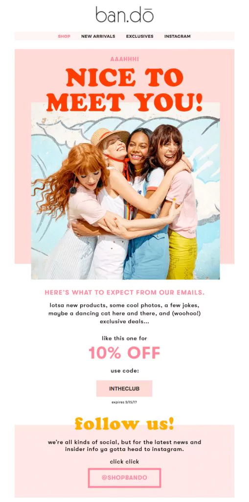
3) Choose the Appropriate Font Style and Size
For email marketing, it is highly advised to limit the number of fonts you use.
As with any other visual elements of your brand, you should keep the type of font consistent with the one on your logo, packaging, or website. Stick to one font if you can. Two is also possible, but do not add more than this.
It is recommended that you use the main font and copy font of your brand within your email content in order to keep the cohesiveness of your brand’s visual identity.
While the header font for your email should align with your brand’s main font, you should select a basic font for your body copy font. Avoid squiggly fonts as this will decrease the readability of your email content.
Fonts that are commonly used as body copy fonts for email marketing include Arial, Times New Roman, Courier, Verdana, and Georgia.
Ideally, your body copy font should be large enough for your readers to be able to read it, but not too large that it takes up too much space. A good rule of thumb for body copy fonts is about a 14-16 font size.
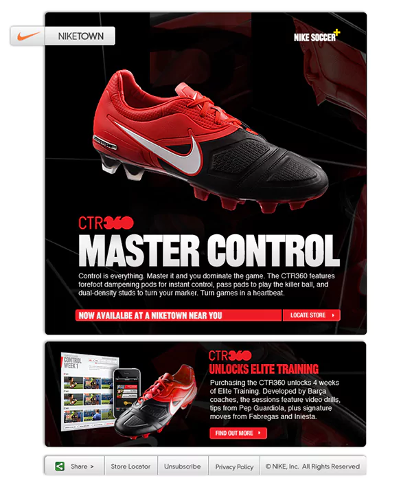
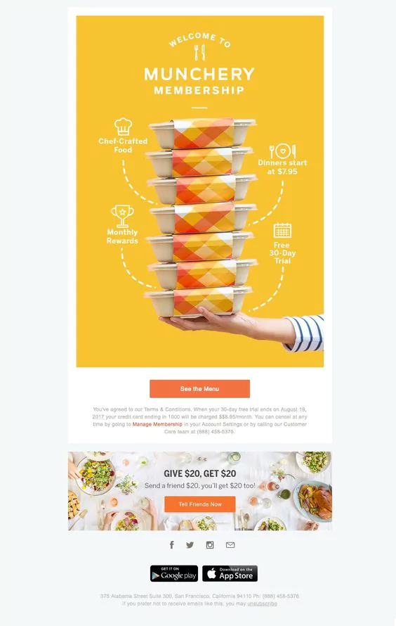
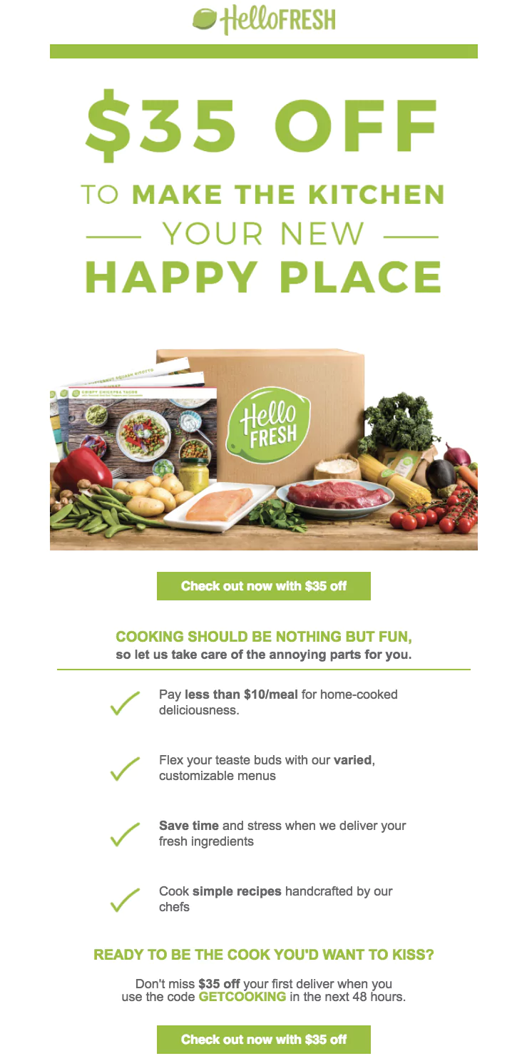
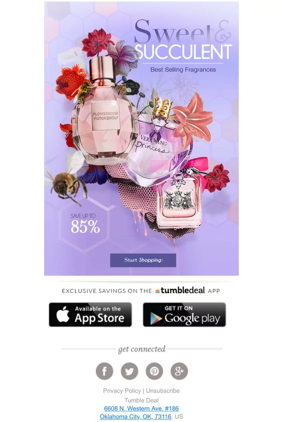
4) Only Add Images That Are Necessary
The current design trend calls for the ‘less is more’ approach, so don’t overflow your email with images. Carefully choose and only include those that are necessary to communicate your main message.
Focus on quality and not quantity. Having a few professional and high-quality images that add value and are highly-related to your email content will be more impactful than including a load of images that have nothing to do with your subject.
It is possible to even use animated images such as GIFs. If you feel that this would add to the visual appeal and communicative aspect of your email, feel free to use them. Just make sure that you format them correctly.
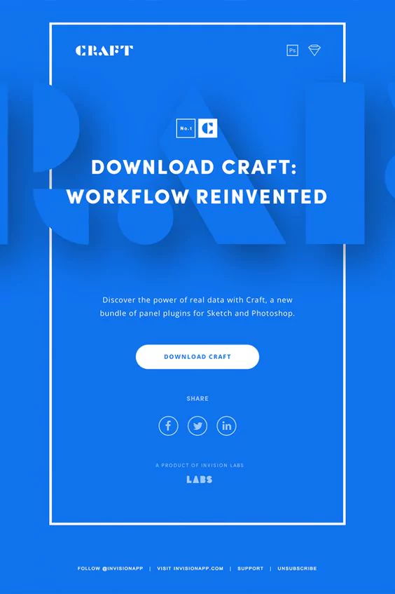
5) Have an Organized Email Marketing Template
Although it would be great if you could professionally design your own email marketing template, getting a premade template is much easier to do. Plus, it can save you a lot of time.
Downloading a premade template does not necessarily mean that your template design will no longer be original. You can tweak it to make it more personal and unique to your brand, and these modifications are always highly advised.
For instance, you may rearrange each section by shifting the position of text boxes and images to make it fitting to your desired email marketing design.
However, regardless of which template you choose, whether originally designed or premade, a good tip is to make sure that your template has a clear visual hierarchy. When it comes to email marketing, you will need to be extremely quick to communicate your message before you lose your readers’ attention.
You should have a focal point, and your design should be able to easily create a sense of what is most important to read to your reader. To create this visual hierarchy, you may use different font and image sizes, color, contrast, shapes, and positions within your template.
Your logo position should also remain consistent throughout all your emails. It does not have to take up a lot of space but make sure it is placed somewhere where your readers can clearly see it. A good idea would be to place your logo within your header so that your readers won’t have to scroll down to recognize your brand.
6) Keep Your Content As Simple As Possible
When opening your email, it is likely that your readers may not take the time to read through its entirety.
To keep it engaging and provoking curiosity out of your readers, you should keep your text as short and concise as possible. Simply, you must get straight to the point.
Leave out the fluff, avoid large chunks of paragraphs, and use infographics whenever possible. As humans tend to process images faster than text and can surprisingly do it as quickly as 13 milliseconds, using symbols can be incredibly helpful in conveying your message more efficiently.
For both campaigns and newsletters, strategically use keywords in the very first few sentences and remember to include a call for action. If you take too long to communicate your point, you will have a very good chance of losing your readers’ engagement as well as the desired results.
Something that would be worth knowing is that some readers may have images turned off by default on their emails. Therefore, avoid having your text embed in an image. Add text separately within your email so your readers aren’t missing out on any important points.
7) Make Sure Your Design Is Mobile-friendly
In this day and age, everyone checks their emails through their phones.
Statistics have shown that 53% emails are opened on a mobile device. With this in mind, it is incredibly necessary that your email marketing design is mobile-friendly but also compatible with other technological devices.
The template should work well and be as visually appealing on mobile devices, so remember to format your email content such as texts, images, and logos.
Remember that your email marketing design template should also not be too wide so that your readers would not have to go through the hassle of scrolling side to side on their phones in order to read your content.
All in all, email marketing services is still quite a relatively new strategy that companies have been using to drive sales in their business.
Although it might seem a bit difficult to nail your email marketing design at first, applying the mentioned email marketing design tips and tricks will help grab and retain your readers’ engagement.
More importantly, they can help you maximize monetary results from your email marketing campaign. However, if you are still unsure about how you can get started on your email marketing campaign design, be sure to give this Benchmark article a read for more explanation on this topic.
About the Author:

France Preechawitayakul is a Thai-born marketing enthusiast who now resides in Amsterdam, the Netherlands. She grew up with an international background and has acquired a degree in Communications and Media at Erasmus University Rotterdam. France currently works with marketing at DesignBro.
A powerfully simple email marketing platform
Sign up for free to see how effortless email marketing can be.
Our Company
Compare
Solutions
Compare
Account
© Polaris Software, LLC Benchmark Email® is a registered trademark of Polaris Software, LLC
© Polaris Software, LLC
Benchmark Email® is a registered trademark of Polaris Software, LLC