Hello, and welcome to another month of Emails That Do Work! At this point, I feel like I should have a gameshow slogan following the intro of this series. “Welcome to Emails That Do Work! Where emails…that do work…actually…” I’ll need some time to sit on this before improvising a cut-throat slogan. For those of you who are new to this series, I go into our Benchmark Community every month to pull emails from actual Benchmark users. I write highlights on useful practices and how this can be applied to your own email campaigns.
Sam Mickail’s CUT Steak House
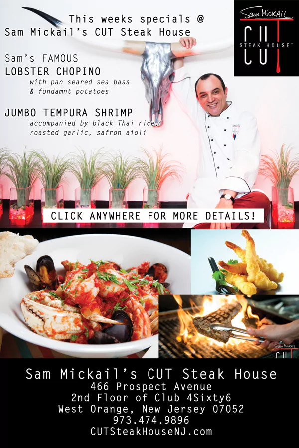
At a quick glance, I found myself salivating over the imagery before I even bothered to look into the text. What is Sam Mickail’s CUT Steak House? Besides the obvious answer (steak house), it is a place where Sam Mickail can infuse a little international twist with the traditional method of preparing and cooking steak. Born in Cairo, raised in France, and trained in Switzerland, Mickail makes good use of his global experiences when it comes to his colorful cuisine.

Why it works:
- Delicious Presentation: When you’re in the food business, email like it! Food, unlike most products and services, require a different kind of TLC when it is being photographed. Lighting and freshness are key. And do your research – what color schemes are appetizing, and what kind of shots are you willing to present to your audience? In this particular email, Mickail presents himself in the top fold. This personalizes the restaurant, and creates ownership for the chef. After all, it IS Sam Mickail’s CUT Steak House, and not just CUT Steak House alone. Stomachs grumble as we move down to the bottom half of the email, where more-than-static images of their menu items burst out in a colorful frenzy. Remember, the menu is the main selling point! Give it the credit it deserves by creating movement with dynamic shots and colorful garnishments. Your readers will crave for more.
- Using REAL Imagery: Stock images are out. And if you still think they’re in, then you’re not investing enough in creating your own content. Remember that content is just as important in your marketing efforts to reach out to prospective customers as it is to get in touch with them. Increase your email readership and opens by changing up your content, both in copy and imagery. What I especially liked about this email is the FOOD, but wait…is this just a generic ad to promote the biz? Absolutely not. It’s a weekly special, and that implies a weekly update. These food pics are not a quick buy from a stock photo website. They are the main course–no, the meat of this email (pardon my bad puns). And because of this, the copy on this email is purely description, leaving the featured specials to do the promoting.
SoundTree Media
SoundTree Media is a music and entertainment company that mainly focuses on independent music marketing. They aspire to invest efforts on promoting independent artists and music to develop partnerships. Their goals lie in strengthening the “alternative entertainment and cultural ecosystem in the country,” through the means of artist management, composing editorials, festivals/events planning and organization, music marketing, and programming.

Why it works:
- Layout is Unique, yet Organized: SoundTree’s email is a great example of applying creativity without sacrificing structure. Far different than the usual stacked layout (which is still clean and professional), the use of diagonal lines to segment the content creates a lot of dynamic flow and movement. Readers will find their eyes traveling in diagonal staggered “S” direction all the way down the page. This layout is something you don’t see every day, but that doesn’t make it any less effective.
- Color Schemes That Flow: It’s always easier said than done when it comes to choosing a good color scheme. SoundTree’s use of color works in several different ways. For one, the existing colors are complimentary. Instead of forcing different colors together to compete for the spotlight, the mellow colors all cancel each other out to make the content easier to read and focus on. Your email’s color scheme should be like backstage help – it allows your emails to function by guiding the reader’s eyes without having too much attention on itself.
Royal LePage Realty in Parksville
Royal LePage Realty in Parksville (Royal LePage) is a realty firm with its real estate sales territory in the British Colombia. Their team of realtors live and work in the Oceanside area and focus mainly on residential home sales and leasing.

Why it works:
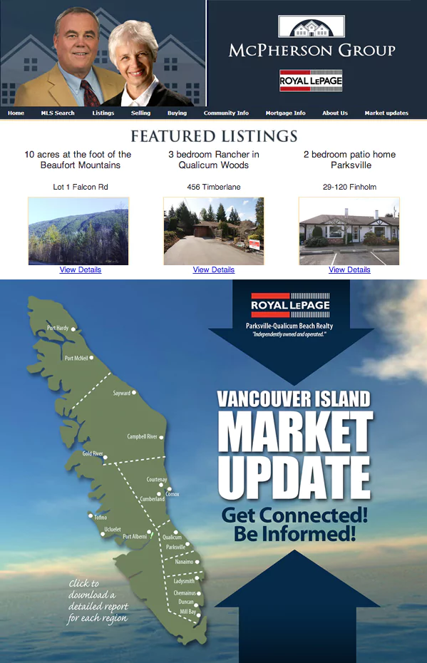
- Simple and Professional: Blue is the main go-to color when it comes to marketing and branding your business professionally, mainly because blues are pegged for projecting trustworthy and reliable impressions. This doesn’t mean that every business should be branded and plastered in blue. If it’s not in your industry to do so, then don’t. Royal LePage keeps a very easy template going since their listings are the main featured content. These are simple to swap out on a regular basis, leaving the rest of the template to fill in the blank areas with secondary marketing offers. As seen in the lower fold of the email, Royal LePage wastes no time promoting subscriptions to get Vancouver Island market updates.
- Detailed CTAs: Not only do they promote readership subscriptions, but they also offer a brief description on what the user will receive by clicking on their CTA (their call-to-action). If I hadn’t mentioned this before, a call-to-action is a banner, button, or a type of graphic with the sole purpose of prompting the user to click and continue down a funnel. As a business, you want your readers to take action on something. Whether it’s to opt in on marketing and promotional efforts or to purchase something right on the spot, you want your users to interact with your business in some way. This stirs up engagement and develops a relationship that leads you one step closer to your audience’s brand loyalty. In this case, Royal LePage explains in the lower left corner of their email what users will receive when they subscribe to market updates. This is a wise move. You don’t want to give your customers something completely irrelevant after they decide to click on your CTA button. Not only will they click out of it, but they might be left with a bad impression of your brand.


