


HTML Email Code: Examples and a Modern Guide to Building Emails That Work Everywhere

Key Takeaways
- HTML email uses tables, not divs. Most email clients, especially Outlook, don’t support modern CSS layout. Table-based structure is still the reliable standard.
- Inline CSS is a must. Many email clients strip <head> styles. Apply CSS directly to each element to keep your design intact.
- Responsive design is non-negotiable. More than half of emails are opened on mobile. Use fluid layouts, media queries, and scalable fonts to adapt across screen sizes.
- Test before you send. Email clients render HTML differently. What looks perfect in your browser can break in Outlook 2019 or Apple Mail. Always preview and test.
- You don’t have to build from scratch. Benchmark Email’s HTML editor lets you paste any HTML email directly into the platform and send.
HTML email sounds simple, but it turns out to be anything but. You know HTML. You’ve built web pages. But the moment you try to apply that knowledge to an email, something breaks in Outlook, your image disappears in Gmail, or your layout collapses on mobile.
That’s because HTML email follows its own rules, and those rules haven’t changed. What has changed is the tooling around them. Today, you can hand-code a beautiful, responsive email, use a modern builder that handles the complexity for you, or do both by bringing your own HTML directly into a platform like Benchmark Email and sending from there.
This guide covers what you need to know about HTML email code in 2026: how it’s structured, how to make it responsive, what to avoid, and how to use the right tools so you’re not fighting your email client on every send.
Why HTML Email Is Different from Regular HTML
Building a webpage and building an HTML email look similar on the surface. Both use HTML and CSS. But web browsers have been standards-compliant for years. Email clients haven’t.
Outlook still uses Microsoft Word’s rendering engine to display HTML, so it ignores much modern CSS. Gmail clips emails that exceed a certain size. Apple Mail handles things differently from the Gmail app on the same phone. The result: an email that looks great in one client can look completely broken in another.
This isn’t a bug in your code. It’s how email clients work, and it’s why HTML email has its own set of conventions that have stayed consistent even as web development has moved on.
The short version of those conventions:
- Use tables for layout, not <div> and CSS grid or flexbox.
- Apply inline styles to each element rather than relying on a stylesheet.
- Stick to web-safe fonts or define bulletproof fallback stacks.
- Use absolute URLs for all images hosted externally.
- Keep the total file size under 100KB to avoid Gmail clipping.
The Basic Structure of an HTML Email
Every HTML email, whether you hand-code it or export it from a builder, follows a similar skeleton. Here’s what that looks like and why each piece matters.
<!DOCTYPE html PUBLIC "-//W3C//DTD XHTML 1.0 Transitional//EN"
  "http://www.w3.org/TR/xhtml1/DTD/xhtml1-transitional.dtd">
<html xmlns="http://www.w3.org/1999/xhtml">
<head>
  <meta http-equiv="Content-Type" content="text/html; charset=UTF-8" />
  <meta name="viewport" content="width=device-width, initial-scale=1.0" />
  <title>Your Email Subject</title>
  <style type="text/css">
    /* Responsive styles go here */
    @media only screen and (max-width: 600px) {
      .wrapper { width: 100% !important; }
      .content { padding: 20px !important; }
    }
  </style>
</head>
<body style="margin: 0; padding: 0; background-color: #f4f4f4;">
  <!-- Outer wrapper table -->
  <table border="0" cellpadding="0" cellspacing="0" width="100%">
    <tr>
      <td align="center" style="padding: 20px 0;">
        <!-- Inner content table -->
        <table class="wrapper" border="0" cellpadding="0" cellspacing="0"
          width="600" style="background-color: #ffffff; border-radius: 4px;">
          <tr>
            <td class="content" style="padding: 40px;">
              <!-- Your content goes here -->
            </td>
          </tr>
        </table>
      </td>
    </tr>
  </table>
</body>
</html>
What each part does:
- The XHTML doctype tells older clients how to interpret your code.
- The viewport meta tag tells mobile browsers how to scale the email.
- The <style> block in the <head> is where your media queries live (note: not all clients read this, which is why inline styles handle everything else).
- The outer table sets the background, and the inner table at 600px is the standard content width that works across desktop clients.
A Practical HTML Email Code Example
Here’s a real-world example of a single-column email section: a header, a short paragraph, and a call-to-action button. Repeat and stack this pattern to build a full email.
<!-- Header image -->
<table border="0" cellpadding="0" cellspacing="0" width="100%">
  <tr>
    <td align="center" style="padding: 0 0 24px 0;">
      <img src="https://yourdomain.com/header-image.png"
        alt="Your Brand Name"
        width="600"
        style="display: block; max-width: 100%; height: auto;" />
    </td>
  </tr>
</table>
<!-- Headline -->
<table border="0" cellpadding="0" cellspacing="0" width="100%">
  <tr>
    <td style="padding: 0 0 16px 0;
                font-family: Arial, Helvetica, sans-serif;
                font-size: 28px;
                font-weight: bold;
                color: #111111;
                line-height: 1.3;">

      Your headline goes here

    </td>
  </tr>
</table>
<!-- Body text -->
<table border="0" cellpadding="0" cellspacing="0" width="100%">
  <tr>
    <td style="padding: 0 0 24px 0;
                font-family: Arial, Helvetica, sans-serif;
                font-size: 16px;
                color: #444444;
                line-height: 1.6;">

      This is your body copy. Keep it short, clear, and focused on one
      message. Every element of this email should point your reader toward
      the action you want them to take.

    </td>
  </tr>
</table>
<!-- CTA Button -->
<table border="0" cellpadding="0" cellspacing="0">
  <tr>
    <td align="center"
        style="border-radius: 4px; background-color: #0066CC;">
      <a href="https://yourdomain.com/your-page"
         target="_blank"
         style="display: inline-block;
                padding: 14px 28px;
                font-family: Arial, Helvetica, sans-serif;
                font-size: 16px;
                font-weight: bold;
                color: #ffffff;
                text-decoration: none;
                border-radius: 4px;">

        Click Here to Learn More

      </a>
    </td>
  </tr>
</table>
A few things worth noting in this example:
- The button is built from a table, not a <div> or <button>. This is the most reliable way to get consistent button rendering across clients, including Outlook.
- Every style is inline. Font family, size, color, line height, padding: all declared on the element itself. The result is verbose, but it’s what keeps the design intact when clients strip the <head>.
- Images have explicit widths and display: block. This prevents unwanted gaps below images in certain clients and keeps layout from shifting when the image loads.
- Links inside buttons carry their own styling. Never rely on the parent element’s color to style an anchor tag inside an email.
Making Your HTML Email Responsive
With more than half of all emails opened on mobile, a design that only works at 600px isn’t finished. Responsive HTML email typically relies on two techniques: fluid layouts and media queries.
Fluid layouts
Instead of fixed pixel widths on inner elements, use percentage widths so columns scale down naturally. Your outer wrapper can stay at 600px, but anything inside it should flex.
<table border="0" cellpadding="0" cellspacing="0" width="100%">
  <tr>
    <!-- Left column -->
    <td width="50%" valign="top"
        style="padding: 0 12px 0 0;">
      <!-- Left content -->
    </td>
    <!-- Right column -->
    <td width="50%" valign="top"
        style="padding: 0 0 0 12px;">
      <!-- Right content -->
    </td>
  </tr>
</table>
Media queries
For screens smaller than 600px, you’ll usually want to stack columns and bump up font sizes. Media queries in the <head> handle this for clients that support them (Gmail on most platforms, Apple Mail, iOS Mail).
@media only screen and (max-width: 600px) {
  /* Stack two-column layouts */
  .two-col td {
    display: block !important;
    width: 100% !important;
    padding: 0 0 16px 0 !important;
  }
  /* Larger body text on small screens */
  .body-text {
    font-size: 18px !important;
    line-height: 1.6 !important;
  }
  /* Full-width CTA button */
  .cta-button {
    width: 100% !important;
    text-align: center !important;
  }
}
Add the matching class names to your table elements (class=”two-col”, class=”body-text”, etc.) and the styles kick in on mobile while the inline styles handle desktop.
Common HTML Email Mistakes to Avoid
- Using background images in Outlook. Outlook ignores CSS background images on most elements. Use <img> tags instead, or use Microsoft’s VML workaround if a background image is essential.
- Relying on JavaScript. No email client executes JavaScript. Any interactive functionality needs to live on a landing page, not inside the email itself.
- Not setting alt text. Many clients block images by default. If your alt text is blank, readers see empty boxes and no context for what they’re looking at.
- Embedding fonts from Google Fonts or custom sources. Web fonts work in Apple Mail and a handful of other clients, but fail silently in many others. Always define a fallback stack: font-family: ‘Your Font’, Georgia, serif;.
- Forgetting the plain-text version. Most email marketing platforms send a plain-text alternative alongside your HTML. If yours doesn’t generate one automatically, write it yourself. It’s important for deliverability and accessibility.
- Keeping file size over 100KB. Gmail clips emails above this threshold, hiding your content behind a “View entire message” link. Keep your HTML lean and host images externally rather than embedding them.
Tools for Building HTML Emails in 2026
You have a few paths depending on how hands-on you want to be.
Hand-coding
If you’re comfortable with HTML and CSS, hand-coding gives you complete control. Use a modern code editor (VS Code, Sublime Text, or similar) and pair it with a local preview tool. The MJML framework is worth a look if you want more maintainable markup and can compile it to email-compatible HTML. It handles much of the table boilerplate for you.
Email-specific design tools
Platforms like Litmus and Email on Acid let you preview your HTML across dozens of clients before sending. They’re especially useful for QAing a hand-coded template.
Benchmark Email’s HTML editor
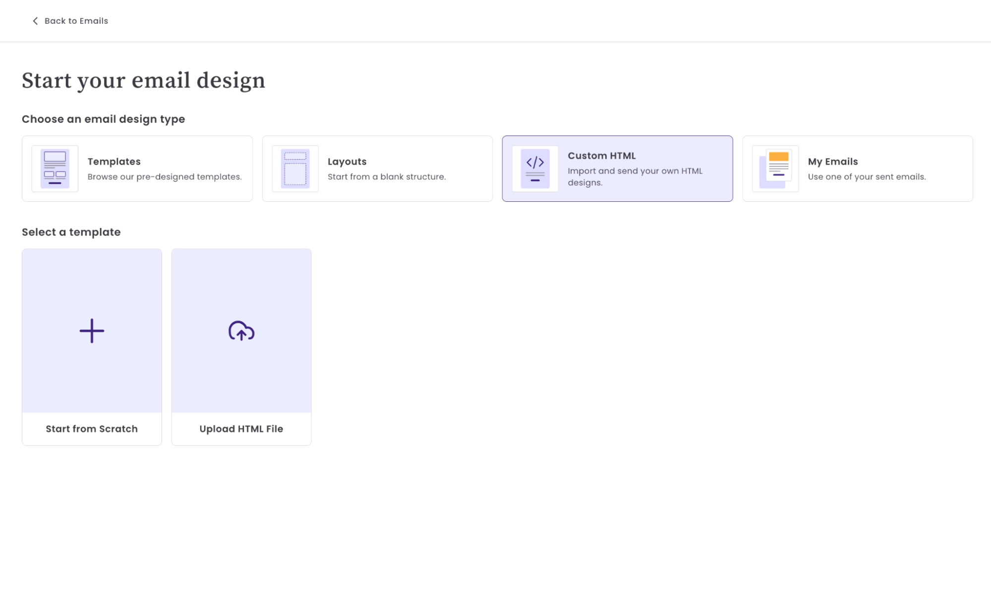
If you’ve already built an HTML email, whether hand-coded, exported from a design tool, or obtained from a template library, Benchmark Email’s HTML editor lets you paste that code directly into the platform and send it to your list.
Here’s how it works:
- Copy the HTML from your email file or template.
- In Benchmark Email, create a new campaign and select the HTML editor option.
- Paste your HTML into the editor.
- Preview across devices to confirm everything renders correctly.
- Send to your list like any other campaign.
You get the full Benchmark Email sending infrastructure, including deliverability tools, list management, open and click tracking, and reporting, without rebuilding your email in a drag-and-drop builder. If you’ve already invested time in a custom template, this is the fastest way to put it to work.
The HTML editor also includes a code view, so you can make quick edits, copy, update a link, or swap out an image URL, all without leaving the platform.
Using AI to write HTML email code
AI coding tools have made hand-coding HTML emails significantly more accessible. If you know what you want but aren’t comfortable writing table-based HTML from scratch, tools like ChatGPT, Claude, and GitHub Copilot can generate a working email structure from a plain-language description, and they’re faster than digging through documentation every time you need a two-column layout or a bulletproof button.
A few ways AI is useful in HTML email work:
Generating a starting template. Describe your email structure (“a header image, two-column section, and a CTA button, single-column on mobile”) and an AI tool will produce a table-based HTML skeleton you can edit from there. This saves setup time and gets you to customization faster.
Writing specific components. Need a bulletproof VML background for Outlook, or a preheader text snippet that hides visually but surfaces in the inbox preview? These are well-documented patterns that AI handles reliably, so you don’t have to look up the exact syntax each time.
Debugging broken code. Paste a broken section of HTML into an AI chat and ask what’s wrong. AI tools can spot unclosed tags, missing inline styles, or attributes email clients don’t support, especially when you’re staring at 300 lines of table markup and can’t find the issue.
Translating plain HTML to email-safe HTML. If you have a web page layout you want to adapt into an email, AI can help rewrite the CSS grid or flexbox structure into table-based equivalents, which is one of the more tedious parts of the conversion process.
One caveat worth flagging: AI-generated HTML email code is a strong starting point, not a finished product. Always test AI-generated code across real clients before sending, because AI tools occasionally produce patterns that work in browsers but break in Outlook, or generate overly complex markup that doesn’t compress cleanly. Use it to speed up the process, then validate it through your normal testing workflow.
Testing Your HTML Email Before You Send
No matter how carefully you code, testing across real clients is the only way to know your email actually works. A few approaches:
Use a preview tool. Litmus and Email on Acid both render screenshots of your email in 90+ clients. If you send regularly to a mixed audience, it is worth the investment.
Send to yourself. Before any campaign goes out, send a test to your own inbox and check it in at least Gmail, Apple Mail, and Outlook. These three cover the majority of your subscribers.
Check on mobile. Open the test email on your phone. Check font sizes, button tap targets, and whether two-column layouts stack correctly.
Validate your links. Click every link in the test email. It’s easy to leave a placeholder URL or a typo in a UTM parameter, and those mistakes are obvious once you send the email.
Review the plain-text version. If your platform generates one automatically, check that it reads clearly and includes all important links.
Frequently Asked Questions
What is HTML email and how is it different from plain-text email?
An HTML email uses markup to control layout, fonts, colors, images, and buttons, giving you a designed, branded experience. A plain-text email is exactly what it sounds like: no formatting, just words. Most marketing emails are HTML, but every HTML campaign should also have a plain-text alternative for deliverability and accessibility.
Do I need to know how to code to send an HTML email?
No. Drag-and-drop email builders like Benchmark Email generate clean HTML behind the scenes. If you already have an HTML template you want to use, Benchmark Email’s HTML editor lets you paste it in and send it directly without any coding on your end.
Why do I have to use tables in HTML email instead of modern CSS?
Email clients, particularly Outlook on Windows, use older rendering engines that don’t support CSS grid, flexbox, or many modern layout properties. Tables have been the reliable fallback for email layout for over a decade and still produce the most consistent results across clients.
How do I make my HTML email responsive?
Use a fluid layout with percentage widths for inner elements, set your max-width at 600px, and add media queries in the <head> for mobile-specific overrides like stacking columns and enlarging fonts. Also ensure images scale with max-width: 100%; height: auto; so they don’t overflow on small screens.
What is the maximum file size for an HTML email?
Keep your HTML file under 100KB. Gmail clips emails that exceed this limit, hiding content behind a “View entire message” link. Host images externally rather than embedding them as base64, and keep your code clean and free of unnecessary comments or whitespace.
Can I use my own HTML template in Benchmark Email?
Yes. Benchmark Email’s HTML editor is built for exactly this. Copy your HTML, paste it into the editor, preview it, and send. You get Benchmark Email’s full sending and reporting features with your own custom design.
About the Author:

High level marketing, technical email topics, email trends | Jessica Lunk is the VP of Growth Marketing at Benchmark Email, where she combines strategic flair with hands-on expertise to help busy marketers elevate their email game. Delivering timely insights on list hygiene, ROI, and email deliverability, she’s a go-to voice for practical marketing wisdom.