The Power Of A Strong Call To Action: How To Make Yours Click-Worthy

Calls to action might be the most important part of your business strategy: the jewel in your marketing crown.
Your brand’s success goes hand in hand with a strong call to action. You will have experienced this first-hand, whether you’ve signed up to Netflix or bought a new jacket online: the chances are a good call to action led you there.
I’ve seen countless CTAs in my work, so I know what works — and what doesn’t. If your CTAs aren’t on point, you’ll see conversions slow and sales fizzle out. So, if you want to know how to make your call to action truly click-worthy, read on…
So why are calls to action important? Well, take this as an example: if you include just a single call to action as part of your email marketing strategy, your clicks could increase by up to 400%, and your sales by over 1000%.
A good call to action works as part of a more comprehensive customer support and experience strategy, building on useful and engaging copy and high-quality aesthetics to work towards a final goal. It should be compelling and drive your customers to take a specific action: to make a purchase or sign up for your newsletter.
Without a compelling call to action, your customers are just lost sheep on a mountain without a shepherd. Your CTA can lead them to where you want them to go.
So, what makes for a strong call to action?
A good call to action is so much more than just a button at the bottom of the page. When you’re writing your CTA, you need to…
Make It Compelling
This is an obvious one, but no less important. Your customers are like mice in a maze: they need direction, and you need to provide them with it.
So, when you write your CTA, it needs to have a clear and compelling directive. This means using a powerful, commanding verb to start your CTA with.
This can vary depending on what it is you’re offering, and therefore what you need from the customer. For example, if you’re running an online store, you would want to start with “buy” or “shop.” Alternatively, if you’re marketing a newsletter or ebook, begin with “subscribe” or “download.”
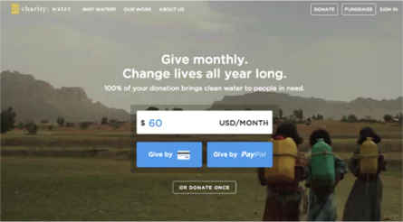
Charity: Water does this nicely with their donation page, below. They start with the imperative to give but follow it up with another command: “change.” It’s a pleasant surprise that gives their CTA a more emotional slant, compelling people to donate.
Keep It In the First Person
Your customers also like to feel like they’re the only customer in the world.
They don’t want to share your attention with anyone else, so be sure that your CTAs are written in the first person. While this might not work with every call to action, it can be hugely effective for some.
For example, saying things like “claim my discount code today” rather than “download your free discount code today” can make the difference between a conversion and a loss.
Convey A Sense of Urgency
Remember when you had to write an essay at school and as you got closer and closer to the deadline, all you could think of was that essay?
While it might have been stressful back then, today, you can leverage that in your CTAs to ramp up your conversions and boost sales.
Consider including a deadline for a special offer or promotion in your CTA, for example: “Buy now! Sale ends tomorrow”. Just like you and me, customers have severe FOMO (that is, Fear Of Missing Out). The thought of losing out on a great deal or offer because of inaction is a powerful motivator.
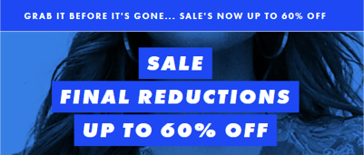
Check out online fashion retailer ASOS’s lead-in to their call to action in the example below. The command to “grab it before it’s gone” reinforces the sense of urgency, further compounded by the bold announcement that these are the “final reductions” below.
Tell Your Customer Why They Should Click
If you want your call to action to be truly click-worthy, you need to show your customers what’s in it for them.
Will they get a great deal on shoes? Will they learn the secrets of the trade?
The benefit might be a summation of your value proposition, the unique quality that your business has over your competitors. Clearly state the benefit they’ll receive when they click on your CTA to give them that little extra nudge.
For example, the eCommerce marketplace Exchange lures their customers in with the promise of their “next big success,” a bold claim that is sure to hook any budding entrepreneur looking for businesses for sale:

Combine that with a brightly-colored CTA button, and your eyes are drawn to it like a pink flower in a lilac field. It’s all about making the CTA irresistible to click.
Engage Your Customers
Consumers are bombarded with demands to buy, download, sign up and more from marketing all the time, from print, digital and television advertisements.
This means they tend to tune out a lot of what they see and hear. So you need to slice through that and grab their attention.
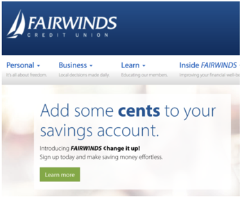
How? With a little quirky humor. Check out credit union Fairwinds’ website, below. They use the oldest (and in my unpopular opinion, the best) trick in the book to get their customers focused: a simple pun. It might not be the funniest thing you’ve read all day, but it’s enough to raise a smile on your face and hook you long enough to read it.
Emphasize Freebies
People love freebies.
Whether it’s a cheese sample at your local grocery store or a ticket to a concert, consumers love getting something for nothing. If you’re able to offer something for free, such as a sample or product trial, make sure that’s clear in your call to action. It could be just enough to push a dithering shopper to purchase or sign up.
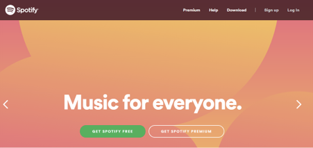
Check out Spotify’s call to action. The offer of their free option is colored a punchy green and naturally draws the reader subtly to their Premium option too. It stands out, and the freebie is hard to miss. The layout as well is nice and simple, the cornerstone of any good CTA.
Minimize Stress and Hassle
As much as people love freebies, they enjoy a stress-free life too (and don’t we all?).
So consumers are understandably wary of signing up to anything if they think that they’re going to have to endure countless tedious phone calls and annoying email exchanges if anything goes wrong. To counter this, you need to reassure them that by clicking your CTA, the process will be as easy or risk-free as possible for them.
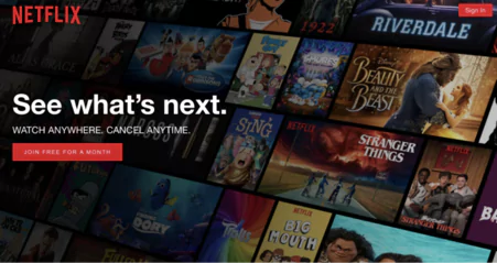
For example, Netflix knows that customers can be put off by the hassle of canceling a subscription to services. Recognizing that they lead into their call to action with the promise that potential customers can cancel at any time, heading off their concern before they can even voice it.
Keep It Simple
This one is crucial. If your website or email is chock-a-block with copy, images, graphics and banners, your potential customers will get an instant headache.
Instead of clicking on your call to action, they’ll probably be more likely to take a painkiller and lie down in a darkened room. Visual clutter is a big turn-off and will distract from your CTA.
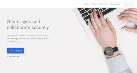
Want to see an example of a brand doing it right? Look no further than file hosting service Dropbox. Their aesthetic is built around subtle imagery and simple design, and their call to action is no difference. Contained in a bold blue box, it contrasts with the negative space around it. It jumps out from the page without any external distractions, and even the photo is simple and understated.
Your call to action is your advertising, Horn of Gondor, the guiding light down your marketing funnel. Work on creating a strong, crafted, and compelling command, and your campaigns will be rejuvenated and injected with a hit of energy and dynamism. Whether it’s part of your email marketing or placed enticingly on your website, be sure to heed the lessons imparted above. And it’s not just there either: a call to action on your blog post or social media content can open up new avenues for you to draw in customers. So what are you waiting for? Get working on those calls to action today!
A powerfully simple email marketing platform
Sign up for free to see how effortless email marketing can be.
Our Company
Compare
Solutions
Compare
Account
© Polaris Software, LLC Benchmark Email® is a registered trademark of Polaris Software, LLC
© Polaris Software, LLC
Benchmark Email® is a registered trademark of Polaris Software, LLC