

Best Practices for Using Email Sign-Up Forms

Key Takeaways
- Sign-up forms are where lead generation actually begins. Driving traffic to your site is only half the battle — your forms are what convert visitors into subscribers and, eventually, paying customers.
- Placement matters more than you think. Place your forms on high-traffic pages and test different positions (top of the page, sidebar, exit-intent pop-up) to determine which drives the most conversions for your audience.
- A strong headline does the heavy lifting. Your headline should instantly communicate value and make visitors want what you’re offering in exchange for their email.
- Be clear about the value exchange. Visitors won’t hand over their email just because you asked — give them a compelling reason, whether that’s a free course, a weekly roundup, or exclusive content.
- Keep it simple. The fewer form fields, the better. In many cases, just asking for an email address is enough to get started. You can always gather more details later.
- Respect user privacy. Be transparent about how you’ll use their information. Trust is built from the very first interaction, and that trust directly impacts long-term engagement.
- Integration makes everything easier. When sign-up forms are built into your email marketing platform, new subscribers flow directly into your list — making welcome emails and follow-ups seamless from day one.
If lead generation is a goal (which it should be), you’ve undoubtedly spent a lot of time and effort on generating website traffic. And while increasing site traffic is a terrific goal to achieve, what you do with that site traffic is even more important.
It isn’t enough to just send people to your site. You have to make sure your site is set up to capture leads so you can start growing your email list and sending email campaigns successfully. This is where website forms come in.
Website forms are essentially sign-up forms, and there are two main types: online and pop-up. They’re an indispensable part of your lead generation and sales strategy, as essentially, they’re where those strategies truly begin. The way you design and use your sign-up forms dictates the rate at which your email lists grow and, in turn, dictates how successful you can be at converting that list into paying customers.
In this article, we’ll discuss the best practices for using sign-up forms so you can use them to effectively grow your email list.
What’s an email sign-up form?
First things first, let’s dive a bit more into what sign-up forms are about.
Email sign-up forms are the forms that pop up or are embedded on your website pages to collect email addresses from potential customers and leads. Generally, the form includes fields for the web visitor to enter their name and email address, along with a CTA button, a headline, and a description.
While the form’s intention is straightforward, convincing visitors to hand over their personal details isn’t. Thankfully, adhering to these best practices will help you move closer to achieving that goal.
When sign-up forms are built directly into your email marketing platform, new subscribers can be added instantly to your contact list, making it easier to follow up, send welcome emails, and start building relationships right away.
Best practices for using email sign-up forms
1. Place them on high-traffic pages
The more people who can find your sign-up form, the better your chances are of building your email list. For this reason, place your forms on high-traffic pages and, most importantly, optimize their placement on the page.
Keep in mind that the page could get hundreds of visitors daily, but only a few make it to the bottom. If you place the sign-up form at the bottom, it may not get you as many results as it would if it popped out from the side or followed readers as they scrolled.
Remember, there are many spots where you can place the sign-up forms:
- Top of the page
- Bottom of the page
- In the sidebar
- Within the text
- As a pop-up triggered by a user action (such as exit intent)
Rather than placing the form randomly, run A/B tests to determine the placements that work best for each page and audience.
When forms are easy to manage and update from the same place where you run your email campaigns, testing placement becomes much more manageable and effective.
2. Grab visitors with a headline
Getting eyeballs on the sign-up form is just a piece of the jigsaw puzzle. Another important piece is convincing these people to read the form content and take the desired action. To do so, create a catchy headline – something that intrigues the readers and makes them yearn for what you’re offering in exchange for their email.
Check out the sign-up form below. The headline is a sticker for anyone who’s pursuing passive income. We like how the website teases readers with definite figures ($50,000+ per month). Handing over your email in exchange for that kind of promise seems like a pretty beneficial trade.

A strong headline should clearly hint at the value readers will receive and reassure them that signing up is worth their time.
3. Make the value exchange clear
Let’s say, for example, that the headline has caught the reader’s attention. To sell them on the idea and convince them to sign up, you have to define what’s in it for them. Web visitors don’t just give you their email because the headline is catchy. They do so because they inherently want to tap into your knowledge or get real value in exchange.
The example above clearly outlines the value exchange. The readers know that once they sign up, they will get a free email course that can help them create a blog churning $50,000+ per month in revenue. That’s an irresistible offer.
Another example is below from Peak Freelance.
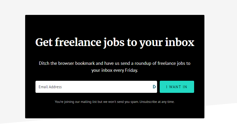
A guaranteed roundup of freelance jobs every week makes it extremely hard for freelance job seekers to pass this up.
Clear value exchanges also make follow-up emails more effective. When subscribers know exactly what they signed up for, engagement tends to be higher from the very first email.
4. Keep it simple
While the headline and description play a significant role in convincing the reader to sign up, they don’t give you the license to cram the form with all sorts of information. It’s always good to keep it simple by using the fewest words possible to sell your value proposition. Simple forms are easier to complete and easier to manage over the long term. Fewer fields not only improve conversion rates but also help you maintain a cleaner, more engaged email list.
This applies to the form fields, too. If you ask for too much information from readers, chances are most won’t oblige. Studies have found that eliminating data fields and leaving only the absolutely necessary fields can significantly increase the subscriber rate.
Zendesk has created a simple sign-up form that only asks for visitors’ emails. This does a great job of getting people to subscribe so they can provide additional details, such as name and address, in their subsequent email messages.
5. Mind user privacy
In the wake of rampant cybercrimes, no one wants to leave their email on websites they don’t trust. Today’s users are conscious of their data privacy, and unless they are sure about how you intend to use the information, they will not complete the form.
This sign-up form from Remote.com goes the extra mile by explaining how they will use the user’s information and requesting the user’s consent to use it.
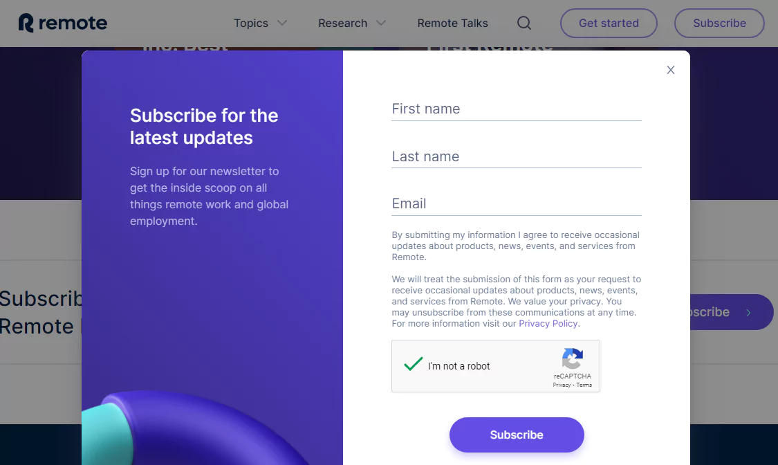
Transparency goes a long way towards not only building a relationship based on trust but also in encouraging users to provide you with what you need to build your list effectively. Transparency doesn’t just protect your brand. It also builds trust from the first interaction. When users understand how their information will be used, they’re more likely to stay engaged after signing up.
Next time you add a form to your website, keep these tips in mind, and you’re sure to see your email list steadily grow. And, if you want a simple email marketing solution that comes with a sign-up form builder for your site, sign up for a free Benchmark Email account.

Sign up for a free Benchmark Email account today!
SIGN UP FREEFrequently Asked Questions
What makes an email sign-up form effective?
Clear value, simple design, minimal fields, and honest messaging. The easier it is to understand and complete, the better it will perform.
How many fields should a sign-up form include?
As few as possible. Often, just an email address is enough to get started. You can always collect more information later through email.
Where should I place email sign-up forms on my website?
High-traffic areas like blog posts, homepages, sidebars, and exit-intent pop-ups tend to perform well. Testing placement is key.
Should every form include an email opt-in?
Yes. Giving users a clear option to opt in helps you build a healthier list and stay aligned with best practices for consent.
How do email sign-up forms connect to email marketing?
When forms are built into your email marketing platform, subscribers can be added instantly—making it easy to send welcome emails and future campaigns without extra steps.
Will Benchmark Email include sign-up forms?
Yes. Email sign-up forms will be part of Benchmark’s next-generation platform, making list growth simpler and more streamlined.
About the Author:

High level marketing, technical email topics, email trends | Jessica Lunk is the VP of Growth Marketing at Benchmark Email, where she combines strategic flair with hands-on expertise to help busy marketers elevate their email game. Delivering timely insights on list hygiene, ROI, and email deliverability, she’s a go-to voice for practical marketing wisdom.