

Visually appealing email design can engage your target audience, showcase your brand message, and encourage subscribers to click your CTA.
Since email marketing generates 40 times more leads than social media, it’s one of the most effective ways to boost conversion rates. This makes good email design more important than ever.
But how can you create great email designs and newsletters that are both visually appealing and packed with helpful content?
In this guide, we’ll share the most important elements of a memorable email layout. We’ll also discuss the types of visuals you can use that will step up your email marketing.
8 Essential Email Design Elements
Start your designing process by creating an email template. This will act as the foundation for your email blasts. Create two to three templates to use for different types of messaging.
Your templates should include the following elements:
1. Email Header
The email header design is the first thing your readers will see. This is why it needs to be attractive and pull readers in.
The following email header design is simple, but with the brand logo at the forefront, there’s no question who the email is coming from. The banner also outlines what to expect from the email content, which is a great way to entice recipients to keep reading.
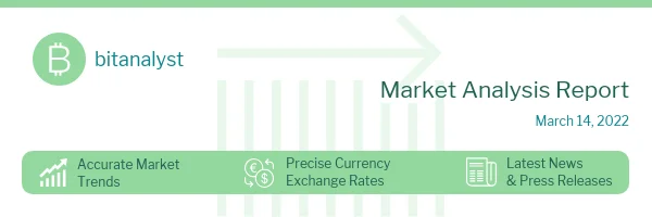
When you create your email template design, ensure you leave room for a branded header. The header doesn’t have to change very often, so one or two designs should be enough.
2. Brands Colors
Your brand identity is what makes you stand out in the industry and from competitors. The brand logo, colors, fonts (more on that in the next point), and your voice are all part of your identity and should be taken into consideration when designing your emails. There’s room to maneuver with colors, but the palette should remain as consistent with your brand as possible.
3. Brand Fonts
Alongside colors, your email layout design should accommodate your brand fonts. Keep in mind that if your brand uses a very niche font, your content may not appear correctly (or at all) on certain email clients.
4. Email Signature
You can add an email signature for brand awareness and a touch of personalization. It helps to create a connection between the people behind your company and your customers.
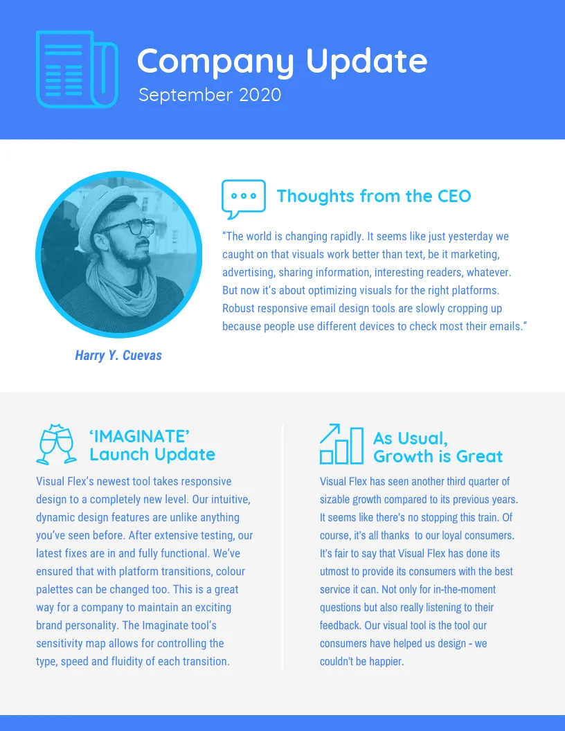
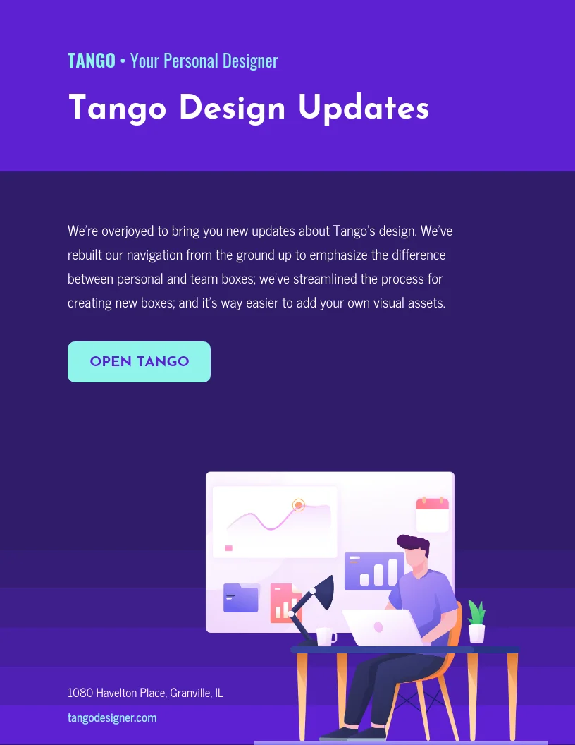
5. Headings and Subheadings
Unlike other content marketing methods, emails can include a block of text and still get attention. But that doesn’t mean you can’t try to make your email design more readable.
If you have multiple stories to share in one email, divide them into sections with distinct headings and subheadings, like in this simple business update email.
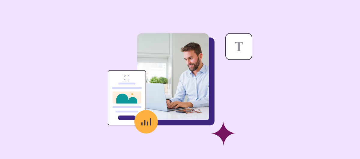
6. Visuals
Visual content makes emails more attractive and can increase the chances of your audience reading your content and clicking on your call-to-action.
Designate sections of your email layout for images, preferably at the email template stage.
You will want to keep email size in mind when adding visuals. Some email servers and clients transmit or accept larger emails than others, as outlined here.
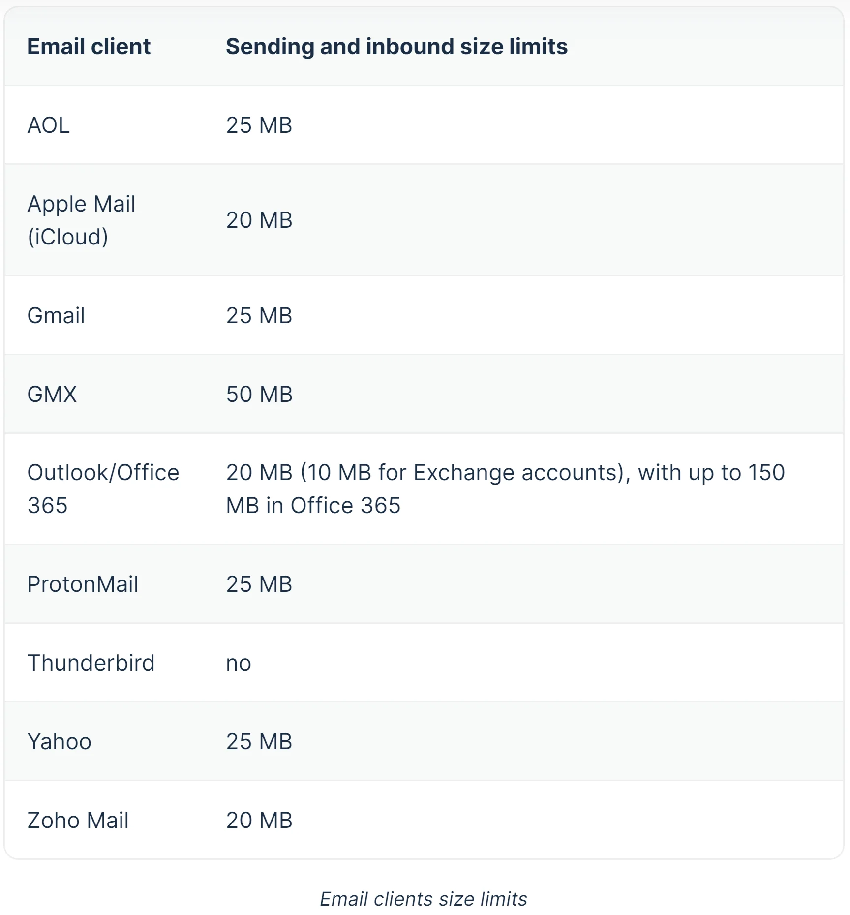
Even if your service allows you to send a larger email size, your email could be rejected if your recipient’s email client has a smaller size cap.
Check your email management software for size limits. Always compress your images before using them in an email blast.
7. White Space
A newsletter layout needs white space to make it more readable. If too many elements are crowded together, users won’t be able to read the text or appreciate the visuals.
As a result of diminished user experience, your emails may not convert. In the worst-case scenario, recipients may be tempted to unsubscribe.
White space is more crucial now since the majority of emails are accessed on mobile devices.
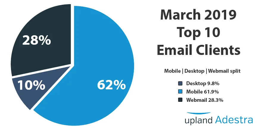
With smaller screens, it’s harder to read the content, so keep space around your content for a better user experience.
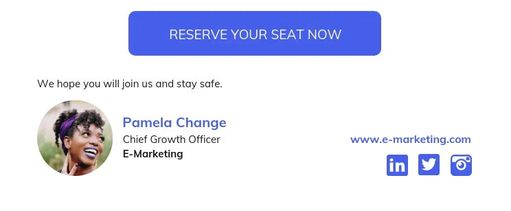
8. Calls to Action
A call-to-action is the primary way to track conversions from email marketing campaigns. The best email designs have a well-placed and designed CTA.
There’s still a lot of discussion around what makes a good CTA, where it should be placed (top, middle, or bottom), and how many CTAs to include in an email.
Here’s what there is agreement on when it comes to CTAs:
- Don’t include too many CTAs — two or three are fine but any more, and you run the risk of confusing recipients. More options aren’t always a good thing.
- Your CTA color should be distinct from the rest of your email design, so it stands out.
- If you’re creating a CTA button, keep your text short. We recommend two to three words maximum. If you’re writing an anchor text CTA, you can hyperlink a phrase or sentence.
Deciding what CTA placement and design works best for your brand will depend on regular A/B testing.
7 Visuals to Use in Newsletter Designs
Now that you know what elements you need to include in your newsletter design let’s look at the types of visuals that help convert.
1. Infographics
Graphic email design catches the eye more than a text email. Humans are drawn to pictures, so if you create an email with pictures, you can get more interest from your audience.
The best way to do that is by designing an infographic email, like the below real estate example.
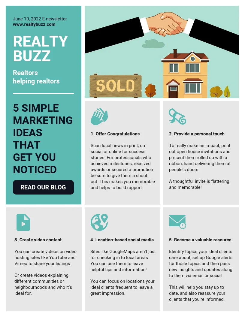
There’s plenty of information to absorb from this infographic, but it’s clearly demarcated into sections. Each story has a header and an associated icon that tells readers what to expect.
For users receiving multiple emails a day, a graphic email will stand out in their inbox as an easier, more succinct way to engage with content.
2. Data Visualizations
Like infographics, data visualizations are a great way to share information through email design.
Data can be overwhelming. However, when that data is transformed into visual content, it becomes much easier to comprehend.
3. Photos
Why ask your subscribers to imagine something when instead you can show it to them? A picture is worth a thousand words, after all.
The best email design makes room for strong product images, like in this simple but direct example.
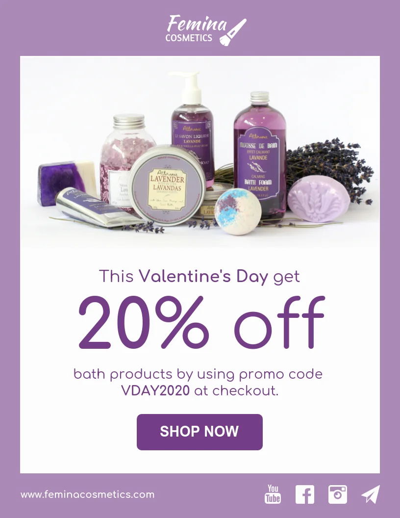
Source: Venngage
Why does this image work? Because it clearly describes what the headline states—this is the range of products available. You barely need the rest of the text to tell the story.
4. Illustrations
Photos are great for sharing your messaging directly with audiences. But if you want to leave room for interpretation, you can design illustrations.
An email banner design that includes an illustration can be captivating for your audience. Or you can use an illustration, like in this example, in your focus story.
Source: Venngage
As attractive as illustrations are, they can be time-consuming to create or source without the proper resources. Understand your content production process before committing to this route.
5. Videos
We all know video isn’t going anywhere. While email marketing may not seem like the best place for videos, they’re certainly a visual method to incorporate into your designs.
Videos are engaging, and they hold your attention, as long as they aren’t too long.
You will want to keep responsive email design rules in mind here. Use a video editor to keep your video short and at a manageable size.
6. User-Generated Content
Creating content takes time and energy. For busy marketers, it can be impossible to keep up with the demand for content creation. So, why not outsource the process to your users?
Adding user-generated content to emails can cut down on your workload and build relationships with your consumers. Who doesn’t want their content featured in their favorite brand’s email?
Let your email design reflect your brand personality by highlighting your loyal customers. This is also a great way to implement social proof in your emails and spread brand awareness.
7. GIFs
Like videos, GIFs are engaging and fun. Popular GIFs tell a story without any associated text. You can also create branded or product GIFs, like this example, using online GIF-makers.
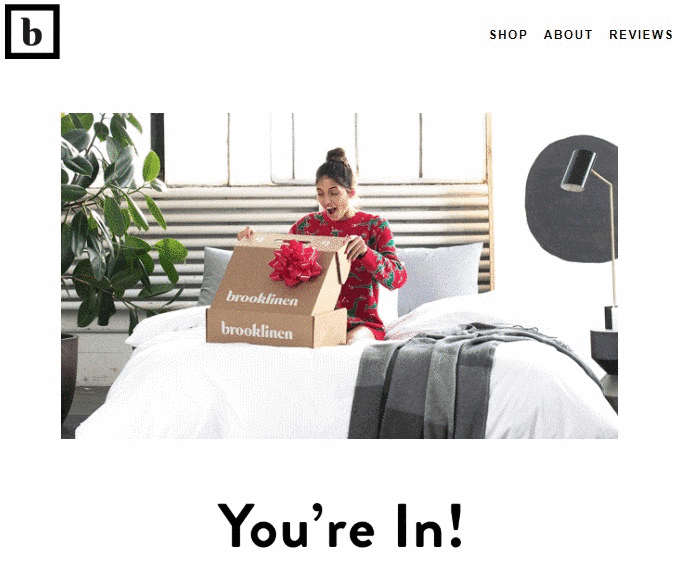
Source: Brooklinen
Again, keep responsive HTML email design in mind so that your emails are accepted by email clients and load properly on smaller screens.
Conclusion: Get Visual With Your Email Design
Text emails have their place in the world of email marketing. But text content, as insightful as it can be, is still labor-intensive for users.
Your email design needs to be visually appealing to encourage users to interact with your content. This will also give them the impetus to click on your CTA and complete conversions.
With Benchmark Email, email design just got easier. Our Smart Design feature uses the power of AI to create emails that are unique and custome to your brand. Create effortless emails today and sign up for a free Benchmark Email plan.
Author Bio

Ronita Mohan is a content marketer at Venngage, the infographic and design platform. Ronita regularly writes about digital marketing, data visualization, design, and small businesses.
Twitter: @Venngage

A powerfully simple email marketing platform
Sign up for free to see how effortless email marketing can be.
Our Company
Compare
Solutions
Compare
Account
© Polaris Software, LLC Benchmark Email® is a registered trademark of Polaris Software, LLC
© Polaris Software, LLC
Benchmark Email® is a registered trademark of Polaris Software, LLC