

Webinar Landing Page 101: How to Convert More Visitors Into Email Leads

To ensure the success of your webinar, you must get as many people as possible to sign up for it.
The more people that sign up to attend your webinar, the more people you have to add to your email list and introduce your product or services to. Which is why it’s crucial you put together an effective landing page.
To create a highly converting page that turns visitors into email leads, it’s always helpful to find a couple of good examples. While doing so doesn’t guarantee you’ll convince every visitor to join your webinar, the tips you’ll gather should help maximize your conversion rate and help secure as many webinar attendees as possible.
Let’s cover some tips for putting together a webinar landing page that sees a lot of traffic and sign-ups, as well as some stellar examples.
Determine Your Target Audience
It’s nearly impossible to target everybody with your webinar invitation, and honestly, you don’t want to. You need to focus all your energy on getting the attention of people who will be most interested in your topic and make great potential customers.
To discover your target audience, refer to your website’s Google Analytics data. It will show you the demographics of your visitors, such as age, gender, geographical location, and more.
To get additional insights about your visitors, you can embed surveys on your website. In those surveys, ask visitors what topics they want to see covered more on your site. This is also a great email marketing tactic for building your list.
It’s also helpful to talk to your sales team and see who they’re having productive conversations with. And examine your existing customers and identify the characteristics of those that have been with you the longest.
Using these techniques allows you to create a more personalized landing page that resonates with the audience you’re aiming to reach. By thoroughly knowing your audience, you’ll be able to arrange a webinar that dives into their issues and offers real solutions they can use.
Optimize Your Headers
One of the elements that immediately catches the attention of your potential webinar attendees is the header image. It’s pretty hard to miss, given its placement and size.
For example, Tailwind uses two headers to first introduce what the webinar is about and then focus on what you’ll learn from it.
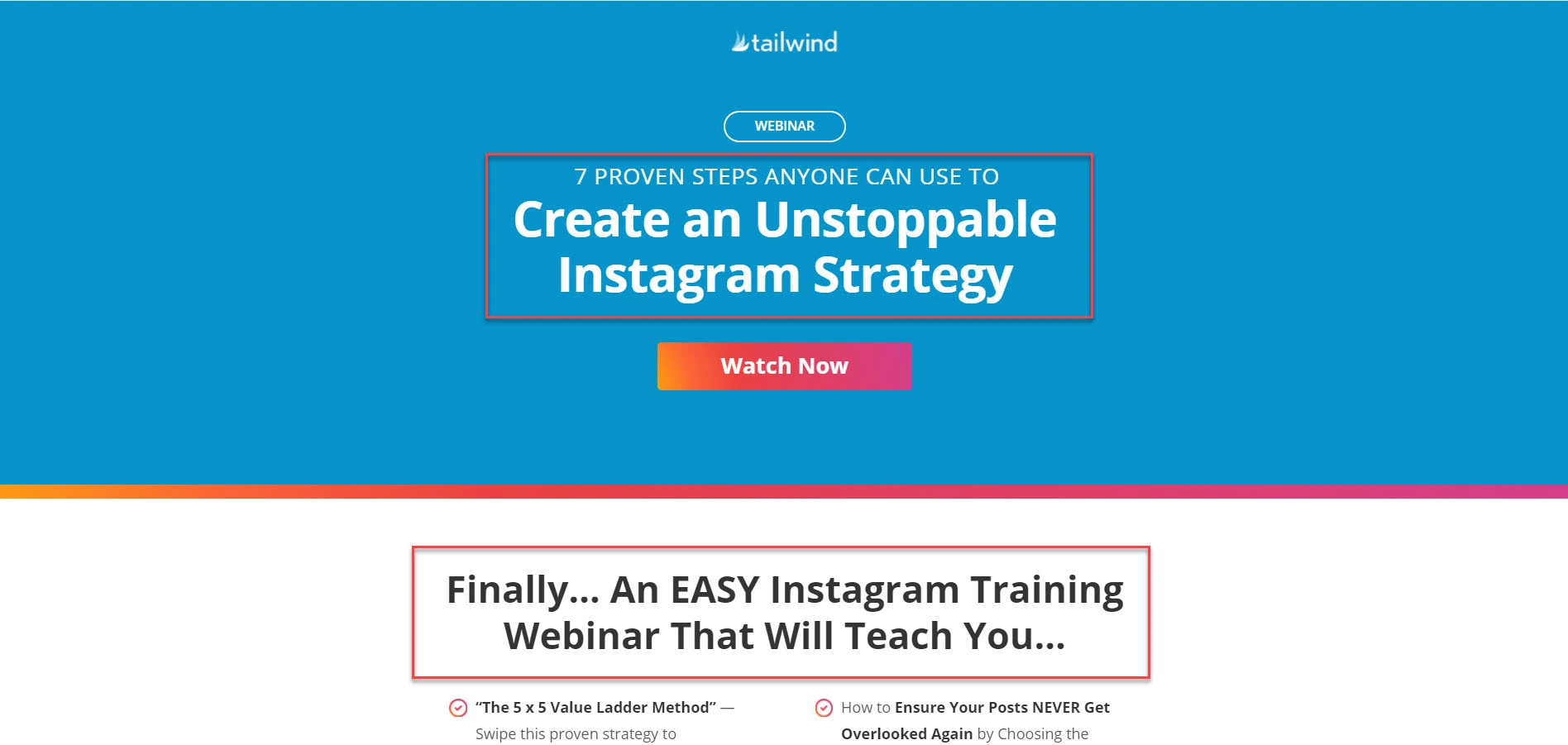
Source: Tailwind
If the headers don’t appeal to your audience, your visitors will most likely gloss over your copy, if not, leave the page right away. Therefore, make your headers eye-catching with colors or a graphic, and include key information, like the webinar title, presenters, time, and date.
Use Images and Videos
Don’t shy away from using images and videos on your webinar landing pages. However, make sure they help reinforce the message and aren’t a huge distraction from your main intent: to encourage signups.
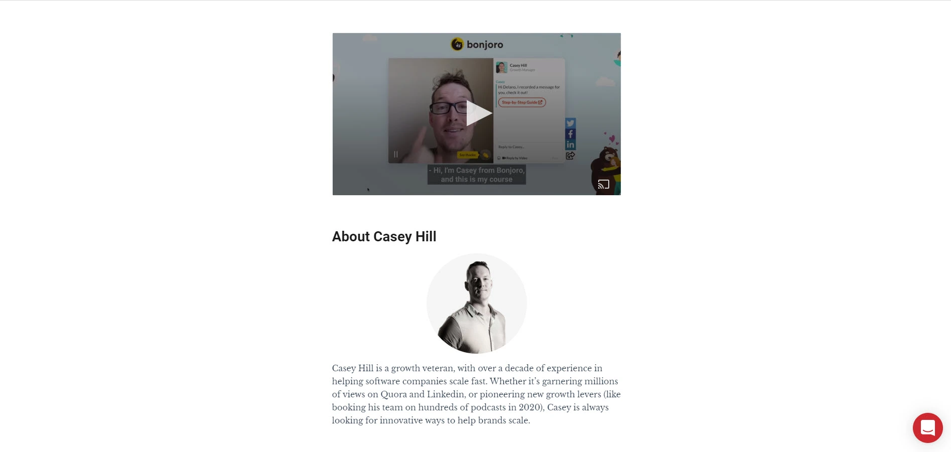
The most common images used on webinar landing pages are the speaker or host images. They allow the audience to put a face to the names of those who will be involved in the webinar, and they help humanize the brands involved. With that said, it doesn’t hurt to also create a visual image to represent the webinar. Or at least create separate branding for the webinar with elements or specific color usage.
As for videos, you can record a short video with your introduction, your accomplishments, and why your prospects should sign up. The video can emphasize what’s already mentioned on your landing page copy, just present it in a different, more engaging format.
Bonus tip: Create closed captions for your video and for your webinar broadcast so both are accessible to registrants who may be hard of hearing.
Build Yourself Up
Be sure to share the speaker’s credentials on your webinar landing page. This helps to introduce the speaker to people who aren’t familiar with them yet and builds up credibility.
You want registrants to view your speaker as a subject matter expert. Therefore, list relevant accomplishments and awards that the speaker achieved to strengthen the portrayal of expertise. This should be relatively easy as long as you select the right speaker for the right topic, and it could convince more people to sign up for your webinar.
Write Straightforward Copy
Your webinar landing page copy plays a huge role in determining the number of signups you will get from it.
The key to writing stellar landing page copy is to cut to the chase. Tell readers exactly what the webinar is about in just a short paragraph or two. Then, list a couple of bullet points explaining the specific points that will be covered. This helps show your audience the purpose of your webinar.
Use a Countdown Timer
Some visitors won’t sign up for a webinar immediately because they think they can do so later. However, in most cases, they end up forgetting about it altogether, bringing their customer journey with your brand to an end.
It helps to create a sense of urgency, so your visitors feel compelled to sign up immediately. To help put this idea into practice, show a countdown timer on your webinar landing page. Make sure to indicate that once the timer hits zero, the window to sign up is closed.
Using countdown timers allows for the psychology of scarcity to take full effect. Since people need to make a decision to join now before it’s too late, they will give in to their fear of missing out.
Include a Strong Call to Action
Obviously, the call to action (CTA) on your webinar landing page is to get people to register for the webinar. But before you can optimize your call to action, you must understand the different ways you can feature it.
There are two types of CTAs you can use:
- A button that will reveal a sign-up form when visitors click on it.
- A form embedded on the page.
While a button may be visually appealing, a form removes an extra step in the process. And when you’re hoping to get as many signups as possible, any little bit helps.
It’s important to note that the type of CTA you use on your page ultimately impacts your conversion rates. In this case, it’s wise to A/B test the CTAs and see which of the two generates the most signups.
There are a few ways you can do this. You can simply test a button against a form. Or, you can test different kinds of buttons to see which yields the most signups.
If you go for the latter, play around with the design of the button. Change the size, color, and text to see what makes a difference. Regarding the copy, use actionable words and phrases such as “Save Your Spot” or “Join the Webinar Now.”
If you’re testing different forms, limit the number of fields to two-their name and email address. This makes signing up for your webinar much easier.
Also, you can offer an enticing freebie, like a guide, a template, or cheat sheets to give your audience more reasons to attend your webinar and join your email list.
Observe Good Design Practices
The design of a webinar registration page is just as critical as its content. Based on how the information is visualized, your online visitors are able to better grasp the core message of the page.
Following good design practices is not rocket science. In fact, taking a cue from top marketing websites is key to high conversion rates.
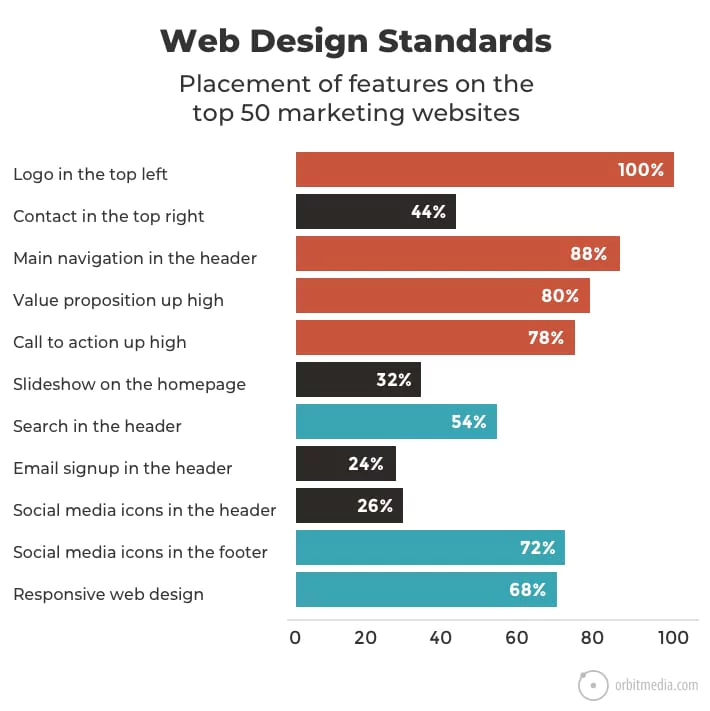
Source: Orbit Media
By featuring your logo in the top left, including the main navigation in the header, and both the value proposition and CTA on top of the page-are all the factors that can help your site perform higher than the average. Therefore, by breeding familiarity with the UI interface of your webinar landing page, you get more of your audience to trust you, which leads to more signups.
Pick the Right Landing Page Builder
The highest converting landing pages are created with the best landing page tools.
At the very heart of a landing page builder is the ability to develop alluring landing pages without any design experience. Drag and drop elements onto the page and publish the page in minutes.
More advanced tools have features mentioned above, like A/B testing. Some have email automation features that let users launch drip campaigns to your subscribers and engage with them on autopilot.
If hosting webinars are an integral part of your content strategy, consider using a platform that has email marketing, a landing page builder, and webinar functionalities, like Benchmark Email. So, instead of juggling different tools on top of your webinar software, you’ll have all features under one roof, which can significantly improve and simplify your workflow.
Author Bio
Christopher Jan Benitez is a freelance writer for hire who specializes in the digital marketing field. His work has been published on SEO and affiliate marketing-specific niches like Monitor Backlinks, Niche Pursuits, NicheHacks, Web Hosting Secret Revealed, and others.
